In Your Image: From Iceberg to Artist in Greenland
In Your Image: From Iceberg to Artist in Greenland
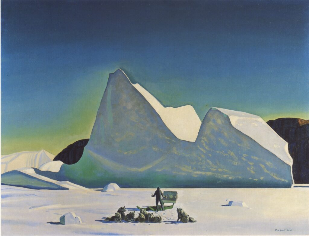
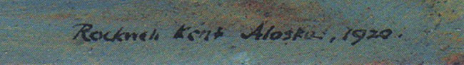
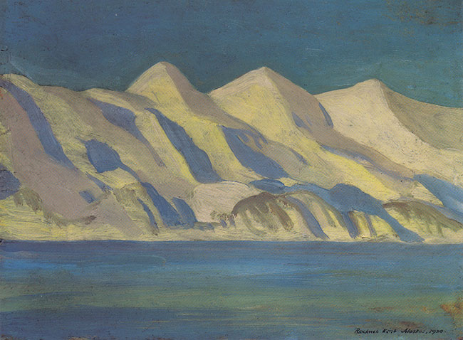
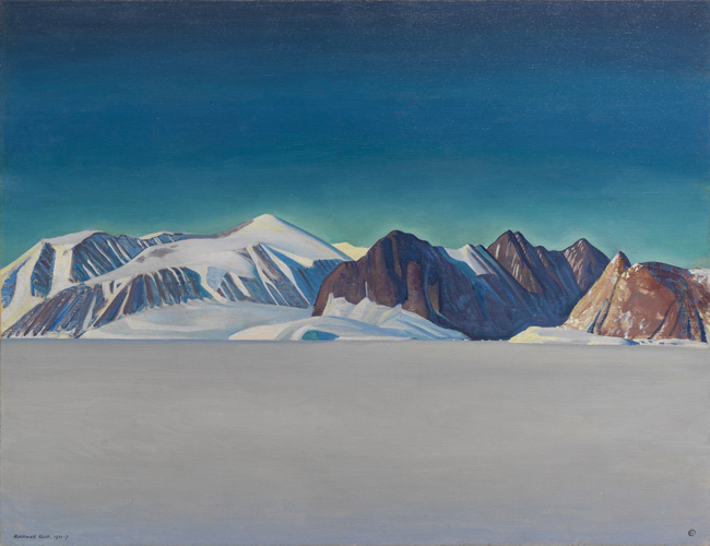
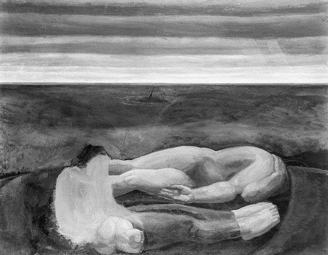
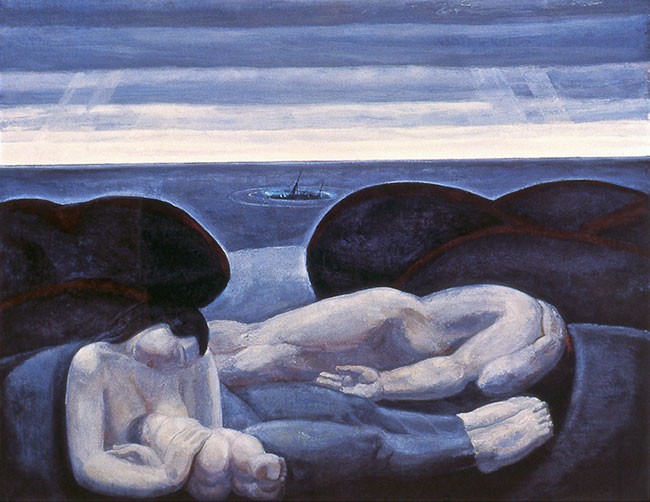
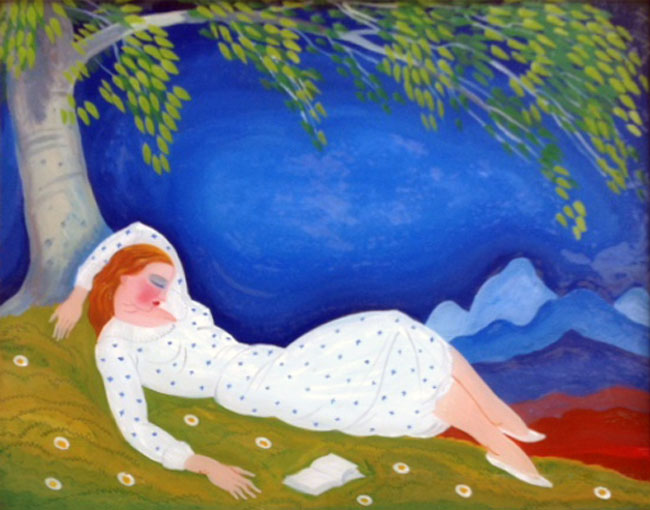
There has been some confusion regarding Rockwell Kent’s painting The Artist in Greenland. It has been assumed that the latter was painted in 1935 when in fact it was not created until 1960, as, in part, a copy of his painting Iceberg, as I will clarify below.
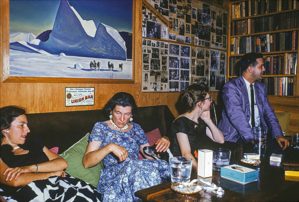
In a manner of prefacing… I possess a set of 35mm slides that depict Sally and Rockwell Kent hosting the annual birthday party for Rockwell, in June of 1960: a party which was attended by several people, including their friends Jacquie and Dan Burne Jones. In one slide, shot in the Kents’ bar, the painting Iceberg is displayed on the wall. Obviously the Joneses saw this painting. Having seen it they wished to add it to their growing Kent collection, however, it was already promised to J.J. Ryan, the artist’s major benefactor at the time.
What transpired next is that Kent decided to copy this painting, for the Joneses, though with some additions, as the artist clarified in his 31 July 1960 letter to the Joneses. In this letter Kent states: “I have removed the picture from the bar… I have begun work on the copy and am happy to learn that you give me a free hand with the dogs.” In this same letter he finishes by saying: “I will end this letter and go back to work on the iceberg picture.” He continues, after referencing J.J. Ryan and commenting on transferring Iceberg to him: “I would like to have the picture in shape for him to take back with him.” Iceberg is the painting that RK was copying for the Joneses. In Kent’s 10 July 1960 letter to Ryan he said: “The bar picture, which I had not intended to send, is marked as yours–for, since you would talk price, two thousand dollars.” (The sale and transfer of Iceberg is completed in September, as per an exchange of letters between Ryan and Kent on the 19th and 22nd.)
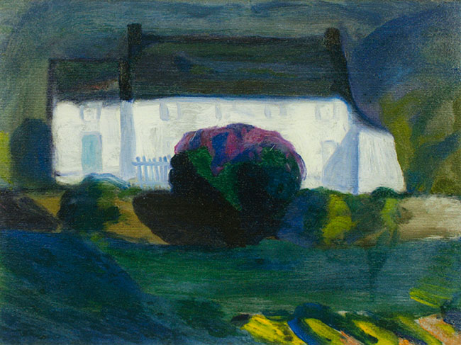
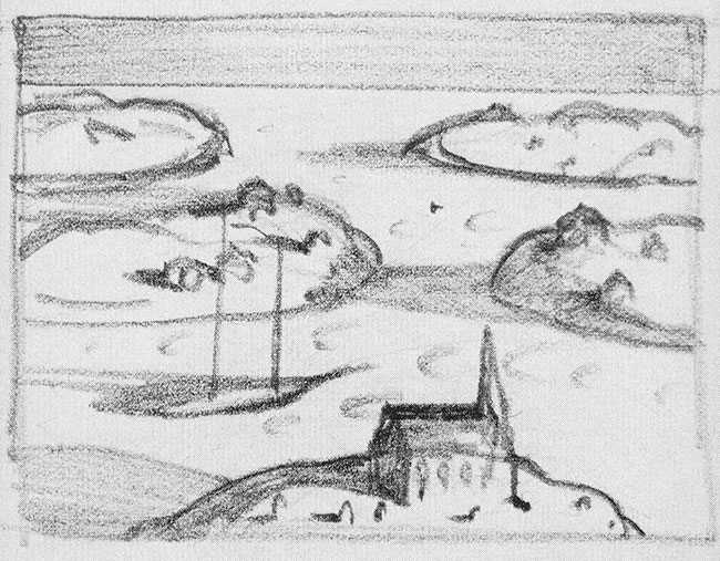
Continuing with the discussion about the development of what would eventually be titled The Artist in Greenland, Kent writes to the Joneses on 1 September 1960: “The recovery of my strength and energy, though steady, has been so slow that I have not yet been able to finish the iceberg picture.” Yet by 10 September 1960 he states: “On yesterday’s noon train from Au Sable Forks the two pictures, SUN GLARE and THE PAINTER IN GREENLAND [The Artist in Greenland]–packed, I believe, securely–left for their Chicago home with you. As I recovered my accustomed strength I was able to work more and more on the Greenland picture and finished it. And both pictures are so nearly like the originals–except for the dogs and me in the foreground of your picture, replacing and outnumbering in dogs the dog-team of the other–that I would find it quite impossible to detect the difference between the original and the copy.” (Herewith illustrated, you can see how Kent applied the landscape from Iceberg as a backdrop for The Artist in Greenland, yet added, as he said in his above letter, the figures.)
As a general statement regarding Kent’s practices, he mentions in his 31 July 1960 letter: “The original, like many of my paintings, is mounted on ply-wood.” The Artist in Greenland, unlike Iceberg, is not mounted on plywood. Other Greenland paintings that exemplify this practice can be seen in my book, Rockwell Kent’s Forgotten Landscapes. As you will read in the captions, all of the Greenland paintings are backed with plywood, except one. Having said that, I know of one instance where a painting that was mounted on board was removed, by a conservator, from the same. The documentation thereof and the remnants of its previous “life” are extant. There is no evidence of the same with regards to The Artist in Greenland.
Another practice common to this artist is that if he significantly altered a composition (which he often did) he would acknowledge the change by re-signing and sometimes re-dating the painting: sometimes burying the original inscription with over-paint or allowing both inscriptions to appear. There is no second signature on The Artist in Greenland.
In summation of the above evidence, I am confident that The Artist in Greenland was inspired by and thus became (in part) a copy of the painting Iceberg.
The Artist in Greenland has resided at the Baltimore Museum of Art since 1991; and Iceberg, is no longer in the J. J. Ryan Collection/Oak Ridge Estate, having sold at Christie’s in 2016.
In Review: The Other Rockwell Kents: An Introduction
In Review: The Other Rockwell Kents: An Introduction
“Some things have to be believed to be seen.”
Ralph Hodgson (1871-1962)
Rockwell Kent (1882-1971) was a renowned artist in the fields of painting, printmaking, book illustration, commercial design, and watercolors: so much so that his artwork was copied throughout his life: from students who wished to learn the master’s techniques, to copyists who mimicked his style.
Over the past several decades I have been presented with paintings (and occasionally works on paper) for which auction houses, galleries, museums and collectors have sought authorship confirmation. Many are documented, others are of questionable attribution. For those that are questionable, the works are often signed “Rockwell Kent”; sometimes rendered in a style similar to that of Kent; and occasionally the content — the assumed geographical location, for instance — recalls the work of our protagonist. (The file on these “non-Kents” has grown exponentially.)
Adding to the confusion, Rockwell Kent was not the only artist by that name. In the early 1900s he exchanged correspondence with his namesake: a man who was near the end of his career as a proofreader for the major New York City area newspapers, and as an amateur prose writer and printmaker [he lived 1858 to 1934]. Throughout the years the artwork by this gentleman has often been mistaken as that by the principal character in this essay. [For more information on the man see of one of my earlier In Reviews — “Addendum for the exhibition brochure, Generations,” in Essays.] There are, undoubtedly, other artists in the “annals of creativity” by the name Rockwell Kent.
What I wish to accomplish in this edition of In Review, is to introduce you, the reader, to the muddied waters of authentication. And illustrate how, by way of descriptive and visual comparisons, dubious attributions could be problematic for academia and the art market of today. Outright copying of the artist’s work and misattributions are nothing new in the Kent world, as we will see below. I will not be illustrating every “non-Kent” that I have on file as that would require a much lengthier publication. Let’s begin with examples of situations that Kent personally experienced.
Admiration or Pirating
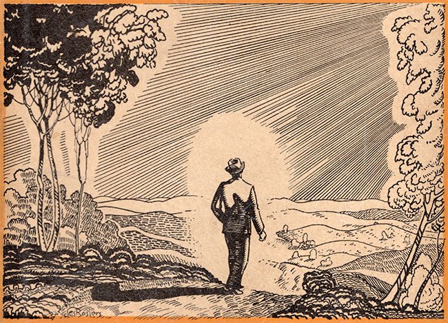
In a March 10, 1934 letter to Howard Lewis of Dodd, Mead and Company, Inc., Rockwell Kent wrote: “Here is proof of the illustration on page 705 of the trade edition of ‘Moby Dick.’ I should like to be present when the young prize fighter explains the likeness between his drawing and mine.” (fig. 1) To which Lewis responded (March 12th, 1934): “Thank you for sending the proof of the illustration from ‘Moby Dick’ which Mr. Des Rossiers [sic. des Rosiers] admired so much that he used it for a jacket drawing for Amos the Wanderer, by W. B. Maxwell, which we published in 1933 [sic. 1932]. Mr. Des Rossiers came in this morning and he informed me that he will make his peace with you in person. He could hardly deny that the two pictures were practically identical.” (fig. 2) [Dodd, Mead and Company went on to publish Kent’s autobiography, It’s Me O Lord in 1955.]
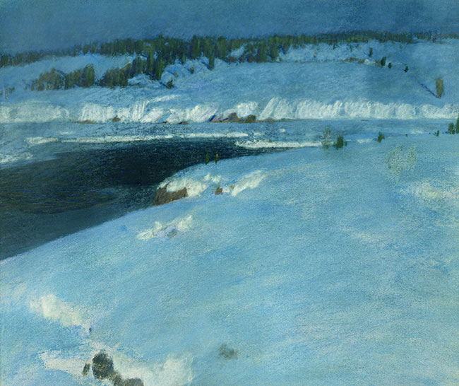
And then in 1965, in a November 23 letter to Richard Larcada [Kent’s gallery representative], the artist wrote: “It may amuse you to know that the Wickersham Gallery two weeks ago was showing — and still may be showing — a little 12 3/4″ x 15 1/2″ pastel of a winter scene titled ‘Greenland Coast,’ allegedly signed by me and dated 1907. (fig. 3) The picture was reproduced in the catalog, and its price, as ascertained by the friend who sent the catalog to me, was $1,700. I wrote the Director, Mr. June, that I had never in all my life used pastels, that I have never seen the place that was pictures [sic.], that it was not, as in the catalog it was called, ‘Greenland Coast’; and that I had not seen the Greenland coast until twenty-one years after the date ascribed to the picture. In short, it is a complete fraud. I was interested in reading in the New York Times of a few days later that picture frauds are so prevalent in New York nowadays that legal action against them is being considered. Incidentally, Mr. June has not replied to my letter. I wish I knew how to give the matter publicity. Such frauds deserve to be exposed.”
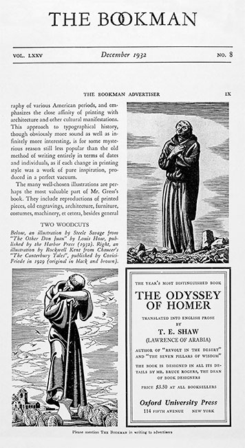
From an historical perspective many other examples abound. Harry Cimino’s illustrations for Seven Horizons, and Edward Shenton’s drawings for This Is My Country and Northern Lights paid homage to Kent’s creativity. Shenton’s illustrations for Northern Lights virtually duplicate many of Kent’s images from N by E. (fig. 4 and fig. 5) Artworks by other artists have often been and still are mistaken to have been rendered by Kent. In 2004 Swann Galleries, of New York, sold a Steele Savage drawing as a Kent, noting “stylistic comparisons with other drawings.” Unbeknownst to Swann, The Bookman, in a December, 1932 issue, illustrated the drawing they were selling — from Louis How’s, The Other Don Juan — comparing it with Kent’s illustration of a monk, from Chaucer’s The Canterbury Tales. (fig. 6) [The Bookman caption title incorrectly refers to the drawings as “two woodcuts.” In Kent’s case this is a frequent misnomer: moreover, many of his drawings were rendered with brush and ink.]
From One…
By examining one painting of dubious authorship we are often led down paths towards many.
Early in the previous decade I was shown an unframed oil on canvas board of a landscape, purportedly depicting a view of Mount Equinox, near Arlington, Vermont: one that is signed “Rockwell Kent.” The painting was in the hands of a prominent New England art dealer. I was informed by the dealer that an associate of his, whom he described as a “picker,” — someone who seeks out art and antiques from primary sources — found the painting at a flea market in New Hampshire. The dealer expressed doubts, to me, about the attribution. Another individual later saw the painting, accepted the attribution, and proceeded to acquire the work. The painting has since appeared in several publications and exhibitions as by Rockwell Kent (1882-1971).
The painting, referred to as “Vermont Study” (fig. 7), certainly has some similarities to Rockwell Kent’s oil paintings of Mount Equinox, as well as to a reverse painting on glass (also executed by the master). Yet it likewise has similarities to paintings that are distinctly not by Kent. Perhaps the most damning evidence against a Kent attribution, though, is the distinct difference between this painting and a study that was handed down from Kent’s first wife, Kathleen, to one of her grandsons. Let’s begin with the latter painting, first.
Known Kents
The Kent family painting, unsigned, — authenticated by Kent’s son, Gordon, in a letter on the verso depicts a view toward Mount Equinox, in winter. (fig. 8) The sky is heavily overcast, and the colors, muted. The pigments are raw; the elements, basically defined. The oil paint is lightly applied on a wood board: quickly sketched in with broad and narrow and abrupt, horizontal and vertical brushstrokes. In short, it is typical of Kent’s approach to laying out the foundation of small studies, and often times larger, what would become finished compositions: a method perhaps inspired by one of his earliest mentors, William Merritt Chase.
In contrast, due in good part to the medium, the reverse painting on glass glistens. (fig. 9) The pigments are brushed on flat and smooth, on the textureless pane of glass. The compositional elements, and hues, share visual qualities with some of Kent’s earlier Berkshire (Massachusetts) landscapes.
Similarities and Differences
“Vermont Study” has the glistening effect that we see in the reverse painting on glass: as if the pigment was mixed with linseed oil. Any sheen that we see in Kent’s Vermont paintings (like others from his greater oeuvre) is more a result of the varnish that he used to cover his completed works.
Kent frequently created three predominant visual tiers, or planes — fore, mid and background — in his compositions: with compositional elements within those planes that are appropriate for that space–a height or width ratio that represents the distance of the given element: such as a field or trees, for instance. “Vermont Study” breaks those planar boundaries with elements that stretch from one plane to the next–the mid ground field overlaps with the foreground field. It lacks the definition of the frontal plane we commonly see in Kent’s Vermont (and other) compositions. What serves as a frontal plane in “Vermont Study” are two diagonals, that originate from the left and right edges of the composition, that meet in the center. The form on the left displays a crude, furrowed effect, atypical of Kent.
The paint is heavily applied throughout “Vermont Study.” And long, continuous brushstrokes and serpentine patterns, like wrappings, (one stacked above another) form the distant mountain. Kent’s application of pigment is lighter, freer. And within his compositions he often contrasts abstract “patches” against well defined elements that he wishes to highlight — a blurred hedgerow focuses the eye toward a tree, deer or mountainside. There are no such contrasting elements in “Vermont Study”: contrasting colors, perhaps.
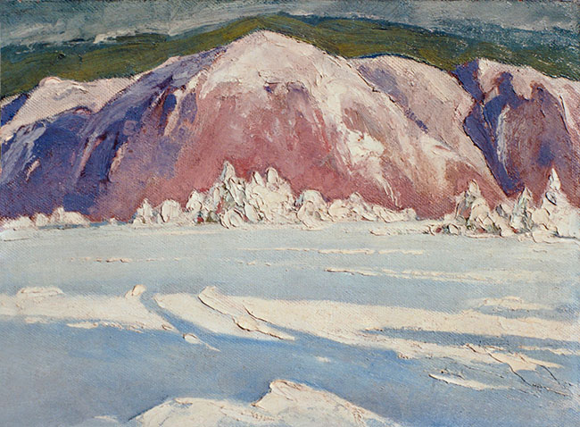
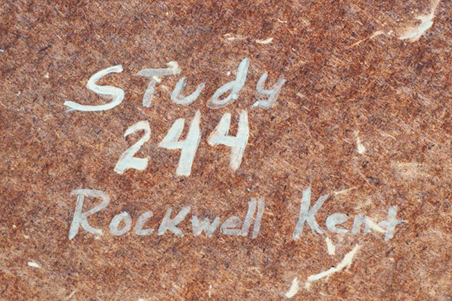
In “Vermont Study,” the foliage and mountain peak become little more than muddled brushstrokes. This manner of rendering shares characteristics with a so-called Greenland painting of equally questionable attribution (inscribed on the verso: “Study 244 Rockwell Kent”). (fig. 10 and fig. 11)
From One, the Many…
Another painting that had been attributed to Rockwell Kent (1882-1971), — which has been referred to as “Adirondack Landscape” (fig. 12) — possesses striking similarities to “Vermont Study”; and in its similarities pulls us further away from an association to Kent’s work. It, like “Vermont Study,” is an oil on canvas board. It is composed, in part, by glistening, sweeping brushstrokes and patterns that provide the contours of hills and mountains: with a palette further afield than that which is common to Kent. And like “Vermont Study,” an element, the clouds in this case, are heavy with impasto.
“Adirondack Landscape,” like “Vermont Study,” is rendered on (maker labeled) canvas boards. The former painting bears a two-toned brown, rectangular label for “H.R. Giger, Ltd./New York, Boston,” with a letter “G” within a crest, above this text. And the canvas board for the latter painting bares a red, scalloped, circular label — more like a stamped seal — which reads: “J.H. Hatfield Hand Ground Artists’ Colors. Canton Jct., Mass.” (Both, Boston area makers or suppliers.) Kent rarely used canvas board, and those that are known do not bear these labels. Kent used a “Royal Crest Illustrating Board,” manufactured by Hurlock Bros. Company, Inc., from Philadelphia, for his commercial illustration, “Science Explains the Fish Deluge”; and the canvas boards for his Greenland, figural works, Northern Exposure and Southern Exposure, give the impression of being homemade: a simple board covered with canvas, with no labels on the versos.
“Vermont Study” and “Adirondack Landscape” are finished, generic works that could represent a variety of geographic locations. The Kent family painting, in its depiction of the view of Mount Equinox, is visually representative of Kent’s other Vermont landscapes; and its manner of construction — the technical aspects of its creation — has precedent in innumerable paintings that come before it.
Belief Through Association
“Vermont Study” was (perhaps still is) on view at the Bennington Museum, in Bennington, Vermont: now framed. The frame is, or is in the style of, the frame that was on the Alaska Impression painting with which it has been juxtaposed. The current frame on the Alaska Impression is contemporary; and its original frame appears to have been re-utilized to display a reverse painting on glass referred to as “Baby with Blue Bird” (see The Magazine Antiques, July 2005, p. 73) — a posthumously completed work: the artist had not painted in the sky. Perhaps the purpose of reusing the Alaska Impression frame was to provide the viewer with a sense of what the painting on glass would have looked like when it was originally displayed. (Both paintings circa date to 1919-1920.)
Brushstrokes 102: Signatures
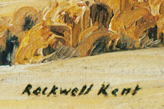
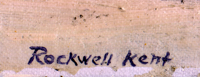
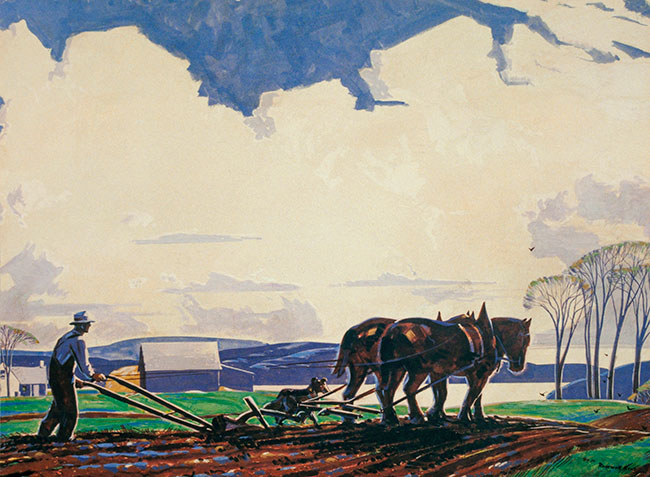
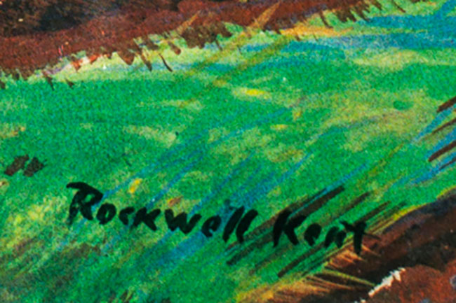
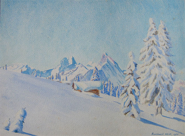
Rockwell Kent’s signature was relatively basic. More often than not, through the late 1910s and early 1920s, the signature appeared with upper case first initials and lower case subsequent letters. Simple enough that a copyist could virtually reproduce the signature. Let’s compare Kent’s signature on his paintings Mt. Equinox, Winter (Art Institute of Chicago) and the Alaska Impression (fig. 13 and fig. 14) with the signatures on “Vermont Study” and “Adirondack Landscape.” (fig. 15 and fig. 16) Now let’s expand that comparison to include signatures that are seen on a composition of a city scene (fig. 17 and fig. 18), another of a farmer, with a horse, plowing a field (fig. 19 and fig. 20), and a mountainous winter landscape (fig. 21 and fig. 22), all by unknown artists: Varying signatures, like varying brushstrokes, that pull us further and further away from what we may have believed to be the work of Rockwell Kent (1882-1971).
Proclamations…
According to an essay in Antiques and Fine Art magazine (Rockwell Kent’s ‘Egypt’: Shadow & Light in Vermont, Summer 2012, p. 141), and in variant rewrites such as the Bennington Museum’s exhibition catalogue of the same name, and the museum’s current display label: “‘Vermont Study’ is undoubtedly the earliest oil painting that Kent conceived in Vermont and closely relates to the artist’s ‘impressions’ from Alaska, in terms of its physical characteristics, style, technique, and compositional strategies.”
When one closely examines the Alaska Impression that is discussed in these publications and label, you can see the “broad and narrow and abrupt, horizontal and vertical brushstrokes” that I mention above — when I speak about the Kent family painting of Mount Equinox. (fig. 23) You do not see the same brushstrokes in “Vermont Study.”
In Rockwell Kent: The Mythic and the Modern (Portland Museum of Art. 2005) the author states that “‘Vermont Study’ shares the same swelling landscape forms and rhythmic ordering of receding planes. It exemplifies how Kent reordered nature in imaginative ways.” For the reasons I illustrate above, the relationship between “Vermont Study” and Kent’s Vermont paintings entice comparison but do not definitively identify the former work with the latter. These are stylistic comparisons that, as we have read in the case of the Steele Savage drawing mentioned above, require reconsideration.
Coda
When I first saw “Vermont Study,” as well as the “Other Kents” that I discuss and/or illustrate, an alarm bell rang out. Perhaps, after 40 years of studying Rockwell Kent’s artwork, I have a visceral response to what I see: which takes over and informs what I cannot otherwise explain at the moment.
I can see why people associate some of the “Other Kents” to Rockwell Kent (1882-1971) but I find no compelling evidence to share their belief.
© Scott R. Ferris – May 2018
In Review: Blue Day
In Review: Blue Day
Blue Day first came to auction at Sotheby’s in December, 2003. It returned to the block, at Sotheby’s, in May, 2017.
An ardent celebrant of Life, Rockwell Kent traversed the world, frequently leaving his footprints in its harsh polar regions. His deep affection for the distant latitudes has its roots in the Nordic tale, The Saga of Burnt Njal, a prophetic tome brought to his attention by his mentor Abbott Thayer. Kent recounts, in his exhaustive autobiography It’s Me O Lord, that Burnt Njal “opened the gate upon that highway to the North which led at last to Greenland and Alaska” (Kent, p. 110). The artist’s early, prolonged stays in the remote communities of Monhegan Island, Maine and Brigus, Newfoundland further encouraged him to venture north, as well as to Tierra del Fuego in the Antarctic. Kent’s sojourns in the “wilderness — the only abiding place on earth of liberty” (Kent, Salamina, quoted in Scott R. Ferris, In the Presence of Light, 2003, p. xx) — were “the flight to freedom of a man who detests the petty quarrels and bitterness of the crowded world (Alaska Drawings by Rockwell Kent, New York, M. Knoedler & Co., 1919).
Rockwell Kent’s tales of his first trip to Greenland (1929) are told in his book, N by E. The artist’s graceless but newsworthy shipwreck upon the shores of Karajak Fjord initiated his historic three voyages to that largest of islands. His subsequent trips in 1931-32 and 1934-35 are retold in Salamina and Greenland Journal.
Many of the paintings that Kent created during his extended visits to Greenland typify the apogee of his artistic achievements. Blue Day, like his paintings Winter, Monhegan (Metropolitan Museum of Art), Toilers of the Sea (New Britain Museum of American Art), The Road Roller (The Phillips Collection) and Citadel (National Gallery of Art) share the pantheon of American Art with George Bellows’s Evening Swell (itself an homage to Kent’s Toilers of the Sea) and Edward Hopper’s Early Sunday Morning (Whitney Museum of American Art).
Arthur Lismer, a member of the Canadian “Group of Seven,” and no foreigner to the Arctic terrain, wrote that Kent “grasps the forms of earth and sky in a powerful summary and… feels the color and design fundamentally… he strives after the big rhythms creating order through the design of land, water and sky.” (The Art Gallery of Toronto, Grange Park Bulletin, April, 1934). Distinguished art critic Royal Cortissoz wrote that Kent “secures his pictorial balance in the first place by his massive treatment of nature in all her dignity and then by the power with which he defines a long flowing contour” (New York Herald Tribune, February 8, 1942).
Like Citadel and Gray Day, Kent created Blue Day from abstract forms — paint applied with dabs and brushstrokes of varying sizes, shapes and orientation — that float within flat, horizontal fields of color: techniques that would appear years later in the paintings of Clyfford Still, Mark Rothko and the Color Field painters.
In September 1950, Robert McIntyre of Macbeth Gallery wrote to Rockwell Kent to inform him of a client’s interest in purchasing paintings by the artist. Inspired by the shared interest in Progressive politics, Joseph James (“J.J.” also known as Jim) Ryan, grandson of renowned financier Thomas Fortune Ryan, became the leading collector of Kent’s paintings. Before the end of September, he had purchased three of Kent’s canvases, one Irish and two Alaskan landscapes. In November, Ryan purchased another five paintings, including Citadel, Gray Day, and its companion composition, Blue Day. Not only is Blue Day one of the paintings Ryan selected from Kent’s oeuvre, this painting was also chosen to appear on the cover of his autobiography It’s Me O Lord. Ryan would acquire just over 30 oils in all, many of which, including Blue Day, along with 54 other oils and approximately 163 graphic works, was exhibited in five cities in the USSR from December 1957 through November 1958. The overwhelming positive response to Kent’s work was a leading factor in his decision to bequeath his personal collection to the Soviet people. Had J.J. Ryan not purchased Blue Day prior to the exhibition, there is reason to believe that it would have become one of the paintings that Kent gave to the Soviet Union in 1960.
- 1935-1937
- Oil on canvas mounted on plywood
- 34 x 44 1/2 inches
- Signed and dated lower left: Rockwell Kent 1935-7, and inscribed lower right ©
Provenance
- The artist
- Joseph James (“J.J.”) Ryan (via Macbeth Gallery)
- Peter Brady (nephew of J.J. Ryan)
- Private Collection in Massachusetts
- Collection of Richard Manoogian (via Sotheby’s)
- Collection of Deborah and Edward Shein
- Sotheby’s
Exhibited
- Washington, D.C., Gallery of Modern Masters, Greenland Paintings and Prints: Rockwell Kent, 1937, no. 17
- Dayton, Ohio, Dayton Art Institute, Paintings, Lithographs, Wood Cuts by Rockwell Kent, 1940;
- Houston, Texas, Meinhard-Taylor Galleries, Paintings, Lithographs, Wood Cuts by Rockwell Kent, 1940, no. 6
- New York, Wildenstein Galleries; Los Angeles, California, Stendahl Art Galleries; Stockton, California, The Haggin Museum; Beloit, Wisconsin, Theodore Lyman Wright Art Hall, Beloit College; Pittsburgh, Pennsylvania, Carnegie Institute; Boston, Massachusetts, Boston Symphony Orchestra, Symphony Hall, Know and Defend America, 1942-43, no. 19
- Moscow, USSR, Pushkin State Museum of Fine Arts; Leningrad, USSR, State Hermitage Museum; Kiev, USSR, Kiev Museum of Western and Eastern Art; Riga, USSR, State Museum of Fine Arts, Rockwell Kent: Paintings and Graphics, 1957-1958, no. 38
- Portland, Maine, Portland Museum of Art, Rockwell Kent: The Mythic and the Modern, 2005, no. 130
- Salem, Massachusetts, Peabody Essex Museum, To the Ends of the Earth: Painting the Polar Landscape, 2008-09
- Canton, New York, Brush Art Gallery, St. Lawrence University, The Once Most Popular American Artist, 2012
Literature
- Rockwell Kent, Rockwell Kent, New York, 1945, illustrated
- Rockwell Kent, It’s Me O Lord: The Autobiography of Rockwell Kent, New York, 1955, illustrated in color opposite p. 56, also illustrated in color on the dust jacket
- Jake Milgram Wien, Rockwell Kent: The Mythic and the Modern, Portland, Maine, 2005, illustrated p. 78
- Samuel Scott, Russell A. Potter, John Paul Caponigro, To the Ends of the Earth: Painting the Polar Landscape, Salem, Massachusetts, 2008, illustrated p. 4
© Scott R. Ferris
In Review: Frozen Falls (Alaska)/Ice Curtains
In Review: Frozen Falls (Alaska)/Ice Curtains
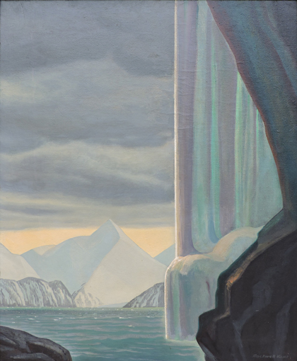
Frozen Falls (Alaska), also known as Ice Curtains, was offered by Christie’s, New York, in their 22 November 2016 American Art auction. It failed to sell.
- Ice Curtains [original title]
- Frozen Falls (Alaska) [Peter A. Juley & Son title]
- Frozen Fall (Frozen Fall/1962) – pencilled on masonite
- [“Emerald”: title referred to in Jake Milgram Wien’s article, “Origin Stories No. 4: Rockwell Kent Paintings in Focus,” Rockwell Kent Review, Volume XLI/2015-2016. The use of the title “Emerald,” as applied to this painting, is unsubstantiated.]
- Painted circa 1919 and 1952 (with alterations potentially occurring between these dates)
- Oil on canvas mounted on masonite
- 34″ x 28″ (86.4 x 71.1 cm)
- Signed lower right
- [Original signature and annotation: “Rockwell Kent, Alaska, 1919.” Confirmed in Peter A. Juley & Son photo.]
- Labels on verso: “XII Esposizione Internazionale d’Arte/della Cittá di Venezia – 1920 1010” and “Merci Visitate/9057/Dogana Italiana.”
This painting, as it was originally conceived, was titled Ice Curtains (Alaska Paintings exhibition brochure). A photograph taken by Peter A. Juley & Son (New York), circa 1920, bears the handwritten title, Frozen Falls (Alaska). A third reference to a title was written on the verso, in pencil, “Frozen Fall.”
There are at least three paintings that are similar in appearance and similarly titled. As a result, it is virtually impossible to ascertain which among them were exhibited at any given time (that is, in their earlier history): The exception being when we have additional documentation — the title/composition relationship — Ice “Curtains” — in the Knoedler brochure; the labels for the Venice exhibition of 1920; the photograph of the painting at Frazers Stable Gallery exhibit.
EXHIBITIONS
(Known)
- M. Knoedler & Company, New York, Alaska Paintings of Rockwell Kent, March 1-12, 1920, no. 7
- Venice, Italy, “XII Esposizione Internazionale d’Arte/della Cittá di Venezia” (Twelfth International Exposition, Venice) April 15-October 31, 1920
- Frazers Stable Gallery, 1910 S Street, NW, DC, December 20, 1977-January 7, 1978
OTHER POSSIBLE EXHIBITIONS
(For “Frozen Falls)
- Carnegie Institute, Pittsburgh, Rockwell Kent: Exhibition of Paintings [retrospective], January – February, 1924 no. 19 (As Frozen Fall)
- Arts Club Exhibitions at the Art Institute of Chicago, Exhibition of Paintings by Rockwell Kent, March – April, 1924, no 14 (As Frozen Fall)
- Wildenstein Galleries, New York, Retrospective Exhibition of the Paintings and Drawings of Rockwell Kent, April-May, 1924, no. 21 (As Frozen Fall)
LITERATURE
(Selected)
- Henry McBride, “Paintings by Rockwell Kent on View at Knoedler’s–In Other Galleries,” New York Sun, March 21, 1920
- Forbes Watson, “Rockwell Kent, Incorporated,” Arts & Decoration, March 25, 1920
- “The Alaska Paintings of Rockwell Kent,” New York Times [author unknown], March 7, 1920
- Benjamin Forgey, “Rockwell Kent: In His Paintings, a Paradox Recalled,” Washington Star, December 20, 1977. “Frozen Fall” illustrated
- Jake Milgram Wien, “Origin Stories No. 4: Rockwell Kent Paintings in Focus,” Rockwell Kent Review, Volume XLI/2015-2016. (Thought to be another painting titled Emerald)
BACKGROUND
Rockwell Kent, with his son Rockwell (who turned 9 while in Alaska), “found Fox Island on Sunday, August twenty-fifth, 1918, and left there finally on the seventeenth of the following March.” From this sojourn the artist wrote his tome, Wilderness: A Journal of Quiet Adventure in Alaska (G. P. Putnam’s Sons, New York, 1920) and created dozens of paintings and drawings, and endeavored to make some relief prints. Two acclaimed exhibitions followed the artist’s return: Alaska Drawings by Rockwell Kent (M. Knoedler & Co., New York, April, 1919) and The Alaska Paintings of Rockwell Kent (M. Knoedler & Company, March, 1920
FROZEN FALLS
(Its Origins)
Frozen Falls (Alaska) was originally titled Ice Curtains before the artist reworked the painting to its current presentation. The former title was written on a photograph taken by the fine arts photographers Peter A. Juley & Son, in New York. The title Ice Curtains is documented in the brochure of Kent’s first exhibition of this work, in 1920, at M. Knoedler & Company.
When one compares Frozen Falls with the photograph of Ice Curtains taken by Juley, you can see the pentimenti of the three dominant mountain peaks, as well as, the vertical strip on the left that once was the second waterfall (or a division of the larger waterfall to the right). This fits Kent’s statement that he was “almost beneath a frozen waterfall” when he painted the work. (Kent, journal entry for February 14, 1919, as quoted in Wilderness, pages 184 and 187) The form of the waterfall on the right, as well as its supporting rocky cliff, is virtually untouched.
In Jake Wien’s article in the Rockwell Kent Review (as noted above), he argues that Frozen Fall, Alaska, at Plattsburgh State Art Museum, was originally Ice Curtains. I argue that this is not the case.
In addition to the similarities between the Christie’s painting [The Oak Ridge Collection] and Ice Curtains, that I have mentioned, it is important to note the following significant difference between the Plattsburgh painting and Ice Curtains. In the lower left corner of the Plattsburgh painting, in the pentimenti, one can still see the remnants of a jagged, two- or three-pronged rocky outcrop, that is not present in the Juley photo of Ice Curtains. Therefore, the Plattsburgh painting could not have originally been Ice Curtains, as Mr. Wien suggests. (This also supports my theory that there are probably more than the three “Frozen Water Fall” paintings that I discuss in this essay.)
The same similarities between Ice Curtains and Frozen Falls — the virtually unaltered waterfall to the right of the composition–exist between Sun and Ice and Frozen Waterfall, Alaska at the Art Gallery of Hamilton (which helps to confirm its origins). Presumably we will one day find an image of the Plattsburgh painting in it’s original state.
One other note regarding these three paintings: Due to their stylistic similarities it would be fair to say that all three were most likely reworked by the artist around the same time — early 1950s, if not before: though they could also have been marginally touched up at any time during the 1950s-60s. This also contrasts with Mr. Wien’s theory on the development of these paintings.
In Kent’s book, Wilderness, he describes and illustrates the terrain around which this painting was conceived. However, one’s interpretation of the terrain is obfuscated by the artist’s later alterations to the painting. Kent notes that he painted at both geographical points (at the tips) of Northwest Harbour. From the southern point of Northwest Harbour, at a rocky promontory, — his relationship to a frozen waterfall — it is at a spot from which it would be virtually impossible to see the tip of Bear Glacier. Kent wrote: “This afternoon I painted at the northern end of the beach almost beneath a frozen waterfall, an emerald of huge size and wonderful form.” (Kent, journal entry for February 14, 1919) It is therefore possible that when Kent painted Frozen Falls, he was looking to the northwest. Kent’s sketches on pages 134 and 162 (looking southwest) and on page 169 (illustrating “Frozen Fall,” presumably to the northwest) also suggests that he painted at the two harbor points, thus, looking in two different directions. Furthermore, Kent states in his February 20th journal entry that he painted at the second point, the rocky promontory “between the two coves of the island” — there are two coves on Fox Island: Sunny and what Kent called Northwest Harbour. And, inscribed in the map that serves as frontend papers to Wilderness, Kent says, “At low tide one can climb around this head and pass from one bay to the other.”
RELATED PAINTINGS
As I previously mentioned, Kent’s painting Bear Glacier was painted at the base of the promontory between Sunny Cove and Northwest Harbour. Another composition that fits this description is Alaska (Art Institute of Chicago), though in this painting the prolonged rocky base is very abrupt, as it juts out into the water; and, on the opposite shore, a lower, timbered frontal range is dominated by a towering mountain peak in the distance. (This latter painting is signed, inscribed “Alaska,” and dated 1919-27 — a reference to its inclusion in the 1927 Wildenstein exhibition.) Because of the sharp differences between the Bear Glacier and Alaska paintings, it is possible that they do not represent the same geographical location.
Nevertheless, they do inspire us to consider the location/s of the various “Frozen Falls” paintings. Perhaps Bear Glacier even more so because of the fact that its cliff dons a frozen waterfall that is not unlike that which we see in Frozen Falls. And, in considering the location/s of the “Frozen Falls” works, we can begin to understand the development of these artworks, in particular — how they transformed from simplified, almost primitive landscapes into the more elaborately detailed paintings that they are today.
Before we close on comparative works, let’s consider three more paintings. One painting that appears to depict the same location as Alaska (AIC) is a composition referred to as “Frozen Lake” (Brady Collection) — by way of pencil inscriptions on the verso (one, by Peter Brady, that may have no basis on fact; the author of the second inscription needs to be identified). This painting also appears to illustrate Callisto Point, but with the front range that I mention above. Another painting, simply known as Alaska (Edwards Collection), may have been painted from a higher elevation, possibly above Sunny Cove: it appears to depict Bear Glacier as it protrudes into Bulldog Cove, with a slightly downward view. Alaska, from the Edwards Collection, also reminds us of the many paintings of Resurrection Bay (Portland Museum of Art, Frye Art Museum, etc.).
The small “impression,” “In Shadow of the Cliff,” that is in the collection of the Alaska State Museum (Juneau), brings up another point for discussion: authorship. This latter painting is very crude in its execution — appearing to be by another hand; though it has good provenance — Richard Larcada, One Art Service. This work shows a similar scene, that of a rocky cliff to the left, a small bay, opening into what we assume to be Resurrection Bay, and a mountain range in the distance. As the proposed painting title, “Frozen Lake” (origin as yet unknown), suggests, and as Kent’s map depictions define, there is a lake on Fox Island, around which the artist could have rendered some of these compositions.
WORKS IN A SERIES
Frozen Falls is one in a series of paintings that depict the frozen waterfall on the northern point of Northwest Harbour, on Fox Island. Two other works included in this series are what are known today as Frozen Waterfall, Alaska (originally known as Sun and Ice as well as Sun and Sea. Art Gallery of Hamilton) and Frozen Fall, Alaska (Plattsburgh State Art Museum).
The serial compositions of frozen waterfalls on Fox Island are only one of several series that Kent created throughout his career. Additional series included multiple depictions of the headlands on Monhegan Island, Maine, the view from Mount Greylock in the Berkshires of Massachusetts, and views of Mount Equinox in Vermont and Whiteface Mountain in the Adirondacks of New York. One can assume from these repeat visits to the same location that Kent intended to capture varying momentary effects. Indeed, as he said when speaking about his “Alaska Impressions” paintings: they are “exceptionally vivid impressions of momentary effects.”
CLOSING REMARKS
Period Reviewers’ Impressions of Frozen Falls (Ice Curtains)
A reviewer for the New York Times (March 7, 1920) wrote: “One of his titles is ‘Ice Curtains,’ and the drapings [sic] of frozen color associate themselves in one’s mind with the drama of the Vikings. Only a race of giants could people such wilderness on a scale appropriate to the setting.” And in a review by Henry McBride of the New York Sun (March 21, 1920) he opined: “The far north is gaunt and bare. The artist is more emphatic upon that point than any other traveller who got as far north as Resurrection Bay, but if I, as a critic, stand shoulder to shoulder with [other viewers] for a moment, it is not so much because of Mr. Kent’s drastic simplifications as it is for the true effects of light that he dispenses and his genuine instincts for form and color.”
As with many of Kent’s paintings, further research is required.
© Scott R. Ferris
In Review: Gray Day
In Review: Gray Day
The following two writings were drafts for my essay for Sotheby’s catalogue entry for Rockwell Kent’s painting, Gray Day (see Sotheby’s “American Art,” New York, 21 November 2016, #25, pp. 46-51). A link is hereby provided for the actual publication: www.sothebys.com. I also provided Sotheby’s with the basic catalogue data.
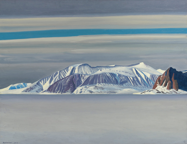
The unprecedented assembling of numerous Rockwell Kents, for sale, at Sotheby’s, Christie’s, and the American Art Fair, in November 2016, undoubtedly had its effect on the Kent sales. The four paintings at auction–Gray Day, Icebergs (Greenland), Frozen Falls (a.k.a. Ice Curtains) and Alaskan Impression–reaped mixed results. The three prominent paintings offered by Manhattan galleries – Sledging, the descriptively titled “Greenland Mountains and Sea,” and Sunday Evening, Greenland – went unsold (to my knowledge). Alaskan Impression broke public sales records for an artwork of that size. Frozen Falls was passed: perhaps because of the later, total reworking by the artist. Icebergs established a new second highest public sale record; and Gray Day became the new public sale record holder: both of which topped Polar Expedition, that was sold by Heritage Auctions just a few years ago.
For just reasons Sotheby’s went all out in promoting Gray Day–numerous pages were devoted to the work within their catalogue, the painting appeared on the back cover of their main catalogue, as well as, in their mini-catalogue; the canvas was previewed on their 10th floor, with other (well established) “modernist” works; the painting hung above the auctioneer during the sale; in addition to other endeavors by the auction house. The reason for this outpouring of promotion was to point out the fact that there is a “quality tier” of artwork by Kent (as with all artists); and Gray Day, like Citadel (unfortunately buried in the collection at the National Gallery in DC), Blue Day, Toilers of the Sea (New Britain Museum of American Art), Winter, Monhegan (Metropolitan Museum of Art), etc., exemplifies the best in Kent: certainly on par with the best of Edward Hopper, Marsden Hartley, and George Bellows, among others. Gray Day was, simply put, the most important Rockwell Kent painting that was offered for sale in November: a point, I am afraid, that may have been lost on the buying public.
The sale at Sotheby’s, as well as the November sale at Christie’s, was reviewed by Maine Antique Digest (February, 2017) in the articles “Sotheby’s American Art” (pp. 13-14-D) and “‘Hands Up!’ Goes Way Up” (pp. 26-28-E). A review of the American Art Fair sales, also penned by Julie Schlenger Adell, and which also included artwork by Kent, can be found on pp. 22-25A.
GRAY DAY
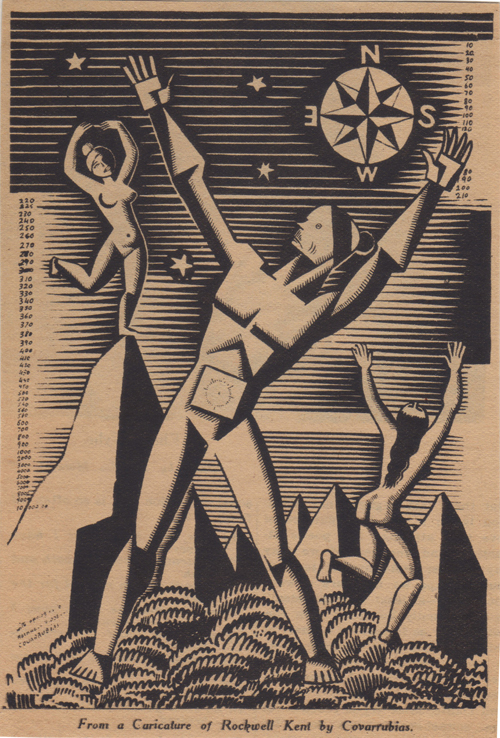
Throughout the 1930s Rockwell Kent’s popularity had reached such heights that The New Yorker wrote: “that day will mark a precedent, which brings no news of Rockwell Kent.” (November 20, 1937) And artists for Ken, Americana, Ballyhoo and other publications, caricatured Kent for his renowned wanderlust. Miguel Covarrubias played on Kent’s restless endeavors to attain greater heights (publication unknown), whereas Alan Dunn played on everyman’s desire to acquire “a new Rockwell Kent,” as seen in The New Yorker (11/4/1933). With Newfoundland, Alaska, Tierra del Fuego, and now Greenland in his travelogues, Kent had become synonymous with the adventurous spirit; and while paintings like Gray Day are records of the artist’s journeys, they are, above all, an extension of the artist himself.
In Greenland, surrounded by vast open spaces, polar light, endless horizons and barren terrain, Kent had found his ideal motif. His paintings Gray Day, Blue Day, Citadel, and North, among others, represent the consummation between artist and subject that defines his most revered work. Though other modernists, including Marsden Hartley, Georgia O’Keeffe, Arthur Dove and Edward Hopper, were visually reflecting on nature throughout their careers, the transcendent landscape had become Kent’s most distinctive theme.
Kent’s sojourns to the “edge of the world where infinite space begins” reinforced his belief that “it is the ultimate which concerns me, and all physical, all material things are but an expression of it.” (Alaska Drawings by Rockwell Kent, M. Knoedler & Company, New York, 1919, n.p.). This continuity of thought was expressed again nearly twenty years later when he said that “speech at its highest art–its metaphors and symbols, its rhythms and harmonies, its moods, its forms, its being–is derived by man from his environment.” (Kent, Salamina, 1935, p. 56) In Gray Day Kent spoke of his communion with Nature in a modernist language that blurred the line between academic illusionism and abstraction.
Other artists who traveled this middle passage included the organic abstractionist Arthur Dove, who exclaimed that “there is no such thing as abstraction” (Arthur Dove. “Notes of Arthur G. Dove.” Dove Exhibition. 1929); and Georgia O’Keeffe, who exercised subjective realism to educe the essence of a subject. Wassily Kandinsky, a German painter solidly of the abstract camp, and of some influence to artists such as Marsden Hartley, proposed that “with the artistic reduced to a minimum, the soul of the object can be heard at its strongest through its shell because tasteful outer beauty can no longer be a distraction.” (Donald Kuspit. “Concerning the Spiritual in Contemporary Art.” The Spiritual in Art: Abstract Painting 1890 – 1985. p. 314). In Gray Day Kent builds his representational imagery of the mountains of Kekertarssuak Island out of what appears to be random dabs and brushstrokes of varying sizes, shapes and orientation, floating within flat, horizontal fields of color–blues, magentas and raw umber: that would be painted by artists Clyfford Still, Mark Rothko and Adolph Gottlieb in the decades to come.
While on his solitary journeys by dog sled throughout western Greenland, Kent heard the sounds of the wind sweeping across the ice packed fjords, the barking of his dogs, the scraping of the rails of his sled on the terrain, and the soul of the landscape. His were the ears of a pantheist–one who sees the creation as God, as opposed to a theist who sees God as the creator. Kent defined his belief system when he stated: “God had become to me the symbol of the life force of our world and universe; a name for the immense unknown. Imponderable, yet immanent in man, in beasts… in the earth, sun, moon and stars. It––I choose the impersonal pronoun as alone consistent with my faith––It was to me a force as un-moral as such manifestations of itself as storms or earthquakes, and for that very reason greatly to be feared. It was as un-moral and impersonal and splendid as its sunset’s light on land and sea––and for that reason to be reverenced. I feared and reverenced god. In fear and reverence I painted”… Gray Day. (Kent, It’s Me O Lord, 1955, p. 138)
Rockwell Kent was as roughly hewn from the proverbial American maple tree as were his spiritual antecedents Ralph Waldo Emerson, Henry David Thoreau and Walt Whitman. Thomas Cole’s conveyance of the “voyage of life” was a path similarly taken by Kent though with the harder edge of Winslow Homer and the spirit of Mother Nature. William Merritt Chase and Kenneth Hayes Miller helped the younger artist develop his sense of design and technical aptitude but it was Robert Henri and Abbott Handerson Thayer who instilled Kent with the belief in “art for Life’s sake”; and Kent specifically credits Thayer for introducing him to the Nordic saga, Burnt Nyal, which he said “opened the gate upon that highway to the North which led at last to Greenland and Alaska.” (Kent, It’s Me O Lord, p. 110). (Kent met, and eventually married, Thayer’s niece, Kathleen Whiting, whom he met at the elder’s home).
Throughout Kent’s adventurous artistic career, he had the support of several patrons–the art dealer Charles Daniel, and noted collectors Ferdinand Howald and Duncan Phillips–which enabled him to experience far away lands. In 1950 he met a new patron, Joseph James (J.J.) Ryan: the grandson of financier Thomas Fortune Ryan.
In a letter to Robert McIntyre, of Macbeth Gallery, –who served to introduce the artist and collector– Kent stated: “Gray Day, as I have told you, is in my judgment one of my very finest things” (November 9, 1950). And Gray Day, like Citadel, North, Blue Day (which also served as the dust jacket illustration), and May, North Greenland, all from Ryan’s collection, were chosen as full page color illustrations in Kent’s autobiography, It’s Me O Lord (Dodd, Mead and Co., New York, 1955). Ryan, like Duncan Phillips decades before him, essentially had his choice of paintings: in this case, before the artist gave the bulk of his personal collection to the Soviet Union (1960). Ryan ultimately came to acquire over thirty oils and numerous works on paper for his collection.
Fittingly, one hundred years later, Rockwell Kent was rejoined with his colleagues–Hartley, John Marin, Dove, O’Keeffe, Stuart Davis–when Gray Day, Blue Day, and Citadel (now at the National Gallery), descended from Ryan, through his family, to the Shein Collection.
GRAY DAY: FROM THE FIRST DRAFT
Kent’s work gives the impression of a world beyond the human circle. These whites, pale greens, blues and yellows, these naked brown rocks and the cold green water–in the midst of our busy life they act as a corrective. They restore our sense of proportion regarding man and universe, they teach us that there really is something ‘beyond’ our petty affairs. … Over his work there hovers the great silent question that is the birthright of all significant art.
Washington Post. Gallery of Modern Masters, Washington, DC, exhibition review. Oct. 31, 1937.
Few other American artist since Frederick Church and William Bradford would expose themselves to such hardships in exchange for the exhilaration and inspiration nature offered. From Kent’s window on Igdlorssuit he “came to feel–as though for the first time in [his] life–the beauty of the world!” Living, virtually outdoors, was “far profounder a devotion… than any Godward posturing of conscious worshippers! There,” in Greenland,”was God’s countenance itself, its light, its majesty of form, its power of life and death.” (Rockwell Kent as quoted by Scott R. Ferris in his “Foreword” to Salamina. Wesleyan University Press, 2003. p. XX.)
In William Murrell’s lengthy review of the 1911 Independent’s exhibition, –”The Exhibition of Independent Artists”–he acknowledged the division of aesthetic camps that would formally raise its head with the Armory Show two years later. What he could not anticipate, or perhaps reconcile, was the interweaving of philosophies and methodologies. From his 1911 perspective, he saw that the “Post Impressionist,” or “Neo-Primitives” (as he also referred to them), –in this case he was specifying four of the twelve exhibitors: Marsden Hartley, Alfred Mauer, Maurice Prendergast and John Marin–aimed to “give expression to the emotion caused by the object and not an impression of the object itself.” Whereas of Kent’s paintings, he considered them a “sturdy rendering of the grandeur and attraction of the big, open spaces.” As we look at these predominantly nature-based artworks in hindsight, dividing each into abstract or realistic categories diverts us away from the heart of the matter: the spirit of the subject.
Arthur Dove and Wassily Kandinsky reinforced this notion in similar ways. Dove exclaimed, “there is no such thing as abstraction” (Dove. “Notes of Arthur G. Dove.” Dove Exhibition. 1929), thus steering a “middle course between academic illusionism and modernist abstraction” (Kevin Muller. “Spirit of the Sea.” Masterworks of American Painting at the De Young. pp. 323-324). Kandinsky was more direct when he stated: “with the artistic reduced to a minimum, the soul of the object can be heard at its strongest through its shell because tasteful outer beauty can no longer be a distraction” (Donald Kuspit. “Concerning the Spiritual in Contemporary Art.” The Spiritual in Art: Abstract Painting 1890 – 1985. p. 314). Similarly, Kent proclaimed that “it is the ultimate which concerns me, and all physical, all material things are but an expression of it.” (Kent. Alaska Drawings of Rockwell Kent).
Critics often cited the artist’s bravura brushwork, his propensity to reduce and model compositional elements, and his strong, defining contours: yet, they failed to see Kent’s kinship with his broader community of contemporaries. It seems that many of the critics were as staunchly committed to labeling him as a pure realist as the artist was himself.
By Kent’s third sojourn to Greenland, –1934-1935–his painting technique had evolved from applying thick, rapidly applied brushstrokes, which shimmered light from the surface, to smooth, flatly painted color areas, with simplified elements, that radiated from within. (with Gray Day he was well on his way to reversing the source of light in his compositions: a process that reached its culmination by the 1950s.) In essence, Gray Day, and paintings like it, were precursors to the compositions developed by the Color Field painters (Mark Rothko’s White and Greens in Blue, for example). Kent’s paintings Calm (Tierra del Fuego) and April Ice (Greenland) are clear examples of this reductive approach.
Also of note is how these paintings were constructed. In compositions such as Gray Day and Citadel, the basic technical structure belies the realistic results. Upon close inspection, the compositional elements in these paintings are born out of what appear to be randomly placed brushstrokes of irregular form and size. They are in themselves abstract compositions, precursors of the finished canvases of Franz Kline and Clyfford Still. If you were to examine these paintings by Kent up close, focusing on how the artist constructed the mountains, –their raw, jagged forms–they might appear to be by the same hand as the oil on canvas PH-858 of 1972 by Still. Now slowly step away from the painting. In doing so you will see that these abstract constructs take on a more representational form, that of Kent’s most prominent muse, the mountain.
Now we have come full circle. Whereas Arthur Dove once suggested that “there is no such thing as abstraction,” Kent could have comparably stated, “there is no such thing as realism.” Both artists employed reductionist techniques, empowered by their spiritual relationships with Nature. At their finest, the works of both artists are modernist interpretations of the universe around us.
© Scott R. Ferris
In Review: Rockwell Kent in Newfoundland
In Review: Rockwell Kent in Newfoundland
A series of programs and an exhibition hosted by the Landfall Trust in partnership with The Rooms Provincial Art Gallery, held in St. John’s and Brigus, Newfoundland, May 30-September 21, 2014.
POINTED NORTH
Rockwell Kent in Newfoundland & Labrador
Exhibition curated by Caroline Stone. Associated publication: Vital Passage: The Newfoundland Epic of Rockwell Kent, with a catalogue raisonné of Kent’s Newfoundland works by Jake Milgram Wien, and a record of the 2014 exhibition by Caroline Stone.
Loneliness is what I want and what I came here for. Fortunately I… am literally carried in my work into a broader — more loving — universe that is as real to me as life itself. This has become my process. I do literally transport myself into the land that with my own pigments I create; painting has become for me the act of populating the realm that I build and that appears to me so splendid… I must confess to you that I am coming to realize and to believe, that I have a distinct spiritual message that is utterly different from anyones and is moreover well worth while.
Rockwell Kent to Charles Daniel, January 8th, 1915
INTRODUCTION
Throughout the middle months of 2014, Landfall Trust, in partnership with The Rooms, hosted a series of events — an exhibition, lectures, armchair discussions, a film — commemorating the centennial of artist Rockwell Kent’s stay in Newfoundland. Based on Kent’s positive experience in Newfoundland in 1910 he returned in 1914 (shortly thereafter followed by his wife and children) with the idea of starting an art school. (Kent had successfully conducted a school on Monhegan Island, Maine in 1910, and attempted another in Richmond, New Hampshire the following year.)
In short: Kent was able to create several paintings and drawings but his school never got off the ground; and, due in part to Kent’s “own past misdeeds,” as he referred to them in his book, After Long Years (Asgaard Press. 1968. p. 15) and Newfoundlanders’ “past injuries,” as Premier Joseph Smallwood was quoted (Kent, p. 12) the Kent family left Newfoundland, in 1915, under less than amicable terms. (Mutual animosity arose when Kent was suspected of being a spy for the Germans, at the outset of what we now refer to as World War I.) Fast forward to 1968, Premier Smallwood invited Kent and his wife Sally, to return to Newfoundland so that they could “show her regard” for Kent.
AN EXHIBITION AND PROGRAM WERE FORMED
Held at The Rooms in St. John’s, and at various locations in Brigus.
According to curator Caroline Stone, in her record of the exhibition (pp.76-77): “what began as a very focused exhibition idea expanded to present Kent at several significant periods of his long career.” The exhibition, as she further clarified, was organized in “two principal sections”: the first being made up of Kent’s Newfoundland related artwork — drawings, paintings prints; the second, work pertaining to Kent, “which [has] a connection to Newfoundland and Labrador through ownership.” “A small bonus,” she continued, was “the addition of several historical and contemporary works by other artists that have a link to Kent.” (A precedent setting, traveling Kent-Newfoundland exhibition and catalogue — Rockwell Kent: The Newfoundland Work — had been organized by Gemey Kelly in 1987 for the Dalhousie Art Gallery, Dalhousie University, Halifax, Nova Scotia.)
Regarding the development of the centennial programs, Milly Brown — director of programs for Landfall Trust — said, in an email, “[We] just put together a string from various contacts we had and it all fell in place.” Sixteen individuals were invited to participate to discuss topics such as “Influences of Brigus and Newfoundland on Kent’s Art,” “Kent’s Life in Newfoundland,” “The House of Dread” (a Newfoundland painting by Kent), and Kent in fictional writings. [Neither Gemey Kelly (to my knowledge) nor this author were invited to participate.]
OBSERVATIONS IN AND OUT OF THE GALLERY
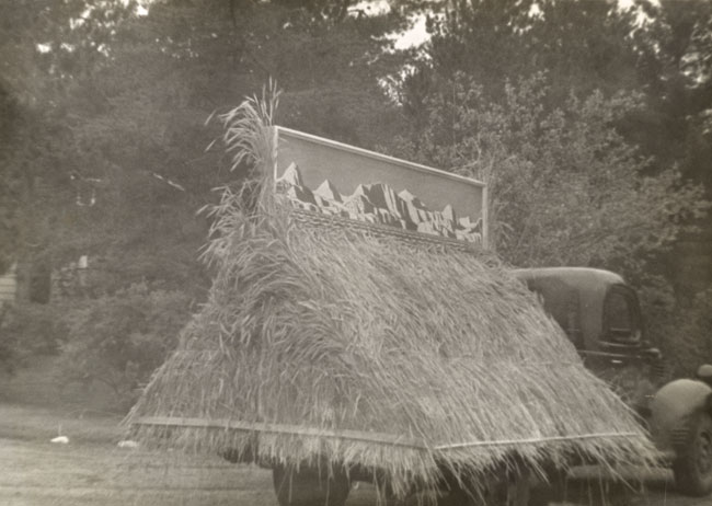
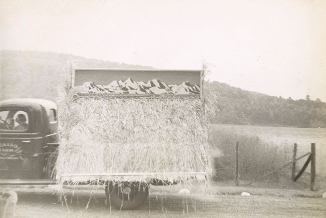
Of the few paintings that highlighted the exhibition, a 24 x 96 inches (over all) oil on board The Rooms refers to as “Mural” — “undated (may be inspired by Alaska or Greenland)” — was certainly the largest. This work, as I had mentioned in an extensive appraisal that I wrote for ADAC (Art Dealers Association of Canada) and The Rooms in 2007, represents half of a diptych. Kent created the diptych as two back-to-back panels, mounted on stacks of hay on the back of his Asgaard Farm pick-up truck. The diptych was used as a float in a local Adirondack parade, to advertise his Asgaard Dairy business (fig. 1 and fig. 2). The concept for the composition of this panel has antecedents in works such as the title pages for Kent’s 1930 book, N by E, and his packing label for Rockwellkentiana (1933) — both of which boast Greenland motifs. (The mate to this painting had been owned, at various times, by J. Stewart Gordon and Richard York Gallery, and auctioned by Doyle, of New York.)
Another painting on display was Newfoundland Dirge (a.k.a. Women). This painting, like others that Kent had kept at his studio over an extended period of time, was subject to the artist’s recreative whims. In this case, as documented in Ms. Kelly’s Dalhousie Gallery exhibition catalogue (p. 47), the artist painted over areas of the composition: virtually obliterating the reclining female figure and the majority of the depicted baby (fig. 3). Mr. Wien [heretofore, “the author”] had the overpaint removed and in his exhibition catalogue says that this painting was conserved.
(There are other occasions on record, of Kent’s artwork being altered posthumously. For example: As I mentioned in my In Review (2005) on the revised edition of Dan Burne Jones’s, The Prints of Rockwell Kent: A Catalogue Raisonné (Alan Wofsy Fine Arts. 2002), artist/printer Letterio Calapai “restored” a wood engraving and “finished” another — works that Kent had abandoned; And, at least one of Kent’s reverse paintings on glass was “completed” well after the artist’s death. [More on these in a future essay.])
The author also asserts, when referring to other compositions that the artist was reworking, that Kent “thwarted an accurate reading of the Newfoundland paintings…” that the artist “disavowed the avant-garde Symbolist spirit animating the Newfoundland Epic…” and that the artist’s “revisions” were intended to “diminish their sense of cosmic mystery.” As if to trump the artist the author boldly states that Newfoundland Dirge was “expertly conserved in New York and returned to its original state” (fig. 4). (The author refers to one other painting that Kent had reworked — The Shepherd-cat. no. 7 p. 35 — as “later revised.” True.)
Late in life, as documented in his autobiography, It’s Me O Lord (Dodd, Mead & Co. 1955. pp. 288-290), Kent tells us that the tragedy in Newfoundland, for he and his family, was “our hidden but prevailing misery.” Of tremendous emotional weight was the tragic loss of life of the seal hunters aboard the S.S. Southern Cross and S.S. Newfoundland — presented in Kent’s account, “A Tragedy of Newfoundland” (1914); the onset of World War I; and the consequences of his own “misdeeds” — his backfired pranks, and the wartime suspicions he inspired. As a consequence, the brooding atmosphere, heightened by long periods of darkness, effected the end results of the artist’s achievements.
In hindsight, Kent made it clear, through his writings, that he thought lesser of some of the artwork that he created during this period. Perhaps, as a result of his disenchantment, Kent found more value in these canvases as the base for other compositions. Perhaps, as in the manner of canceling a wood engraving block, — which one would deface — he was canceling these compositions. Regardless, the decision to create and then alter was the artist’s to make.
THE CATALOGUING PROCEDURE
It is important to note that the provenance of Kent’s artwork is often difficult to follow, due, in part, to his varying methods of “marketing” — outright purchases, trades, gifts, loans. What makes matters worse for Kent scholars is the artist’s common practice of retitling his artwork. The author fell into these traps: following are some examples.
In his catalogue entry for Portrait of a Child, the author makes no mention of the paintings association with Kent’s friend, the composer, Carl Ruggles. As I note in my book, Rockwell Kent’s Forgotten Landscapes (Down East Books. 1998. p. 78), the artist inscribed — lower right; just below the baby’s head — “To Carl Ruggles From Rockwell Kent.” If one looks closely at the illustration of “Portrait” in Kent’s book, Rockwellkentiana (Harcourt Brace & Co. 1933), you can just make out that inscription. In the course of reworking this painting Kent covered over the inscription.
Also with regards to provenance, the author does not address the purported one time ownership of Kent’s painting, Bones of Ships, by Mrs. Harry Payne Whitney. In November, 1921, American Art News announced that Whitney purchased seven American paintings for the purpose of giving them to American museums: the article states that she acquired Bones of Ships. An interesting twist to this provenance is that in 1929, Kent traded, with collector Duncan Phillips, “Bones,” for a work referred to as “Bonson, Maritime Alps” [etc.] — a painting Phillips had acquired shortly before. Questions of provenance, such as these, should be resolved in a catalogue raisonné.
Regarding titles: the author mentions only a few of the variant titles that the artist and others applied to his paintings: Let’s take Portrait of a Child, for example. In “Forgotten Landscapes” (p. 92), I listed six of these titles: some appear in Kent’s documents; others in publications that he had a hand in producing.
Kent did not apply titles to many of his works: sometimes giving that task to a paintings “adoptive parents” — he often referred to his paintings as his children; and, often, without acknowledging a reason, he applied more than one title to a work of art. Without the benefit of knowing all variations, one could easily lose track of a paintings provenance, exhibition history, even which painting is being addressed.
ON INTERPRETATION AND PARAMETERS
There is no license on interpretation. There are parameters on a catalogue raisonné.
The author argues for a direct relationship between Kent’s To The Stars and his Newfoundland work (“To the Stars” — Andreieff. Also spelled Andreyev, etc. 1937). He says that early in Kent’s time in Brigus, Kent and artist Kenneth Hayes Miller communicated about Andreyev’s drama; and mention was made of a topically related sketch that Kent rendered.
Without a doubt there is a literary connection. And as you read Kent’s writings, you discover numerous influential literary antecedents that the artist carried with him, and evoked in his work, throughout his life. (Beyond Andreyev’s To the Stars, Goethe’s Wilhelm Meister, the Bible, and Darwin’s On the Origin of Species, come to mind.)
So what are the parameters that the author set when he included artwork under the Newfoundland umbrella? Is it work that was actually begun in Newfoundland — in 1910 or 1914-1915; work that was begun at an earlier time but completed during this period; work that was conceived during this period but finished much later? Do works created outside of the time Kent actually spent in Newfoundland have to bear characteristics of the locale or might they simply possess conceptual roots?
If To the Stars, Burial of a Young Man (ca. 1908-1911), and The Seiners (ca. 1910-1913) can be included in this catalogue raisonné, then why exclude A Mother and Her Sons (Motherhood, etc. 1913)? The author included this painting in his Rockwell Kent: The Mythic and the Modern exhibition catalogue (Portland Museum of Art. 2005), suggesting it “previewed the psychological dislocations evident in his works from Newfoundland” (Wien. “Mythic and the Modern,” p. 36). And, this painting possesses compositional as well as palette similarities to the work begun in Newfoundland. And, chronologically, it fits within the artist’s first and second trips to Newfoundland.
There are other works Kent created — that fit one or more of the parameters I offer above — that are not included in the catalogue raisonné: including some works that did not come to fruition until the artist’s stay in Alaska — 1918-1919. The descriptively titled painting, “Recumbent Nudes with Ringed Sun” (fig. 5), with its nude male and female figures that resemble those in Newfoundland Dirge, but with Alaskan styled peaks in the background, is a good example. (The mountain backdrop in To the Stars more closely resembles New York’s Adirondacks.)
THE SPIRITUAL
Little wonder that Kent didn’t follow Alfred Stieglitz and Marsden Hartley’s lead (as discussed by Wien, pp. 11-12) and dwell in a hub of “civilization” for inspiration: but instead followed a parallel stream of thought expressed by critic Henry McBride. Writing of Kent’s Newfoundland work McBride said that the artist “communed with himself and has apparently been interrogating the stars.” McBride beseeched artists to “get out of the rut. There are too many agencies, particularly in New York, that are calculated to make artists think alike” (McBride. The New York Sun. 4/4/1917). Kent did have one foot in the “cultured” world, but his other foot was in the “wastelands and thoughtless seas” (as, in this instance, Hartley would make us believe. Wien p. 12).
Perhaps the boldest of the author’s interpretations is his suggestion that the numerical listing of the Newfoundland exhibition brochure “offers additional insight into the way Kent and… Charles Daniel viewed the series… with titles suggesting a larger, philosophical context beyond the local and temporal.” The author suggests that the paintings The Shepherd, A Landscape, and A Young Sailor — numbers 1-3 in the brochure — represent “the ministry of Jesus”; that A Young Sailor and Man, the Abyss (3 and 6) represent “the sufferings of Jesus”; that Newfoundland Dirge and The House of Dread (4 and 5) represent “the death of Jesus and lamentations of the community”; that The Voyager Beyond Life and Ruin and Eternity (7 and 8) represent “the Resurrection”; and that A Pastoral (9) represents “the Empyrean Heaven” (Wien. p. 16)
Though the author may not have claimed that Kent was a practicing Christian, he does believe that the artist possessed “a doubting mind wrestling with doctrinaire religion,” which was now “responsive to new and radical currents of thought” (Wien. p. 17). Fair enough.
In childhood, Kent was a member in the Church of England. Into his twenties he was writing about Christianity and the teachings of Christ in relationship to his belief in socialism, “Brotherly Love,” and Labor. As he evolved away from a theistic belief system he journeyed toward pantheism. The theist sees God as the creator whereas the pantheist sees the creation as God. To quote Kent: “God had become to me the symbol of the life force of our world and universe; a name for the immense unknown. Imponderable, yet immanent in man, in beasts… in the earth, sun, moon and stars. It — I choose the impersonal pronoun as alone consistent with my faith — It was to me a force as un-moral as such manifestations of itself as storms or earthquakes, and for that very reason greatly to be feared. It was as un-moral and impersonal and splendid as its sunset’s light on land and sea — and for that reason to be reverenced. I feared and reverenced god. In fear and reverence I painted.”
WORKS MISSED OR POSSIBLY MISATTRIBUTED
As is often the case when compiling a catalogue raisonné, some works are missed. Examples of those that are not included: the descriptively titled paintings “Newfoundland Home” (fig. 6) and “Newfoundland Harbor” (fig. 7); Our front yard, Brigus, N’f’l’nd (fig. 8); and brush and ink drawings of Kent’s Newfoundland house, the harbor, a study for The Shepherd, and a theatrical appearing sketch (fig. 9 – fig. 12).
Within the author’s notes for his catalogue raisonné, and specifically regarding “Lamb and Child Beneath Crescent Moon” (number 75), he notes that two examples of the announcement were found in Kent’s daughter, Barbara Carter’s, estate. In a conversation with this author, several years ago, Barbara, a former Art Students League pupil, told me she was the author of one of these works.
A Tragedy of Newfoundland. The author refers to this writing as a “journal,” rendered in much the same manner as Kent’s autobiographical writings Wilderness, Voyaging, N by E and Salamina. The author’s understanding of this essay is incomplete: incomplete in the sense that he was limited to the resources that he notes — a manuscript, in the Carl Zigrosser Papers and a typescript in the Kent Papers, respectively, at the Archives of American Art. He was unaware of the editorial variations that are evident in the handwritten manuscript and the typescript that are in my archives.
IN CLOSING
As I stated early in this review, there is no license on interpreting an artist’s work. However, it is imperative to delineate between one’s personal interpretation and an interpretation based on evidence provided by the artist. Moreover, when compiling a catalogue raisonné, there is an obligation to present all known facts.
When one limits the scope of their catalogue raisonné to, say, geography — Newfoundland, as we examine here — versus a standard time line, confusion can arise. In this case, as I address above, there appear to be no concrete parameters on the definition of a “Newfoundland work.” And without parameters, we should consider this publication an illustrated catalogue of selected works. It has fulfilled this purpose honorably.
There are several issues that I have not addressed in this review, that are fodder for a Kent scholar to pursue: if for no better reason than to better understand Rockwell Kent and his work. I will briefly mention that, in this author’s opinion, the jury is still out on the location of such works as the descriptively titled “Woman Kneeling” and “Nude Family in Landscape”: though their timeline certainly falls within the “Newfoundland period.”
In a final note on the exhibition, “Pointed North”: The Rooms had included, in it’s “works pertaining to Kent” section of the exhibition, a watercolor of a church, signed by “Rockwell Kent.” As I am familiar with the style of rendering and the signature of this watercolor, I informed Ms. Stone that this work may have been by another Rockwell Kent but not the one featured in this exhibition. By consent with the owner, the watercolor was removed.
To close… I found this exhibition, like all Kent exhibitions, rewarding: for the simple reason that it exposes people to the life and work of an important artist, or avails them an opportunity to view the work afresh.
ADDENDA
To elaborate on the origins and use of the two parade panels…
In a 13 September 1935 letter to Donald Brace, of the publisher, Harcourt Brace and Company, Rockwell Kent mentions using the “two large decorative panels used in 1933 in Dutton’s window” as promotional props for his then latest publication, Salamina. Indeed, in a 26 September 1933 letter Kent tells Brace: “I am preparing two 8 feet long by 2 feet high panels of mountains and sea, handpainted in simple colors by R.K., for the decoration of Dutton’s window.” To which Brace replied: “…Excellent thing to have this on Fifth Avenue, and no doubt we can use them else where later.” The book they were discussing, in 1933, was Kent’s, Rockwellkentiana: Few Words and Many Pictures. Dutton’s, at that time, was located at 681 Fifth Avenue in New York City.
As we know, the panels were later used as Asgaard Farm parade props.
In Mr. Wien’s essay “Vital Passage” (p. 13 and footnote 5, p. 28), he makes reference to two small reverse paintings on glass that were purchased by Arthur Jerome Eddy: which were included in the 1922 Art Institute of Chicago’s Exhibition of Paintings from the Collection of the Late Arthur Jerome Eddy. These paintings were purchased from Knoedler Galleries in March of 1920 for $200.00.
The paintings are indeed as descriptively titled in the AIC catalogue: “Girl Tripping Downhill” (fig. 13) and “Girl Asleep Under a Tree” (fig. 14). The latter is not to be confused with the similar painting on glass, referred to as “Sleeping Maiden with Book,” that accompanies Mr. Wien’s other essays–The Magazine Antiques, July 2005, p. 70; and Rockwell Kent; The Mythic and the Modern, Portland Museum of Art, 2005, p. 93).
The bibliography on page 75 lists my book, Rockwell Kent’s Forgotten Landscapes (Down East Books. 1998) but fails to include the name of my co-author, Ellen Pearce.
My thanks to Betty Badcock. In memory of Peter Roberts.
© Scott R. Ferris
Mr. Kent Goes to Washington (Again)
Mr. Kent Goes to Washington (Again)
A GIFT TO THE AMERICAN PEOPLE
When the new gift of Rockwell Kent’s oil painting, Citadel, goes on display at the National Gallery of Art, it will not be the first time that Kent has made an appearance in our Nation’s capital. In fact, it will not be the first time that this painting has been displayed, publicly or privately, in Washington, DC.
It could be said that Kent made notable appearances in DC on three previous occasions: the first being while under the patronage of Duncan Phillips — the grand patron of American art, whose self named museum, The Phillips Collection, once boasted ownership of at least 15 oil paintings, drawings, watercolors and prints by the artist.
Kent’s second notable presence came on two occasions in 1937 when, one, his highly controversial mural for the Benjamin Franklin Post Office was unveiled — this two-panel mural was commonly referred to as the “let us change chief’s” mural because of its overt support of independence for Puerto Rico; and two, the Gallery of Modern Masters hosted “Greenland Paintings and Prints: Rockwell Kent.” Of the 19 paintings and 10 prints that were on display, prints were the only works that sold. (Citadel had been priced at $1800.)
Kent’s third most memorable appearance occurred in 1953 when the artist was summoned to appear before Senator Joseph McCarthy and the Permanent Subcommittee on Investigations on “charges” that he was a communist. Kent took the Fifth Amendment before the Committee but once outside the hall he proclaimed to the world, via television, that “I am not now and I never have been a member of the Communist Party.”
Just prior to Kent’s confrontation with Senator McCarthy he was under surveillance for his association with numerous “leftist” causes — he was a protagonist for innumerable unions; during Christmas of 1942 he hosted Soviet students from Columbia University; he attended meetings of the World Congress for Peace in Europe and the Soviet Union in 1949 and 1950, and the list went on. Due, in part, to his prominence in these so-called leftist causes, Kent found a patron in J. J. (Joseph James or “Jim”) Ryan, a descendant of Thomas Fortune Ryan, the multi-millionaire financier.
On 16 September 1950, Robert McIntyre, of the prominent New York City gallery William Macbeth, wrote a letter to Kent seeking artwork for one of his clients. From an initial purchase of 3 paintings J. J. Ryan came to acquire more than 30 oils, including Citadel, and several other works. Thus began the patronage that supported Kent through the tumultuous decade of the 1950s: through a decade of litigation, — the prolonged case that ultimately concluded at the U. S. Supreme Court: a case that became known as “The Right to Travel” — and a virtual boycott of his artwork in commercial and arts venues.
Several of Ryan’s Kents — including Citadel, Blue Day, Gray Day, North, and May, North Greenland — are among the best works the artist created, and were highlighted in Kent’s autobiography, It’s Me O Lord.
By the turn of the century four of these paintings were acquired by collectors Ed and Deborah Shein. Ed, under his firm American Art Search, was no newcomer to Kent: he had brokered several Kent paintings throughout his 40 years in the business, — “Neither Snow, Nor Rain, Nor Ice,” Croquet, Artist in Greenland, Headlands and Sea — while also marketing other important 19th and 20th century artists/paintings.
As Shein’s “inventory” of artwork evolved so did his consideration of Kent’s work. Once a strong advocate of Kent’s early Monhegan Island canvases, Shein came to appreciate the modernist aspects of the artist’s finest Greenland compositions. Though Shein initially passed up an opportunity to purchase May, North Greenland, he soon after acquired Citadel, Blue Day, and Gray Day with the assistance of this author. Each of these paintings would complement Shein’s other area of interest, early American modernism (see American Modernism: The Shein Collection. National Gallery of Art. 2010-2011). By adding Kent’s work to their collection the Sheins inadvertently regrouped (some 100 years later) former friends and contemporaries, Kent, Mardsen Hartley, Stuart Davis, Arthur Dove and Georgia O’Keeffe. And with the gift of Citadel to the National Gallery, the museum restores, and shares with it’s visitors, this lost episode of 20th century American art.
So what makes Citadel one of Kent’s finest paintings? It’s that rare union of profound subject matter, refined composition, and technical acumen. For Kent the mountain was his muse. Though he was speaking about Mount Whiteface, — the beacon, westward, from his farm in the Adirondack Mountains — at the time that he wrote this, the same description applies to Citadel. Kent believed that a mountain commands, “not by its height alone or by the grandeur of its form, but by that portion of the unchanged wilderness that it holds up for us to see and contemplate; a symbol of immutability.” And to accent his point, as we see in Citadel, he visually restrains the mountainous apex of Karrat Island within the confines of his canvas: thus highlighting the solid mass, texture, and muted colors of the rock.
Citadel not only holds its own among the artwork of his contemporaries at the National Gallery but also among some of the artist’s other important works that hang in Washington, DC — Snowfields, at the Smithsonian American Art Museum; Burial of a Young Man, Road Roller, North Wind, and Azopardo River at The Phillips Collection; and Adirondacks at the Corcoran Gallery of Art.
With the addition of Citadel, one of the artist’s most important Greenland paintings, Washington, DC has now become the ideal city for viewing the work of Rockwell Kent. The city boasts two murals — the Benjamin Franklin Post Office murals (now the William Jefferson Clinton Federal Building) and the “On Earth Peace” mural, originally in the room of the House Committee on Interstate and Foreign Commerce (in the Longworth House Office Building); artwork that depicts Kent’s travels to New England, Alaska, Tierra del Fuego, Ireland, France, the Adirondacks, and now Greenland; nearly the full range of media in which Kent worked — oil paintings to watercolors and drawings, the varied print media, photography, etc.; and the largest collection of Kent’s papers, housed in the Archives of American Art.
CODA
Valley View, 1801 Foxhall Road, DC (the home of Elinor Morse Ryan Brady, sister of J. J. Ryan, and the last of the significant private properties in the city) to the National Gallery of Art. In hindsight, it could have been a short trip for Citadel: yet it resulted in a journey of three locations and 20 years. The view from the center: well, it could not have ended better.
In the beginning of this chapter of my shared path with Rockwell Kent, I did not foresee the outcome of the destination of this painting or the direction that all of the players would take: It is safe to say, neither did they. I trust that this gift of Citadel to one of our Nation’s most renown museums, will reawaken academia and introduce future generations to the accomplishments of one truly American artist.
Kudos to Peter Brady (son of Elinor M. R. Brady), Ed and Deborah Shein, and the curatorial staff of the National Gallery of Art for their roles in the development of this provenance. May this be the beginning of a lasting chapter in Rockwell Kent’s renaissance.
ADDENDUM
Some of the locations where visitors can find work by Rockwell Kent:
- National Gallery of Art
- The Phillips Collection
- Smithsonian American Art Museum
- Hirshhorn Museum and Sculpture Garden
- Corcoran Gallery of Art
- Archives of American Art
- American University
- Library of Congress
- William Jefferson Clinton Federal Building
- Longworth House Office Building
© Scott R. Ferris
The Avenue in Skinner
The Avenue in Skinner
The following statement served as the catalogue entry for The Avenue in American & European Paintings & Prints; Skinner (Boston) auction Sale 2507, May 21, 2010.
THE AVENUE
Alternatively titled Th’Avenue
- Signed “Hogarth Jr.” in pen upper right; titled in pen, lower center; annotated in ink, on verso: “Rockwell Kent/1262 Richmond Terrace./Staten Island.”
- Ink on paper/board, 8 x 10 1/16 in. (20.3 x 25.6 cm), framed.
LITERATURE
- Vanity Fair, January 1916, p. 50, and Chappell, George S., A Basket of Poses, New York: Albert and Charles Boni, 1924.
The drawing of a busy city avenue scene—replete with cold-weather-bundled dainties and a gendarme directing a bustle of sport cars, buses and limousines—first appeared as an illustration to George S. Chappell’s “poetic panorama,” “Th’ Avenue.” The published caption for this illustration is partially incorrect in that it refers to the drawing as “a rare wood engraving” by William Hogarth, Jr. Although the attribution to William Hogarth, Jr.—Rockwell Kent’s pseudonym—is correct, the illustration is indeed a brush (possibly pen as well) and ink drawing. (Kent’s drawings were often misidentified as wood engravings or woodcuts.)
Kent collaborated with George S. Chappell on numerous publication ventures throughout the second and third decades of the twentieth century, many of which appeared in Vanity Fair and Puck. Kent and Chappell knew each other from professional architectural circles; the Ewing and Chappell architectural firm, based in New York City, began as the result of a commission from Kent’s mother, Sarah—a house designed by her architecturally trained son; Kent worked off and on as a draftsman for Ewing and Chappell (during the first two decades).
This particular illustration, and the poem “Th’ Avenue,” was reprinted in A Basket of Poses—an anthology of Kent’s and Chappell’s satirical collaborations.
© Scott R. Ferris
The Evolving Legacy of Rockwell Kent
The following essay was first published in FineArtConnoisseur. (January/February 2008. Volume 5, Issue 1). See www.fineartconnoisseur.com.
The Evolving Legacy of Rockwell Kent
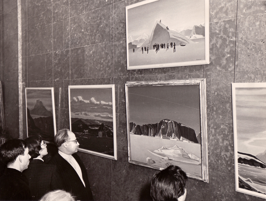
Few figures in the history of 20th-century American art have received such praise, and nearly equal condemnation, as Rockwell Kent (1882-1971). For some, his name conjures up sweeping landscape paintings of Maine’s Monhegan Island, austere renderings of Alaska, Tierra del Fuego, Greenland, and Ireland, or spiritually charged depictions of New York State’s Adirondack Mountains. Others may recall his dramatic interpretations of Moby Dick, Candide, Beowulf, and the works of Chaucer and Shakespeare. Westinghouse, General Electric, Steinway & Sons, Sherwin-Williams, and Rolls Royce all capitalized on Kent’s renown by commissioning advertisements from him. And his highly visible support of unions and other progressive causes, such as the International Workers Order and the American Artists’ Congress, inspired the ditty published by The New Yorker in 1937: “That day will mark a precedent, which brings no news of Rockwell Kent.”
By the early 1950s, American society had, in the midst of the “Red Scare,” displaced Kent as its cultural icon. Senator Joseph McCarthy and his fellow investigators hurled enough mud at Kent that those less firm in their principles shifted their aesthetic appreciation away from him, for fear of guilt by association. The crowning blow was the art world’s drift from realism toward abstract expressionism. Kent was relegated to relative obscurity, and the art historian Carl Zigrosser was right to describe this fluctuation from “extravagant praise to fanatic denunciation” as a phenomenon “based on non-aesthetic considerations or a misunderstanding of the real import of his work.”
FORMATIVE YEARS
Kent was born to Victorian affluence in 1882. His father, Rockwell Kent Sr., was a partner in a prominent New York City law firm, and also a successful investor in Central American mining operations. His mother, Sara Ann Holgate, was the niece and surrogate daughter of James Banker, one of New York’s first millionaires.
Kent’s first five years were spent shuttling between the family’s fashionable homes in the lower Hudson River Valley, Long Island, and Manhattan. This comfortable existence ended abruptly in 1887 when Kent Sr. died of typhoid fever contracted in Honduras, leaving Sara alone to raise Rockwell and his two siblings. Relying on the generosity of Sara’s family, the Kents always hovered between upper-middleclass comfort and genteel poverty. Kent recalled that during this period he “was very much disturbed by there being some people with lots of money and lots of people with no money.” Thus when he voted in his first election in 1904, he supported the Socialist Eugene V. Debs.
Kent’s first love was painting. Though he formally studied architecture at Columbia University, he enjoyed a lengthier tutelage under some of his era’s most prominent painters: with William Merritt Chase at his summer school at Shinnecock on Long Island, and with Robert Henri and Kenneth Hayes Miller at the New York School of Art (where his classmates included George Bellows and Edward Hopper). Kent later credited Chase with having taught him to use his eyes, Henri his heart, and Miller his head.
Of Kent’s mentors, it was Abbott Thayer who made the most lasting impression. In the primitive but hearty surroundings of Thayer’s studio at Dublin, New Hampshire, Kent participated in debates on the writings of Tolstoy, Emerson, Darwin, and Thoreau, listened to German lieder, and was introduced to the Nordic sagas. For Kent, these tales “opened the gate upon that highway to the North which led at last to Greenland and Alaska.”
It was also at Thayer’s home that Kent met the master’s niece Kathleen Whiting, whom he would eventually marry. A devoted wife and mother, she remained loyal to Kent despite his open infidelities. Eventually his promiscuity and regular uprootings of the family wore on Kathleen, so the couple divorced when their fifth child was a toddler. Kathleen was the only wife with whom Kent had children, yet she, like his subsequent wives (Frances Lee and Shirley, or Sally, Johnstone), served at Kent’s beck and call. Frances and Sally were also in charge of secretarial duties, in addition to keeping house and garden on a sunrise-to-sunset schedule.
In 1927 Rockwell and Frances Kent purchased a fallow Adirondack farm, which they renamed Asgaard and transformed into a thriving dairy business. This became the center of Kent’s artistic production, and the setting of his legendary parties, where guests included Paul Robeson, Peter Freuchen, John Dos Passos, and Pete Seeger, among many others. (Asgaard also became Kent’s final resting place.)
AN ARTIST COMES OF AGE
Robert Henri steered Kent down a momentous path when he encouraged him to visit Maine’s rugged and picturesque Monhegan Island. From 1905 through 1910, Kent spent much of his time rambling over its rocky cliffs, finding an abundance of subjects to paint. It was also here that he was exposed to, and became engaged in, the labors of harvesting lobsters and building homes. On Monhegan Kent’s love affair with nature and commitment to the working class were solidified.
In 1907 Kent exhibited a group of Monhegan paintings at New York City’s Clausen Galleries; although this show was acclaimed, it did not do well financially, yet Kent had clearly come of age as an artist. This success won him further opportunities to exhibit, and indeed he figured prominently in the 1910 and 1911 Exhibitions of Independent Artists. Many of his subsequent exhibitions were widely noticed for their illumination of his journeys to remote polar regions. The 1920 publication of his illustrated diary, Wilderness: A Journal of Quiet Adventure in Alaska positioned Kent as a leading travel writer, as well as a respected artist. Kent ultimately published five major travelogues, two memoirs, and innumerable writings and illustrated books, all of which earned warm praise. (Several were reprinted.)
In 1918 Kent became the youngest living artist represented in the collection of New York’s Metropolitan Museum of Art, and in 1924 Wildenstein & Co., also in New York, hosted his first retrospective. Over the next 25 years, his work entered the permanent collections of such leading institutions as the Whitney Museum of American Art, Phillips Collection, Smithsonian American Art Museum, Museum of Fine Arts Boston, Art Institute of Chicago, Fine Arts Museums of San Francisco, and Art Gallery of Ontario.
After being introduced to etching by John Sloan in 1910, Kent soon mastered other printmaking media. In the decades ahead he also made advertisements and architectural renderings; designed fabrics, metalwork, jewelry, and ceramic patterns; and painted murals, but discounted these activities as means of making a living.
Throughout his life, Kent’s obvious talent attracted much-needed patronage: His mother and the New York art dealer Charles Daniel underwrote his stay in Newfoundland, while the Alaskan adventure was supported by the collector Ferdinand Howald. The collector Duncan Phillips offered Kent a monthly stipend in exchange for first choice of two paintings per year, and the artist even incorporated himself so that stock could be purchased by three investors, including the first director of the Whitney Museum, Juliana Force. (Within two years, he paid them back with a dividend.)
THE LOSS OF FAVOR
Kent was well known for his aggressive personality and outspokenness, which often got him into trouble. While he and his family were living in Newfoundland in 1915, he was suspected of spying for the Germans due to his intimacy with the German language and culture. Instead of downplaying this admiration, he fueled his neighbors’ fears by placing a sign over his studio door that read “Bomb Shop, Wireless Room, Chart Room.” (The family was soon deported, but the government of Newfoundland invited Kent back 52 years later to accept an official apology for its wartime hysteria.)
By the 1930s, Kent was active in dozens of causes and labor unions. In 1937, while painting a mural in the federal post office in Washington, he inserted a letter that read “To the peoples of Puerto Rico, our friends: Go ahead, Let us change chiefs”— a direct reference to that island’s independence movement. In 1948, Kent’s neighbors boycotted his dairy business to protest his support of the Progressive Party’s presidential candidate, Henry Wallace, and Kent himself failed to win state office under the American Labor Party banner. In 1949, he attended the World Congress of Peace in Paris, and additional peace meetings in Moscow and Stockholm the following year. Upon his return to the U.S., the State Department seized his passport, and it was only after a lengthy lawsuit that Kent won the right, for all Americans, to hold a passport regardless of one’s political affiliations.
Controversially, Kent became the first American to exhibit his art in the Soviet Union (1957-58). Inspired by the Soviet people’s enthusiasm, he donated hundreds of paintings, drawings, prints, and writings to them in 1960. (The bulk of these are held by the State Hermitage Museum in St. Petersburg and the State Pushkin Museum of Fine Arts in Moscow.) In appreciation of this donation and his efforts toward world peace, the Soviet government awarded Kent the Lenin Peace Prize in 1967.
Kent always remained a socialist, a stance that made him persona non grata in many circles. Today, a new generation of scholars and collectors, more tolerant of his personal life and politics, are examining Kent’s artistic achievements.
THE SLOW RETURN TO PROMINENCE
Early in 1969, Kent’s home and most of its contents were destroyed by fire. Fortunately, much of his remaining artworks were either in his studio nearby, or at Larcada Gallery in New York City. Most of his papers were saved, and they now constitute one of the largest artist holdings in the Smithsonian Institution’s Archives of American Art.
Kent died in 1971, having laid the groundwork for the inevitable revival of interest in him: His friendship with George Angell, then president of the State University of New York at Plattsburgh, led to the donation of the collection for its comprehensive Rockwell Kent Gallery, and discussions with the publisher Angus Cameron eventually led to Fridolf Johnson’s Rockwell Kent: An Anthology of His Work (1982).
Kent’s popularity has increased gradually, with waves of activity concentrated in the years immediately after his death; around his centennial in 1982; and around 2000 as the market for modern American art soared. The first wave saw the publication of Dan Burne Jones’s The Prints of Rockwell Kent: A Catalogue Raisonné, as well as the launching of George and Gladys Spector’s newsletter, The Kent Collector, now issued by the Rockwell Kent Gallery. The second wave focused on centennial exhibitions, and on the publishing of David Traxel’s An American Saga: The Life and Times of Rockwell Kent (1980) and the anthology mentioned above. The latest wave began with the publication of my own Rockwell Kent’s Forgotten Landscapes (1998, with Ellen Pearce), and the mounting of such exhibitions as the Adirondack Museum’s The View from Asgaard (1999) and Rockwell Kent: The Mythic and the Modern at Maine’s Portland Museum of Art (2005).
The reasons for this revival are complex. The wide-ranging nature of Kent’s oeuvre — from spiritually charged to documentary, from realist to modernist — makes it difficult to categorize, yet also accessible to an unusually broad audience. Fortunately, the strength of the American art market has encouraged scholars, dealers, and collectors to mine the field more deeply, returning to the surface material by Kent that has not been seen in generations.
A RECEPTIVE MARKETPLACE
Not surprisingly, Kent’s market values have increased. In 1990, the auction record for one of his large oils was $64,900 (set at Grogan’s in Massachusetts); in 1996, this rose to $156,500 (Sotheby’s), and in 2004 to $300,000 (Northeast Auctions, Portsmouth, New Hampshire). Although they do not report their sales publicly, commercial galleries have sold major oils for as much as $650,000. The highest prices are generally brought for Monhegan and Greenland scenes, though other landscapes have also fared well.
The auction record for a watercolor signed and dated by Kent is $45,000 (Sotheby’s, 2005), and for a large drawing $21,600 (Sotheby’s, 2004). Kent’s prints, especially his marvelous wood engravings for the American Car and Foundry Company, have approached the $10,000 mark (Swann Galleries, New York, 2005), although they can often be found well below $5,000. Though the highest-valued lithographs — including Sermilik Fjord, Charlotte, and Self Portrait — usually sell above Kent’s other prints, they remain, on average, below $6,000.
The 1930 three-volume edition of Herman Melville’s Moby Dick, illustrated by Kent and housed in an aluminum slipcase, has reached the $3,000-5,000 range, while other limited editions range from $250 to $1,800. His inscribed cards and letters have fetched up to $3,300 at auction, depending, of course, upon their content. Other Kent ephemera — such as bookplates and exhibition catalogues produced during his lifetime — can now command several hundred dollars. Kent’s work can be found regularly at galleries in New York City (D. Wigmore, Hollis Taggart, Owen, Questroyal), Tom Veilleux (Portland, Maine), Aaron (Chicago), Thomas French (Fairlawn, OH), Brock & Co. (Carlisle, MA), Sunne Savage (Winchester, MA), and Abigail Furey (Brighton, MA). The Internet, and particularly eBay, has made his books, ephemera, and prints more readily available.
When any artist’s reputation is revived, the market often experiences an influx of dubious works. Indeed, another artist by the name of Rockwell Kent (who lived 1858-1934) produced prints and prose that have sold attributed to the master. Still other works, signed “Rockwell Kent” or “R. Kent,” have surfaced at sales and even museum exhibitions. Buyers should thus move carefully and consult a knowledgeable dealer or scholar whenever possible.
Fortunately, our collective understanding of Kent’s achievement will soon be enriched when a retrospective drawn from Plattburgh’s rich holdings opens at the New York State Museum in Albany on November 15, 2008. This project will surely enhance Kent’s visibility and reputation still further, a process that looks set to continue for many years to come.
SCOTT R. FERRIS is compiling the catalogue raisonné of Rockwell Kent’s paintings. He has organized several Kent exhibitions and has authored, among other publications, Rockwell Kent’s Forgotten Landscapes (1998) with Ellen Pearce and The View from Asgaard: Rockwell Kent’s Adirondack Legacy (1999) with Caroline Welsh.
© Scott R. Ferris
In Review: Mythic and Modern
In Review: The Mythic and the Modern was privately printed in October 2005. It was republished online by Resource Library (Traditional Fine Arts Organization, Inc.).
In Review: Mythic and Modern
ROCKWELL KENT: THE MYTHIC AND THE MODERN
- Portland Museum of Art, Portland, Maine
- Guest Curator: Jake Milgram Wien
- Catalog written by Jake Milgram Wien
- Introductory essay, “Recalling Rockwell,” by Richard V. West.
By Scott R. Ferris
If you long for a thrill, go…and look at the…pictures…of Rockwell Kent…he knocks you off your pins before you can sit down with these broad, realistic, powerful representations…
– James Huneker, New York Sun, 2 April 1907
Some of this same commendation could be used to describe Rockwell Kent: The Mythic and the Modern. It’s a fabulous show. Fabulous because of individual works that represent the best in Kent, including: the oil paintings Afternoon on the Sea; Winter, Monhegan; Burial of a Young Man; Down to the Sea; Snow Fields; Men and Mountains; Parry Harbor; Dead Calm: North Greenland; Blue Day; May: North Greenland; My Daughter Clara; North Wind; The Trapper; and studies for Toilers of the Sea and of Manana and Gull Rock; and the drawings for the book, Wilderness, the illustrated poem to Marie Sterner, the map of Hobcaw Barony, the portraits of Carl Zigrosser and Lillian LaBatt, some of the Hogarth, Jr. offerings such as––”The Collector,” “The Social Zoo,” “Pool Reflection” and a few each of the Moby-Dick and Paul Bunyan illustrations. The show and companion catalog are noteworthy because they bring out a sampling of Kentiana––works created by the artist––that few have seen in person, and morsels of obscure information. And the show is inviting because of the ambiance created by the lighting and sea grass green walls that tug like an undertow, pulling you into the galleries. Notwithstanding, once the visitor steps over the threshold, from didactic-panel-emblazoned entryway into the first gallery, the premise of this exhibition, as proposed by the shows title––The Mythic and the Modern––is forgotten. Why is that?
WHAT’S IN A TITLE? CONCEPTUAL AMBIGUITY
…the title is a flare fired from an ocean liner that has yet to crest the horizon; it lights up the night sky regardless of whether the vessel is sinking or there’s a party onboard.
– Roberta Smith. “Field Guide To Judging A Show By Its Title,” New York Times, 4 September 2005
Recent exhibitions of the work of Rockwell Kent––Distant Shores: The Odyssey of Rockwell Kent (Norman Rockwell Museum. 2000) and The View from Asgaard: Rockwell Kent’s Adirondack Legacy (Adirondack Museum. 1999) among them––possessed titles that anticipated the shows content. These shows presented artwork that almost exclusively supported their themes––Kent’s travels and work across the globe, and the artist’s depiction of his Adirondack home and his views from that perspective. This exhibition struggles to do both. A full examination of its proposal is repeatedly derailed by peripheral interests. Instead of pursuing two theories––the “mythic” and “modern” in Kent’s work––it should have remained focused on one.
The layout of the exhibition accentuates the problems that are created by a lack of focus. In this case the physical separation––two floors of display space––removes the viewer from any conceptual continuity. (When I walked the galleries of this exhibition I overheard several people say that they enjoyed the downstairs better than the upstairs, as if they were seeing two shows. Was the modern separated from the mythic or were they integrated?) And internal divisions––separating objects by chronology and subtopics––further disconnects the viewer from a unified theme.
Anyone who is familiar with the artwork that forms the basis of this exhibition will recognize that it belongs or recently belonged to the guest curator, Mr. Wien: several of the Hogarth, Jr. drawings and paintings on glass, the To Thee, America! and American Export Lines drawings, “Greenland Winter” (cat. 125#), “Salamina” (cat. #122), etc. Some of these categories are over represented, obfuscating the shows intent. Whereas independent examinations of these categories would have, will! benefit Kent scholarship.
ORIGINS OF A MULTIFARIOUS TALENT
Mr. Wien appears to frame his arguments on the artist’s spiritual and national centric nature, without fully examining either. The foundation of these characteristics was clearly laid in Kent’s youth. Some of the most influential factors effecting the artist’s development included: the polar economic conditions under which he was raised––the premature death of his father left his family living in the concurrent worlds of wealth and genteel poverty; his Austrian maid, Rosa, who taught him German, the art of social graces and who took him on wilderness junkets around his home; an art study excursion with his “Auntie Jo” (Josephine Holgate), to Europe, in 1895; and his diverse cultural experiences, including innumerable readings from such works as Struwwelpeter––the children’s book that inspired his pursuit of vegetarianism and his embrace of tolerance, and the Bible; and by Darwin, and somewhat later, the English Romantics, Emerson, Blake, Thoreau, Whitman, Nietzsche, Tolstoi, Kropotkin, the Nordic Sagas and Coomaraswamy, among others; all of which nourished the seeds from which Kent blossomed.
That Kent was raised on both sides of the track is especially poignant because, among other things, it explains how he could live in the parallel worlds of socialism and capitalism (a concern expressed by some critics and lay persons alike) It also suggests that his broader view of the world played out in other aspects of his life––e.g. creating dissimilar artwork at the same time (often “high” vs. “low”); reading both sides of an issue, etc. Considering a man of Kent’s talent, drive and character, is there any wonder why he was successful, and fairly well off?
A BRIEF WORD ON KENT’S SPIRITUALITY
It could be said that Kent was a conduit between the transmundane and the artwork he created. And in the process of channeling, or opening a stream of consciousness, he enjoyed a “unitary” experience, a oneness with Nature, with the sublime. My colleague, Dr. Francis V. O’Connor, uses the term “unitary” in his review, “William Blake (1757-1827): Poet, Artist, Mystic & Prophet” (Commentary No. 11C. 2001). He suggests that “the mystical experience is a purely secular perception of oneness with an aspect of Nature.” He goes on to say, “such a ‘unitary’ experience is usually, but not inevitably, colored by the belief system into which the person so bestowed was born.” Kent all but states that he had “unitary” experiences, and pantheistic tendencies, when he wrote that “God” is the…
…symbol of the life force of our world and universe; a name for the immense unknown. Imponderable, yet immanent in man, in beasts and birds and bugs, in trees and flowers and toadstools, in the earth, sun, moon and stars. It––I choose the impersonal pronoun as alone consistent with my faith––It was to me a force as un-moral as such manifestations of itself as storms or earthquakes, and for that very reason greatly to be feared. It was as un-moral and impersonal and splendid as its sunset’s light on land and sea––and for that reason to be reverenced. I feared and reverenced God. In fear and reverence I painted. That mood forbids defining art as self-expression.
– Kent. It’s Me O Lord. (New York: Dodd, Mead & Co. 1955)
I am convinced that a great number of critics, academics and museum goers alike have no idea what a wilderness experience is like, let alone a “unitary” one. If one cannot commune with Nature then one has little chance of understanding Kent’s spirituality as depicted in his simple, direct, reductive landscapes.
WHAT IS MODERN?
American as Plymouth Rock or his beloved Adirondack Mountains, enamoured alike of the lonely spaces of the Far North and of the impending social revolution, mystic in penetration but declaring flatly for a representational art, Rockwell Kent has been likely in any reckoning to fall between the realists and the anti-realistic moderns… Never one of the moderns in placing abstract design before transcription, never seriously distorting the seen aspect, he yet fulfilled that other requirement of the new school, that the artist should convey the feeling rather than merely the look of the posing person or the observed place.
– Sheldon Cheney. The Story of Modern Art (New York: Viking Press. 1941)
To view Kent as a modernist one needs to consider what makes a modernist “modern.” Cheney, as quoted above, suggests that modern art is as much about conveying feeling as it is about expressing it in new ways. H. H. Arnason states that “the work of art is ultimately a consequence of the emotions, of the inner spirit of the artist rather than of observed nature” (History of Modern Art. New York: Harry N. Abrams, Inc. et al. 1977, 2nd ed.). Similar definitions have been made by several other art historians. Modern art has crossed many boundaries from its inception (debatably as early as the work of Goya) to today, with Kent easily fitting within these parameters.
No one generation or artistic movement has a license on the spiritual––the “sublime”––or the modern. In Karen Wilkin’s review of The Mythic and the Modern (“Portrait of an Enigmatic Artist.” Wall Street Journal. 8/17/05) she implies that the Abstract Expressionists held such a license. Quoting Barnett Newman, she writes: “In our search for the sublime, we had to reject the mock-heroic, voluptuous, and superficial realism.” Is that to say that Newman had a better understanding of the sublime than Thomas Cole, Winslow Homer, Rockwell Kent or Arthur Dove, for example? Or that the Abstract Expressionists, if that is who Newman was speaking for, had a different “modern” way of expressing themselves? To Kent, the sublime was both tangible and intuitive––”God” was ever-present in the (natural) world around him.
AWAY FROM THE PACK
As a modern artist Kent comes across most convincingly as a “realist,” not as a Symbolist. (Kent has been pegged, in various writings, as a Symbolist, Realist, Precisionist and Social Realist, among other categories.) In this sense he is more like his fellow Robert Henri school classmate, Edward Hopper––they both employed representational styles to convey an inner meaning. Where they differ, however, is that Hopper often depicts something that is familiar to us––an abandoned city street scene, e.g., Early Sunday Morning––whereas Kent captures the unfamiliar––a truly natural phenomenon: the barren arctic land and seascape, e.g. Blue Day. Hopper often addresses human emotion––loneliness, anxiety––whereas Kent speaks of the eternal question: our place in the universe. It is this lack of intimacy with the wilderness landscape in Kent’s oeuvre that befuddles the viewer.
The classification pendulum swings in the opposite direction when we consider Kent with artists such as Arthur Dove, Georgia O’Keeffe and Marsden Hartley. The commonality of their work is the Nature/spirit relationship, versus the representational similarities we see between Kent and Hopper. Compare Kent’s painting Dead Tree (Tierra del Fuego) with Dove’s, Ferry Boat Wreck; Rocky Inlet (Monhegan) with O’Keeffe’s From the White Place; and Mirrored Mountain: South Greenland with Hartley’s Mount Katahdin. In truth, Kent lies somewhere in art historical limbo, a taxonomist’s conundrum.
DETAILS AND DEVILS
When Rockwell Kent passed away he left an exhaustive paper trail––thousands of letters and manuscripts; articles, books, photography and ephemera by and about him––that is still being tapped for original material today. Despite, and perhaps because of the sheer volume of documents, the culling of factual tidbits is no sinecure. As with many publications on the artist the catalog for this exhibition possesses its share of errors. Following are a few examples found in the text.
The painting Artist in Greenland (cat. #126), circa dated 1935 in this catalog as well as in all related publicity, was actually created in 1960. In referring to this and another painting that was commissioned by Jacquie and Dan Burne Jones, Kent states: “…I was able to work more and more on the Greenland picture and finished it. And both pictures are so nearly like the originals––expect for the dogs and me in the foreground of your picture, replacing and outnumbering in dogs the dog-team of the other––that I would find it quite impossible to detect the difference between the original and the copy” (RK to Jones, 9/10/60). Additional correspondence between Kent and the Jones’ supports this statement.
Post Arrival is referred to in the catalog as “Arrival of the Post.” This may be an English reversion of a Russian translation of one of Kent’s titles for this piece––Post Arrival (see “Rockwell Kent 1882-1971”; Soviet exhibition cat. #26; illus.). Two other titles are documented for this work: Sunlit Mountains (a title penned by Kent on a 35 mm slide of this work) and “Mail, Greenland” (see “List of Rockwell Kent paintings in the USSR”––from notes taken by Richard Stowe of SUNY College at Plattsburgh, Sally Kent Gorton, et al., circa 1978). This painting is not found in Kent’s final inventory of works initially given to the Soviet peoples in 1960; it was a later gift, given perhaps as late as 1965.
Time and the artist’s whim have been responsible for deteriorating or altering some of the artwork that is on display in this exhibition. Documenting the restoration of these works, in this catalog, would have been of immense scholarly value. The reverse painting on glass, descriptively titled “Sleeping Maiden with Book” (cat. #53), is one example of a restored work. Another, more prominent piece is the painting Newfoundland Dirge (cat. #29). Kent had painted over much of the canvas, presumably to rework the composition. (Reworking his compositions, over an extended period of time, is well documented.) This painting was left unfinished at his death. What we see in this exhibition is a relatively current “restoration” of the work. This brings up the questions: Why was the “restoration” done, and are the colors and other details that we see similar to those that would have been visible when Kent last exhibited the work; were there three or four figures in the original composition?
Other scholarly opportunities that were missed include: creating a system, within this text, of documenting actual versus descriptive titles (using quotation marks versus italics, for example); clarifying dates, of artwork, that are clearly questionable. Mr. Wien merely notes these problems in his preface to “Works in the Exhibition” (p. 175).
A few miscellaneous mistakes that have been identified include:
- The illustration of A Young Sailor, a.k.a. “Man on a Mast,” is reversed (fig. 16, p. 22).
- In referring to Kent’s canvas, Winter, Monhegan, Mr. Wien states that it was “probably originally called The Shadows of Evening, as listed in the Clausen Galleries 1907 exhibition brochure” (see Wien, p. 147, f12). This is not the case, Shadows of Evening is another 1907 painting.
- The portrait of Lillian LaBatt (fig. 88, p. 114) is referred to as an ink drawing when it may have been rendered with sepia pencil.
- On p. 129 Mr. Wien mentions that the painting This Is My Own is in a private collection; it is owned by the Pushkin State Museum of Fine Arts. An oil study for this work is in a private collection.
- Mr. Wien states that “the public first saw” Kent’s painting A Mother and Her Sons during February and March of 1914, at the National Arts Club (Wien p. 37). Documentation––an exhibit catalog and newspaper reviews––shows that this canvas was previously exhibited––12/16/13-1/4/14––in “A Group of Modern Painters” at the Daniel Gallery.
Much of the final decade of Kent’s life, as outlined in “Chronology” (p. 168), is lacking important information, including: the dates of several of Kent’s return trips to the Soviet Union; his return trip to Newfoundland, by invitation of Premier Smallwood (an especially important event in the artist’s life); and the publication of Kent’s Greenland Journal (1963) and the story of his last Newfoundland visit, After Long Years (1968).
Also in the “Chronology” section Mr. Wien states that Kathleen and Rockwell Kent’s fourth child, Barbara, was born with the name “Hildegarde.” Barbara perpetuated the same legend in her interview with Frederick Lewis in his film documentary, Rockwell Kent. Barbara later questioned this story, motivating her son Eric to unearth a 1943 “Certificate of Birth”: a “true copy,” of Barbara’s birth certificate, “as recorded in the Register of Births.” According to the Registrar General of the Dominion of Newfoundland, Barbara Kent was born with that name. One can presume by this that Barbara was nicknamed, Hildegarde. Barbara died in 2002, not 2003 as Mr. Wien records.
The “Solo Exhibitions, 1907-1969” section (pp. 159-161) is riddled with problems. Several exhibits are not accounted for; numerous known titles and dates are missing; exhibits that were picked up by other venues, sometimes after the original exhibition had been launched, are not mentioned. Apparently it is little known that the last solo exhibit of Kent’s work opened seven days before he died: Appropriately enough it was held by his old friends, the Weyhe Gallery, exhibiting some of his greatest work, the “Drawings for Moby Dick.”
IN CONCLUSION
To summarize, Rockwell Kent: The Mythic and the Modern falls short of its mission––to define the “mythic” and the “modern” in Kent’s work. Perhaps Mr. Wien floundered under the weight of too much baggage––the broad parameters that encompass modern art and the breadth and depth of Kent’s oeuvre. Before heading down the runway he should have discarded the tangential artwork as well as the redundant and lesser works, and focused on art that was more relevant to his argument. The painting Calm (Tierra del Fuego) would have been more pertinent to the shows thesis than either Admiralty Sound, Tierra del Fuego (cats. #86 and #85); April Ice (Greenland) and/or Greenland Gothic could have supplanted “Greenland Winter (cat. #125),” Early November: North Greenland (cat. #120) and/or Post Arrival (cat. #129). (If nothing else, Mr. Wien could have explored the possibility that these minimalist works by Kent may have had some influence on successive generations of artists such as the Color Field painters.)
Having seen the exhibit several times, and read the companion catalog, I am still left with several questions including: Is all that Mr. Wien meant by the “mythic,” Kent’s interpretation of another’s mythology (Melville’s, Shephard’s, Stravinsky’s)? Why wasn’t the artist’s interpretation of the mythic in his native land, or Ireland for that matter, represented in this show? Does the abundant sampling of Kent’s New England and Newfoundland work, as seen in this exhibition, serve to define the mythic or the modern, or both?
Mr. Wien writes: “With the passage of time storms dissipate, and today, more than thirty years after Rockwell Kent’s death in 1971, so has the political storm that riled his later years” (“Introduction,” p.5). Unfortunately this is not true, as evidenced as recently as last year. In the 16 September 2004 edition of the New York Observer, art critic Hilton Kramer wrote a review of the exhibition, Seeing Red: Rockwell Kent and the Farnsworth Art Museum, he titled, “Two Rockwell Kents: A Moby-Dick Etcher And Stalin Admirer.” Kramer’s venomous commentary is a fine example of red baiting incarnate. Ignoring Mr. Kramer’s shallow statements, as perhaps Mr. Wien has, only perpetuates the misguided “Cold War attitude” toward Kent, and impedes a fuller understanding of his significant contribution to the arts.
Rockwell Kent: The Mythic and the Modern has rekindled and hopefully broadened an interest in Kent’s art and life. With refinement, a future exhibition and scholarly text will strengthen our understanding of Kent’s achievements and solidify his standing in the pantheon of American art.
© Scott R. Ferris
In Review: The Prints of Rockwell Kent: A Catalogue Raisonné
In Review: The Prints of Rockwell Kent: A Catalogue Raisonné was privately printed in 2005. It was republished in the Winter, 2005 issue of CRSA Forum: The Newsletter of the Catalogue Raisonné Scholars Association. It was subsequently republished online on August 18, 2005 in Resource Library (Traditional Fine Arts Organization, Inc.). The text is a review of the revised edition of The Prints of Rockwell Kent: A Catalogue Raisonné.
In Review: The Prints of Rockwell Kent: A Catalogue Raisonné
Dan Burne Jones, with an Introduction by Carl Zigrosser
The Prints of Rockwell Kent: A Catalogue Raisonné
Revised by Robert Rightmire, with contributions by Jake Milgram Wien
San Francisco, CA.: Alan Wofsy Fine Arts, 2002. 448 pp.; 9 color ills., 325 b/w. $150.
Catalogue raisonné. An annotated catalogue of the works of an artist that aims at completeness.
Producing a catalogue raisonné (hereafter: CR) is a daunting, all consuming task. The scholar compiling a CR must possess an intimate knowledge of the artwork under study, have examined the artwork and relevant studies, and have access to related, often obscure references — artist’s notes, photography, publications, ephemera. For the chronicler who is fortunate enough to be working with an artist, the burden may be vastly reduced.
Though late out of the gate on this specific project, Dan Burne Jones had accumulated volumes of reference materials, over decades of collecting, prior to obtaining the artist’s confidence. Therefore, when Carl Zigrosser, who had begun the process of cataloguing Kent’s prints, decided he could not complete the project, he confidently relinquished his task to Burne Jones.

Burne Jones came to this CR project a trained studio artist and a teacher of fine arts, whose own graphic work reflected the influence of Kent and Lynd Ward. He was a traditionalist in the sense that he maintained a restricted view of how a print was created. For example, he favored the theory that a lithograph was directly drawn on and hand pulled from a stone or plate. Nonetheless, he apparently possessed no qualms about Kent’s propensity to have his relief prints pulled from an electro-type versus the original block.
Though Burne Jones, like most CR scholars, was meticulous (not infallible) in his research, the odds of locating all the artwork and related data were stacked against him. Consequently, there are a few factors that instigated the updating of this CR:
- the publication of this tome alerted holders of previously undisclosed material to come forth with their objects;
- the ongoing study of this artist and his work generated a wealth of new data;
- the greater access to original resources, and the critiquing by informed critics, brought to light errors throughout the text.
Not long after its initial release, Alan Wofsy, a publisher of catalogues raisonné, anticipated the need for a revised edition of The Prints of Rockwell Kent (hereafter: Original Edition). He first had contact with this author in January of 1982, when I was in the final stretch of my tenure as director of The Rockwell Kent Legacies — the promotional arm of the Kent estate. Though no discussion of the CR occurred between us, Wofsy, for all intensive purposes, had established contact with the estate. Subsequent attempts to develop a working relationship with the estate wallowed. When Kent’s widow, Sally Kent Gorton — the owner of most of the artist’s/author’s intellectual property — passed away in May of 2000, she bequeathed the majority of her rights to the College Foundation at the State University of New York College at Plattsburgh. Apparently, during the transition of affairs from Sally Gorton to the College Foundation, negotiations, that may have germinated between Mr. Wofsy and the estate, collapsed. As a result, the failure to establish a cooperative venture has crippled the release of the revised edition (hereafter: Revised Edition).
The Revised Edition, a collaboration between Mr. Wofsy, as publisher, and Kent aficionado Robert Rightmire as editor (with additional commentary by fellow Kent aficionado and dealer, Jake Milgram Wien) was reprinted in 2002 and is being marketed independently through Alan Wofsy Fine Arts. In retrospect, the unfortunate misunderstanding between Mr. Wofsy and the copyright holders foreshadowed the mistakes that would encumber the Revised Edition, which now requires a fresh revision.
The following review — often abbreviated — is written for those who have read The Prints of Rockwell Kent, or are familiar with Kent’s prints.
STRENGTHS AND NOTICEABLE WEAKNESSES IN DESIGN
If one were to judge a book solely by its cover, the Revised Edition would pass as a rich, colorful tome. Its dust wrapper provides a handsome alternative to the sharp design of the Original Edition: it displays Kent’s lithograph, Sermilik Fjord (DBJ#65), in full, albeit slightly off, color. The rich tonalities and bold modeling Kent created to depict the Greenland terrain are better appreciated by removing the dust wrapper and unfolding it horizontally. The strength of this surface design is carried over inside the hardcover, from the frontispiece to page vii. Within this space the designer has juxtaposed elements from both editions, adding measurably by incorporating illustrations of four of Kent’s colored prints (three of these are depicted full page). Five additional prints are illustrated in color, also within the front matter, but to lesser effect.
The Revised Edition was produced in a smaller format but with a substantial increase in the number of pages. The page increase is due, in good part, to the separation of several of the major print illustrations from the related text and imagery, and by the inclusion of two new appendices. One advantage of this separation, as well as of the larger font and line spacing, is that the page is easier to read. The new layout is basically sound design, though occasionally misapplied, as in Appendix I, “Posthumous Prints.”
From a visual perspective the “posthumous” section will be remembered more for its white paper. In an attempt to maintain the text-to-the-left, image-to-the-right layout, the designer reduced the size of the image versus working the text around a larger illustration. In some sections the inconsistency of this design becomes more of a distraction than a visual aid.
An appropriate choice was made to exchange the textured paper of the Original Edition for a matte finish in the Revised. Unfortunately, the potential benefits of the matte finish were lost when the designer declined to use new photography. As a consequence, the illustrations in the Revised Edition are drastically darkened, jeopardizing the integrity of Kent’s fine lines and subtle shading; extreme examples of this include Seated Nude (DBJ#80) and Princeton Tiger (DBJ#144).
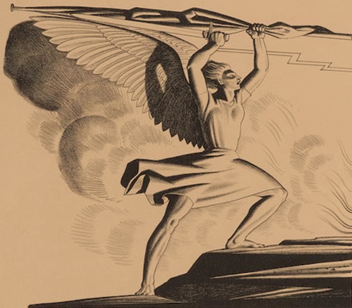
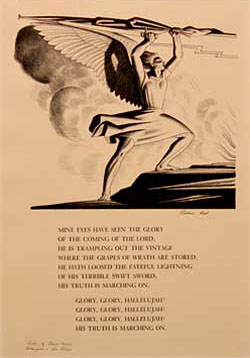
Another design/editorial shortcoming that could readily have been avoided, pertains to related illustrations and how they are used to clarify the text; I offer three examples that speak to this matter.
- Identifying an artist’s technical applications through illustrations. The lithograph Glory, Glory Hallelujah (DBJ#134) was conceived as a broadside, of sorts, incorporating figural and textual elements. In the Original Edition this print is illustrated solely in its figural state; in the Revised Edition we see it in its completed form. Appropriately so, the accompanying CR entry provides the explanation that the illustrations fail to do on their own: the figural imagery was created as a lithograph; the text was added later as handset type.
- Identifying the print and, where relavent, its variant forms. For example, Supplication (DBJ#8) was printed in an edition of 1560: 60 as the figural composition only, and 1500, with text, as an announcement for an exhibition of Kent’s watercolors. It is believed that the total edition was pulled from the same printing block.
- The artist’s proclivity to recycle his imagery. Kent created a composition — In the Year of Our Lord — whose similarities to two other works has led to misattributions. In the Year of Our Lord (DBJ#112) is a wood engraving that depicts a mother, alarmed by an explosion (a spherical ball of light) to her left, shielding her child at her right flank. A second work, considered to be a drawing, depicts the same mother and child, but this time the mother looks toward two people who are fleeing from a burning building, while sparks from the fire blow their way. This second image was reproduced in the newsletter, Equal Justice (9/39), under the title, “The Hunted,” in the 9/37 edition of The Labor Defender, in the article, “From This Time Forward, Forevermore” (the article is mis-titled in both CR editions), in Kent’s book, This Is My Own (Duell, Sloan & Pearce, 1940), under the title, “In the Year of Our Lord,” and in Andrei Chegodaev’s hardcover book, Rockwell Kent (1962 and 63). The third composition, referred to as the “original drawing” for In the Year of Our Lord (though again, varying slightly in composition: reversed; flames shooting towards the couple, who are framed in light; detailed ground cover), was reproduced, relatively recently, in an edition of 159 offset prints, authorized by Plattsburgh State Art Museum — bringing us to three variant forms of a similar composition. Needless to say, visual support, by means of related illustrations, would have helped identify the variations in each case described above.
I will address two additional issues — one pertaining to design, the other, regarding new material — before turning to more specific matters of content.Kent’s wood engraving, Starlight (DBJ#52) was reversed in the Original Edition; the error was corrected in the Revised. A brief statement regarding this correction would have eliminated any lingering doubt as to its proper position. Unfortunately, two other images, this time in the Revised Edition, are illustrated in reverse: The Christmas Tree (DBJ#155 and RR [Robert Rightmire] #0) and the reproduced drawing, Madonna and Child (RR#P2).There are two new appendices in the Revised Edition: a “Title Index” and “Posthumous Prints.” Both of these appendices are welcomed additions, though with the following caveat. It may have provided for easier referencing had the “Title Index” been placed at the beginning of all appendices — much like a table of contents — succeed by the “List of Variant Print Titles.” All other appendices — equally visual as textual — would then follow. “Posthumous Prints” presents an assortment of complex issues (that will be discussed below) that underscore the purpose of a print CR: identifying what constitutes a print; the ethics of posthumous printing; and a somewhat more general issue, the structure of a CR (chronological order is presumed to be the criterion).
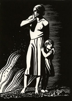
WHEN A CR IS NOT A CR: CONTENT
The underlying problem with The Prints of Rockwell Kent: A Catalogue Raisonné — both the Original and the Revised Editions — is that it lacks CR foundations. What I mean by this is, the book has its roots in a general anthology that the artist and his friend, Carl Zigrosser, published in 1933 — “Rockwellkentiana: Few Words and Many Pictures by R. K. and, Carl Zigrosser, A Bibliography and List of Prints.” According to the books subtitle, it was never meant to contain anything more than a descriptive list of the prints.
Zigrosser, as we know, was a print specialist: a former director at Weyhe Gallery in New York and head of the print department at the Philadelphia Museum of Art. He left his enormous Kent collection (hundreds of drawings, prints, etc.) to PMA and his papers — including his correspondence with Kent — to the University of Pennsylvania.
If we take the subtitle literally, and we should, Rockwellkentiana provides a mere list of prints, not a CR. Moreover, Zigrosser’s accompanying comments, he titled “Notes,” shed light on Kent’s printing and spare documenting processes. “The dates given [to the prints in the checklist] are those of execution, which sometimes do not coincide with the dates of publication,” Zigrosser wrote, and “an exception to this has been made in the case of small and relatively unimportant woodcuts, which are arranged in a separate chronological list numbered with letters of the alphabet.” Regarding wood engravings, Zigrosser said: “Mr. Kent…print[s] not from the original block, but from an electro-type of the original block, carefully worked over with a burin by the artist.” (Identifying which of Kent’s prints were produced in this manner and which were produced directly from the engraver’s block, should have been clarified at the very top of each catalogue entry.) With regards to the common misidentification of Kent’s various media, Zigrosser wrote: “In order to avoid any possible confusion that might ensue between the true woodcuts and certain signed reproductions of brush drawings, a list of the reproductions with dimensions is given below.”
In essence, Zigrosser was offering an outline of how, and how not to catalogue Kent’s work. Without heeding his warnings, Burne Jones modeled his catalogue after Zigrosser’s list, which became the template for Mr. Rightmire as well. Therefore, the problems that we face in the Original Edition are compounded in the Revised, and they begin with the very first entry.
Burne Jones began his CR with the wood engraving, Blue Bird (DBJ#1). Mr. Rightmire began the Revised Edition with a print that Mr. Wien owns, The Christmas Tree (see Jake Milgram Wien, “Rockwell Kent’s First Print,” Print Quarterly, Vol. XVIII, 2001). Though Mr. Wien argues, in his Print Quarterly review of the Revised Edition (Vol. XX, 2003), that the Burne Jones text should have been reorganized, he does not stray from his conclusion that The Christmas Tree is Kent’s first print.
Mr. Wien also differs with Burne Jones on how The Christmas Tree was produced — the medium Kent employed: Mr. Wien believes it to be a woodcut; Burne Jones, a linoleum cut. It appears that this print was pulled by hand, therefore, the grain of a wood block should be visible; conversely, the smooth surface of a linoleum block does have the propensity to smudge, as is evident in the illustrations provided in both the Original and the Revised Editions. Considering the available evidence — drawn from partial and full artist’s proofs (the location of the block is still unknown) — the linoleum cut theory seems logical.
In Mr. Wien’s review of the Revised Edition, he argues that Mother and Child at Monhegan (circa 1910), an etching on copper, and Punch and Judy Show (1914), a woodcut, would be, had Burne Jones followed Peter Morse’s CR of John Sloan’s prints as a model, catalogued as Kent’s first two prints. I would agree with him except for the fact that Frederic Dorr Steele (1873-1944), in his article “Veteran Illustrator Goes Reminiscent,” (The Colophon, No. 3, September, 1939), illustrates his reminiscences of Kent with a small block he captioned, “First wood block by Rockwell Kent.” The illustration depicts a lone tree at waters edge before a jut of land that could arguably be the island, Manana, just off Monhegan Island (a believable Kent composition). Burne Jones knew of this earlier “wood block,” but when and if he came to any conclusions regarding its dating or authenticity, is not known.
We have determined that chronology must be addressed in a newly revised CR. Another issue that needs to be revisited is: What defines the various print media? Here are a few examples that warrant this scrutiny:
- There is some argument that the series of images for The Bridge of San Luis Rey (DBJ#40-49) should not be considered lithographs, though these works are composed by the artist using transfer and direct marking processes.
- Kent’s involvement in the development of the engravings Library of Congress Bookplate (DBJ#120) and S. C. Johnson & Son, Inc. (DBJ#121), went no further than providing the design; the transfer and engraving was done by others.
- King Street (DBJ#154; rightly omitted from the Revised Edition) has been determined by this author (see Print Quarterly, Vol. XIX, 2002) to be by the hand of another Rockwell Kent (1858-1934).
The appendix “Posthumous Prints” presents its own set of problems. For various reasons, several of these compositions cannot be considered “posthumous prints”; among them are the linecuts Madonna and Child (P2) and Portrait of Me Trapped (P12), and the photo-silkscreens Forest Pool (P4) and The Lovers (P5). These works are reproductions of drawings and wood engravings that were commissioned by the Rockwell Kent Legacies. The prudent CR editor would have taken Zigrosser’s advice to prepare a separate list of reproductions.
“Posthumous Prints” also raises ethical questions. The Kent Legacies — at the time, consisting of the artist’s widow, Sally Kent Gorton, and her second husband, John Gorton, an ex-minister — authorized the reworking and printing of several blocks. To be more explicit, the Legacies allowed artist/printer Letterio Calapai to restore the cracked block referred to as “Embarkation” (P7), re-glue and execute what he considered Kent’s final cuts might be on the block known as “Contemplation” (P8) and print small editions from each of these. It is believed that neither one of these blocks had been proofed, in their final state, by the artist.
Calapai was aggressive in his desire to work with Kent’s prints. One disagreement between the Legacies — Sally Gorton and myself (following his death I succeeded John Gorton as director of the Kent Legacies) — and Calapai, put a stop to the authorized publishing of Kent’s works.
While on the topic of works attributed to Kent, I will quickly address the matter of “Twenty-eight Drawings by Kent Cut in Wood by J. J. Lankes” (see Appendix III, in the Original Edition, V in the Revised). As the title of this appendix suggests, it was believed that Kent drew the images for these woodcuts, sending the designs on to Lankes to cut and print. Recent evidence suggests that this was not the case, at least for some of these woodcuts. Kent did indeed draw compositions on maple wood engraving blocks but Lankes did not cut them. A few of these blocks came into the hands of a Nashville (TN) collector, through the Lankes family. Two of the blocks include ten pencil and ink drawings and one sketch that were commissioned by Doremus and Company (an advertising agency). According to Lankes’ detailed ledger — a copy of which the Nashville collector has also obtained — there were 30 woodcuts for Doremus, as well as, a set of eight prints based upon drawings from Kent’s book, Wilderness (proofs of seven of these prints are also in the Nashville collection). In his ledger Lankes indicates that he redrew several of Kent’s designs and photographically transferred others onto blocks before cutting them.
There remain several factual errors and omissions in both editions. To acknowledge them all would be to submit the full revision that this CR requires. Therefore, I will briefly mention a few examples in four categories.
TITLES
- Mr. Rightmire refers to Child and Star (DBJ#19) and Mother and Child at Monhegan (DBJ#153 and RR#P1) as Child and Bird and Mother and Daughter at Monhegan, respectfully, without an explanation for the re-titling.
- The “Title Index” does not include titles for the “print patterns and designs on cloth,” and the appendix by the same name does not include a list of the additional designs that are in the collection of the Metropolitan Museum of Art. (The “Print Patterns and Designs on Cloth” appendix begs us to revisit the questions: What constitutes a print and/or what should or should not be included in a CR?)
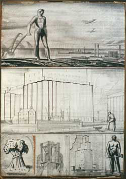
OMMISSIONS AND ERRORS
- Regarding preliminary drawings: the drawing for Pinnacle (DBJ#20)––known to many Kent collectors as the (partial) cover illustration for The Kent Collector (Vol. IV, No. 3, Winter, 1977) — is owned by this author; a drawing for Resting (DBJ#36) is owned by The Art Gallery of Hamilton; and preliminary drawings for Girl on Cliff (DBJ#57) and Self-portrait (DBJ#104) were recently auctioned on the internet.
- The maple engraver’s block for the composition known as the Gerald Kelly bookplate — see The Bookplates and Marks of Rockwell Kent (Pynson Printers, 1929, #21) — is in the collection of the Rhode Island School of Design. (According to Don Roberts, in his book Rockwell Kent: The Art of the Bookplate — see pages 33-35 — the “bookplate itself was printed from an ink drawing. It is now apparent that the bookplate originated from the wood engraving).
- The block for Flame (DBJ#24) is now in the collection of Boston Public Library.
- In the Original Edition Burne Jones refers to several printing blocks and plates, as well as sketches and drawings, that were in the Kent collection in Au Sable Forks, NY. It is believed that many of these are now in the Kent Collection at Plattsburgh State Art Museum. The museum’s curator, Cecilia Esposito, states that she has not had the time to catalogue this aspect of their new holdings.
- References to Kent’s print exhibitions, and related publicity, have been omitted, for the most part.
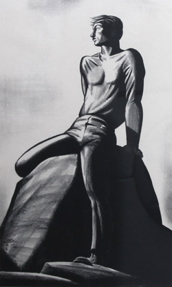
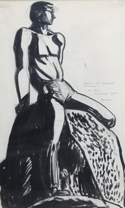
ADDITIONAL OR INCORRECT DATES
- Kent’s prints appeared in numerable publications during his lifetime, though not all are accounted for in either edition of the CR; below I cite a few additional references. Blue Bird is illustrated in Art and Artists of Today (Sept.-Oct. 1937); Twilight of Man (DBJ#6) is illustrated in Printer’s Ink Monthly (March, 1927) and The Golden Book Magazine (March, 1929); Masthead (DBJ#7) appears in The Spur (December 1, 1928), Foreboding (DBJ#9) is illustrated in You, Who Love Life, A Book of Poems by Helen Sobell (1956).
- It should be noted that some book references seem to be incorrect, due to the fact that variant editions did not always follow the same pagination (or include all of the same illustrative material). For example, Flame (DBJ#24), is illustrated facing page 460 in one edition and on 544 in another, in 101 of the World’s Greatest Books;
- Starlight illustrates “My Unconquerable Soul,” not “Invictus,” in The Book of Noble Thoughts.
- The color proofs (marked, “t.p.”––trial proof––and “a.p.”––artist proof) for Sermilik Fjord that were in the collection in Au Sable Forks, NY, were sold during my tenure at the estate. This transaction would be on file in my early papers, that are now part of the collection at Plattsburgh State.
- Oarsman (DBJ#86) was not reproduced in Rhythm (No. 3, 1959) but the similar print, Drifter (DBJ#92) was (there are additional discrepancies regarding the prints illustrated in Rhythm that are not accounted for in both editions).
- The study for Sledging (DBJ#99) could likewise have been a study for the oil painting by the same name (see illustration in Rockwellkentiana).
- Self-portrait is the cover illustration for American Book Collector (Summer, 1964).
- The oil painting Heavy, Heavy Hangs Over Thy Head, not the lithograph by the same name, is reproduced on the cover of Rally for Peace and Disarmament, and as illustrative matter in Kent’s autobiography, It’s Me O Lord (Dodd, Mead & Co., 1955) and in American Book Collector. The painting and lithograph are not “similar in all respects…with the exception of the incised title at the bottom,” as stated in both CRs. On the contrary, the appearance of the title in both works is one of their similarities. The details are the devil: the child is covered by a blanket in the lithograph and naked in the painting; there is a teddy bear in bed with the child in the painting, not so in the lithograph; there are curtains at the windows in the painting, not so in the lithograph; the landscape in the lithograph appears to be a composite whereas an Adirondack landscape serves as the backdrop in the painting, etc.
INCORRECT DATES
- Twilight of Man appears in the May, 1922 issue of Century Magazine, not May 22, 1926.
- August XXIII, MCMXXVII (DBJ#13) appears in the June 23, 1936 issue of New Masses, not August 23, 1936.
- Precipice (DBJ#15) appears in the April, 1928 issue of Harpers Magazine, not April, 1929.
There are no less than 50 additional illustrative references that have not been cited (publications that reproduced Kent’s prints during his life time), and this does not include the mass media or exhibition brochure and catalog illustrations, or the innumerable Soviet publications in which Kent’s work appeared. At least a half dozen dates and several general errors have not been corrected.
CODA
It was made abundantly clear to me recently, by a Kent collector, that there are several independent Kent scholars or “students of Kent,” but never has this group of individuals, who know each other, worked together. This problem is not uncommon in the world of art research and publication. It is now obvious that the Revised Edition could have benefited from a broader cooperative effort, and that The Prints of Rockwell Kent still needs to be amended.
My thanks to E.P. and P.A. for their assistance with this essay.
© Scott R. Ferris
In the Presence of Light
In the Presence of Light. Foreword to the reprint of Rockwell Kent’s 1935 autobiographical tome, Salamina (Wesleyan University Press. Middletown, CT. 2003).
In the Presence of Light
Speech at its highest art — its metaphors and symbols, its rhythms and harmonies, its moods, its forms, its being — is derived by man from his environment.
– Rockwell Kent, Salamina.
The manuscript for Salamina — Rockwell Kent’s Greenland Book, as it is otherwise known — first arrived at the publishing offices of Harcourt, Brace and Company (New York City) in an odorous caribou skin parcel. Shipped from Igdlorssuit, Greenland, on March 14 1935, the manuscript, along with eighty drawings, docked in New York on June 20. By October a limited author’s and first trade editions were simultaneously released. Since 1961, the manuscripts (the first and final drafts), along with the typescript, have gathered dust in a cabinet within the Pushkin State Museum of Fine Arts (Moscow).
The October publications were wrapped in a dust jacket that displayed a tantalizing portrait of our Greenland heroine — Salamina — bathing in an icy fjord. Kent, an irredeemable humorist, and no bluenose himself, undoubtedly intended to titillate the reader. Another edition followed within two years. This subsequent printing was cloaked in a jacket that portrays an eagle, defiantly poised, as if to safeguard Kent’s Greenland paradise against a world rapidly turning on it’s head. A detail of Kent’s painting Seal Hunter: Greenland, which covers the edition you hold in your hands, represents two aspects of Kent’s life and work, as abbreviated in this tome: his conveyance of his own spirituality through a modern interpretation of light and the life of the laborer who enriches himself by providing for the good of society.
While considering the appropriate contents for this foreword I re-read several of Kent’s prefatory writings: many were solemn, some were witty, others, prophetic. The “precarious, card-house nature of our social edifice” was the topic of his introduction to the early editions of Salamina. Kent’s compassion for the human condition was a consistent act, felt (and documented) by the same man that proclaimed that he did not renounce his citizenship when he picked up the brush or pen. As you will read, the forthcoming chapters entitled “On Things” and “On Mutual Aid” — a direct reference to sociopolitical philosopher Peter Kropotkin’s essay, “Mutual Aid” (1889-1895) — tell much about Kent’s belief in socialism as well as the failings of Progress and self-centeredness over personal betterment and mutual support for the welfare of the community.
Salamina is autobiographical in that it recounts a brief chapter in Kent’s long life — his 1931 through 1932 stay in Igdlorssuit; it is ethnographical in that it documents 1930s west Greenland culture; and it’s a treasure trove of art historical and philosophical squibs for the student of Kent. At the time of publication, Salamina was Kent’s longest literary work and, according to a few critics, was considered to be his richest. In many respects it is the rightful forebearer — for its narrative styling, illustrations, and design — of his voluminous 1955 autobiograhpy, It’s Me O Lord.
Rockwell Kent’s writings were never meant to be literary masterpieces. They were accounts of his adventurous life, penned on the spot, of which Salamina is literally and figuratively a classic example. Indeed, Kent spent much of his first several months during his 1934 through 1935 stay in Igdlorssuit close to the pages that would become Salamina. Unlike the story of N by E, which tells of Kent’s journey and brief visit to Greenland for the first time, Salamina hits the turf running. The author immediately involves us in a local event: a story about a performance by the local angakok or “wizard” (the Danish trader and amateur magician, Trolleman). Kent encourages the reader to accompany him on an enjoyable though not frivolous, informative but not prosaic, account of his life among a now lost colony of primitive peoples.
At the time of Salamina’s first publication, Lewis Gannett of the New York Herald Tribune wrote that Salamina “has in it a moving sense of the wonder of the virgin universe, the dignity of mountains and of sea, and a rarely intimate picture of Greenlanders at play.” Kent’s “style is abrupt, rhapsodic, hearty…it is good anthropology and even better adventure narrative,” wrote a reviewer for The New Yorker. This is why Kent’s sagas continue to be reissued.
Marie Ahnighito Peary, daughter of the North Pole explorer Robert Peary, and a birth child of Greenland, commented on her enjoyment of the story in a critique she wrote for The Saturday Review. She approved of Kent’s observations of the native peoples and the terrain they inhabited. Furthermore, unlike some of the haughty desk side reviewers of the time who considered Kent’s writing “loquacious,” Peary appreciated his “chatty and familiar style which has the advantage of presenting places and people in an unforgettably vivid manner.” She recognized that Kent was an artist first, and that his viewpoint of this one group of Eskimos was as legitimate as any other’s. Peary considered Kent’s “word pictures” and illustrations a “revelation to all those who think of Greenland as a desolate, unimpressive island, peopled with uncouth savages.” As she well knew the beauty and grandeur of the land were always present, but it took Kent to capture that majesty, to bring it all back home for the “less adventurous spirits to see and enjoy.”
It is little wonder that Peary held this view of Kent’s chronicle for the artist considered his arctic travels in grave detail. His pre-excursion readings included A Description of Greenland (1818) by Hans Egede and Ossian Elgstrom’s Moderna Eskimaer (1916). In addition he acquired atlases —”Meddelelser om Grønland” (1921) and “Vestkysten af Grönland” (1888) — for use during his sojourn. Once in Igdlorssuit Kent carefully calculated his impact upon the villagers when planning the building site for his house. As he describes in Salamina, “I had hoped to be an observer in Greenland rather than one observed, and naturally preferred looking down on others to being looked down upon” — even to the extreme of choosing a rock littered site, nearer the base of a mountainous overhang, that resembled a “battlefield.” Kent felt that by “lying uphill from the settlement, it was enough removed from the other house sites to promise privacy, and yet so reasonably situated as to offer no suggestion that seclusion had been sought for.”
Once settled into his abode, Kent required a kifak, a “housekeeper”: someone to keep his stove lit, his food from freezing, make his clothes — his kamiks (boots) and anoraks — and occasionally peel them off. Salamina, for whom this book is titled, became his kifak. Along with Salamina came her two children, one of whom, her daughter Helena, stayed the duration.
The traditional Greenland home in 1935, we learn, was a single room turf structure, barely “ten feet square and scarcely man’s height high,” that would accommodate, or compact, a family of six or seven, with an additional distant relative or three. As Kent informs us, “they ate from one pot, and they slept all huddled close for warmth and happiness on one broad bed — the sleeping platform. There had the children been conceived and born; there would, at last, the parents die. Life was an open bed to Greenlanders.”
These tiny dwellings, like the Greenlanders themselves, were indeed small in structure but generous by every other means. Into these cramped rooms passed a familiar parade of guests. Villagers hosted regular kaffemiks — coffee parties — to help while away endless winter nights. Baronial feasts were not uncommon. Traditional foods included boiled seal, fjord cod, halibut, and matak — “that succulent hide of the white whale,” Kent wrote, that was also used for whips and lines. The hunter who devoured a serving of newly beached whale during the initial carving process was thoroughly besmeared with blood.
Kent’s knowledge of the local Eskimo language was limited to, as he wrote, “a few mispronunciations of the names of common things.” Nevertheless he relates to us, the reader, an intimate understanding of Greenland life. While reading Salamina we discover that it was socially acceptable for the Greenland husband to offer his wife in exchange for cigarettes, schnapps, or Kent’s pipe: we also learn of the perseverance of pagan ways 200 years after the young Norwegian Lutheran priest, Hans Egede, re-established Greenland as a Christian settlement. We discover that village elders were still able to resurrect the music and dramatic dances of their ancestors, and recount tales from their “Ancient Testament” — stories of the spirits Mitatdlussokune (the helping spirit) and Arnakune (the female spirit) — much to the dismay of the local catechist who considered these activities to be “the outlawed past.” We read that Kent learned how to maneuver a kayak and handle dogs to drive his sledge; and how he came to appreciate the climate in its dangerously infinite variety — the balance of life and death in Greenland was weighed by one’s knowledge of and respect for nature’s cycles.
Regardless of the physical and emotional challenges Kent faced, he believed, as he wrote in Salamina, that “all solitudes, no matter how forlorn, are the only abiding-place on earth of liberty.” Few other American artists, since Frederic Church and William Bradford, would expose themselves to such hardships in exchange for the exhilaration and inspiration nature offered. From Kent’s window on Igdlorssuit he “came to feel — as though for the first time in [his] life — the beauty of the world!” Living, virtually outdoors, was “far profounder a devotion…than any Godward posturing of conscious worshippers! There,” in Greenland, “was God’s countenance itself, its light, its majesty of form, its power of life and death.”
Kent was an insatiable doer of heroic adventures and multifarious tasks. Throughout his career, Kent’s work often expressed a sense of boundless energy. As a young painter his brush strokes were barely contained as we see in many of his Monhegan canvases circa 1907. Take a close look at the strokes that define Winter, Monhegan —on the surface as well as the underpainting — they are slashed on the canvas as aggressively as the paint we see in Jackson Pollock’s Blue Poles. The energy conveyed on Kent’s canvases is emotionally or some would say spiritually charged, the manifestation of a unitary experience perhaps. It has been said that William Blake had a vision of a tree imbued with angels. Kent perceived “truth and beauty emanating as the light from Heaven, God’s abode.” That same force, now harnessed in his Greenland canvases as seamless swaths of limitless hues, is no less energized.
As a painter, printmaker, and designer Kent was a “modern artist.” During the “nineteen teens” his paintings visualized his oppressed emotional state by depicting modeled, representational symbols in the style of Franz Marc. However, by the 1930s several of his most successful paintings were devoid of symbolic elements, emphasizing instead, vibrant light and stacked horizontal planes — a precursory view of what would come in the work of Mark Rothko. Kent matured in an era of rapidly evolving technology, though unlike many modernist of his time, he did not find the machine — its design, its sense of progress, its urban origins — deeply inspirational. Instead he found his muse in the remote, austere landscapes of Newfoundland, Alaska, Tierra del Fuego, Greenland, and closer to home in northern New York State and New England.
Kent’s adventurous spirit has stirred the imagination of countless other artists and authors. It has been said that George Bellows, upon first seeing Kent’s paintings of Monhegan Island, Maine, was envious of his friends accomplishments and vowed to go to the island to paint better compositions. Early in his career Fairfield Porter was influenced by Kent’s illustrative work and depictions of Monhegan. Harry Cimino’s illustrations for Seven Horizons, and Edward Shenton’s drawings for This Is My Country and Northern Lights paid homage to Kent’s creativity — Shenton’s illustrations for Northern Lights virtually duplicate many of Kent’s images from N by E. Author Gretel Ehrlich took all three of Kent’s Greenland books — N by E, Salamina, and Greenland Journal — with her on her trip to that largest of islands, and quotes generously from each in her own adventure story, This Cold Heaven: Seven Seasons in Greenland. And in Barry Lopez’s book, Arctic Dreams, he discusses Kent’s relationship with the wilderness and notes that Kent “argued in his art and heroic prose for the essential dignity of human beings and for the existence of man’s Godlike qualities.”
Kent’s visual and literary creations continue to uplift the virtual adventurer and inspire the more expressive soul. Like his polar explorer/author friends Knud Rasmussen and Peter Freuchen, Kent has preserved a lost chapter in human history. In his introduction to Greenland Journal, published nearly 30 years after Salamina, Kent reflects that these books became a “record, intimate and authentic, of the past, of a way of life that has vanished beyond recall, and of a people the remains of whose ancient, cultural identity are fast being submerged by the tides of ‘progress.'”
Let’s partake in this little known world Rockwell Kent considered paradise. Slip on your anorak, step into your kamiks, and without further ado, we’ll pull back the curtains and see what magic our friend Trolleman is up to.
© Scott R. Ferris
Generations: The Artistic Influence of an American Master (Addendum)
The following addendum was originally published with the exhibition brochure, Generations: The Artistic Influence of an American Master (Plattsburgh State Art Museum. January, 2002). This corrective likewise applies to an unfortunate reprinting of misinformation published in American Art Review (October, 2002). In a slightly altered form the below essay was reprinted in IFAR Journal (International Foundation for Art Research. Vol. 6, No. 4, 2003/04) under the title, Will the Real Rockwell Kent Please Stand Forward. And a more in-depth account of “other Rockwell Kents” appeared in Print Quarterly, in the section Notes (June, 2002. Vol. XIX).
ADDENDUM
Generations: The Artistic Influence of an American Master
As a corrective to the information in this brochure on Percy Rockwell Kent (1900-1947) — a.k.a. Rockwell Kent — Percy was a professional banker but not an artist or author. He was a first cousin of Rockwell Kent (1882-1971) and Alice Kent Stoddard Pearson.
The amateur artist/author who created such works as Hosea, x, 12 (seen in this exhibition), King Street, Argosy, and Oak Street, New York was also named Rockwell Kent. (King Street was previously attributed to Kent — see Dan Burne Jones, The Prints of Rockwell Kent: A Catalogue Raisonné, #154.) Rockwell Kent (1858-1934), of Brooklyn, NY, was a renown amateur oarsman with the Nonpareil Rowing Club during the 1870s-1880s. By profession he was a proofreader, employed, during his career, by several New York newspapers including The Sun, The New York Herald, and The New York American.
The professional artist, Kent, and blood relative to the artists in this exhibition, confirmed his knowledge of the other Rockwell Kent in a March 17, 1970 letter to his cousin, Richard Travis Kent. In this letter he wrote, “There appears to be a rash of Rockwell Kents in the world, and as far as I can make out many of them quite unrelated to me.” He goes on to say that “there was a Rockwell Kent in Brooklyn years ago. I came into correspondence with him and learned that his name, Rockwell, was derived from the doctor who brought him into the world in the Civil War era.”
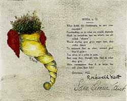
Rockwell Kent, from Brooklyn, lived with his wife, Sara Sloane Kent, at 1198 Pacific Street. Sara Sloane Kent’s signature is included on Hosea, x, 12 with her husband’s. This is the same address that is stamped on the verso of the marine picture and poem titled, Argosy. Two variations of Argosy are included in two (allegedly of ten) bound manuscripts in the Kent Collection, Rare Book and Manuscript Library, Columbia University — one dedicated to Kent’s sister, Charlotte, the second to his niece, Dorothy Ruth Kent Bennett.
Respectfully submitted,
Scott R. Ferris
© Scott R. Ferris
Generations: The Artistic Heritage of Rockwell Kent
Generations: The Artistic Heritage of Rockwell Kent was published in conjunction with the exhibition of the same title. The exhibition was held at Frye Art Museum in Seattle, WA, from September 13-December 1, 2002. The core exhibition originated at Plattsburgh State Art Museum, Plattsburgh, NY, under the exhibition and brochure essay title, Generations: The Artistic Influence of an American Master. This exhibit was held January 26-March 23, 2002. This latter essay varies slightly from the Frye Art Museum essay due to alternate artwork displayed at each institution. Another variant essay was published in American Art Review––October, 2002. Past tense has been inserted into statements regarding Barbara Kent Carter and Gordon Kent as they have passed away since the inception of this essay.
Generartions: The Artistic Heritage of Rockwell Kent
FROM THE TREE
Generations of artists are not uncommon. In the families of Pieter Brueghel, Charles Willson Peale, Abbott Handerson Thayer, and N. C. Wyeth, a prominent father/artist figure generally assumed the responsibility of guiding his own childrens’ technical development. In the family of Rockwell Kent (1882-1971), however, this was not the case. Kent’s influence came from his strong philosophical convictions and the physical presence of his work—paintings, drawings, prints, books—not through direct instruction.
There is no precedence in the Kent family for a direct artistic lineage although Kent’s great uncle, Cleveland Rockwell, his aunt, Ellen Josephine Holgate (“Auntie Jo”), his cousin, Alice Kent Stoddard Pearson, and his sister, Dorothy Kent, all practiced the fine arts with varying degrees of success. To this broad heritage must be added the family of Kathleen Whiting, Kent’s first wife. Her uncle, Abbott H. Thayer, reined as the artistic beacon from which generations, including his daughter, Gladys Thayer Reasoner, and son, Gerald, were guided.
While Rockwell Kent never formally studied the arts with his elders, his family certainly provided the cultural stimulus. Artworks by Auntie Jo and Cleveland Rockwell, as well as others, were displayed in the family home. The practice and enjoyment of music and literature were also family traditions. At the age of thirteen Kent accompanied Auntie Jo on a trip to Dresden and Holland, where she pursued her studies of decorating china and flower painting. When Kent expressed a desire to paint his mother financed summer sessions with William Merritt Chase. Moreover, Auntie Jo, a one-time student of Abbott Thayer, arranged Kent’s apprenticeship with her former teacher; she also arranged for Kent’s first solo exhibition at Clausen Galleries in New York.
Without a doubt, the dichotomy of Kent’s childhood—living in affluence one moment and relative poverty the next—and the era during which he matured, had as much influence on his direction and success as did growing up in a family that loved the arts. His social fabric and work ethic were born of his childhood environment and led him to believe in “Art for Life’s sake.” Kent became a bridge between Victorianism and Modernity that for subsequent generations has served as a source of familial irritation as well as inspiration.
Kent studied with Abbott Thayer during the summer of 1903. He quickly befriended Thayer’s son Gerald and became a frequent visitor at the family’s New Hampshire home. By 1908 Kent met and fell in love with Gerald’s cousin, Kathleen Whiting; the two were married on New Years Eve of that same year—1908-1909.
ROCKWELL KENT (1882-1971)
Kent’s painting, Monhegan (1907), expresses the unrefined innocence of an exuberant, budding artist who was racing headlong into life, grappling with his own identity as well as an artistic style. The artist’s energy, reflected in this canvas, was as unbounded as the elements of this isolated Maine Island. His blunt realism of this period forever identifies him with his Ash Can School heritage. Kent revisited this scene repeatedly during one of the most prolific chapters of his life (1905-1910).
The weathered tree stumps, distant pyramidal mountains, and sheer rocky headlands that we see in Resurrection Bay (1918-1939) represent signature elements from several of Kent’s early Alaska compositions (1918-1919), including Into the Sun and Otter (not in exhibition). These works have come to symbolize the “pilgrimage of a philosopher in quest of Happiness” [Kent, 1919]. Resurrection Bay possesses the aura of raw energy that we see in Into the Sun, yet with a more polished surface, reminiscent of Otter. These rather contrary effects suggest that Resurrection Bay was composed over an extended period of time.
Eskimo Study, Greenland (ca. 1934) offers a third impression of Kent’s diverse oeuvre. This watercolor of a solitary female figure, seated stiffly in traditional costume, lost in a distant gaze, is related to several paintings resulting from Kent’s three trips to Greenland (1929-1935). The exaggerated articulation of the figure, however, may indicate that Kent intended to use this image for an advertising commission.
ARTISTS IN THEIR OWN RIGHT
Abbott Thayer (1849-1921), the so-called “father of camouflage” was renowned as a figure painter and naturalist; he was also considered to be an eccentric. His book, Concealing-Coloration in the Animal Kingdom, with artistic contributions by Emma (his wife), Gerald, and Kent, was an effort to promote his theories of camouflage to the U. S. government, unfortunately without success. Thayer’s portrait, Woman in White Dress (1910), is believed to depict the model, Alma Wallerman, the year before she married the artist’s son. The authorship of the portrait is easily recognizable due to its conveyance of idealized beauty. Thayer’s mastery of pigment and his concern for the integrity of the subject were teachings that Kent would apply to his own work.
Auntie Jo (1858-1935) was “a gifted professional watercolorist,” as Kent recalled [Kent, undated, unpublished manuscript], whose forte was floral still-lifes and decorated china. Her work was included in the annual exhibitions of the Art Institute of Chicago and Pennsylvania Academy of the Fine Arts. She taught Kent the art of china decoration and together they supplemented the shallow family coffers by selling their wares to their Tarrytown, New York neighbors. Aside from the few works that Kent inherited, little remains of her artistic record. Auntie Jo’s legacy was her inspiration to Kent and the professional opportunities she provided him.
There is no current evidence to suggest that Cleveland Rockwell (1837-1907) was as influential on Kent’s career as his Auntie Jo or Abbott Thayer. Kent was certainly aware of Rockwell’s work with the U. S. Coast Survey and related artistic accomplishments, as confirmed by his preservation of an ink drawing entitled, The Sugar Loaf, Hudson River (not in this exhibit). Kent may not have known, however, that his great uncle preceded him to South America, western Canada, and Alaska. Rockwell’s oil on canvas, Mt. Shasta from Strawberry Valley (ca. 1879), rendered in the Hudson River School style, typical of the period, captures the untrampled wilderness that Kent frequently sought. Its panoramic view and grandiose treatment of California’s Mt. Shasta resembles the landscapes of Albert Bierstadt, though on a much smaller scale.
Unlike Kent, whose extended stays on Monhegan Island, Maine were limited to two distinct periods, his cousin, Alice Kent Stoddard Pearson (ca. 1885-1976), returned to the island throughout her life. Kent maintained contact with Stoddard Pearson primarily through family channels and by chance mutual stays on Monhegan. While crossing paths it is likely that the two became aware of each other’s artistic accomplishments. In Stoddard Pearson’s unfinished view of Monhegan village and neighboring Manana Island (ca. 1942), she conveyed a familiarity with Monhegan’s atmosphere and unique physical characteristics that are also portrayed in Kent’s paintings.
As a young adult, Kent’s sister Dorothy (1888-1981) moved from Tarrytown to New Mexico, where she pursued her love of the violin and painting. In 1917 she joined her brother and nephew (Rocky) in submitting artwork for the Society of Independent Artists exhibition held at New York’s Grand Central Palace. Like Kent, Dorothy found her voice in a variety of media—watercolors, oils, lithography—and, as we see in her compositions of the American southwest, she reduced the complexities of nature to highly stylized, modeled forms. Dorothy enjoyed a modicum of success, exhibiting her work throughout her life.
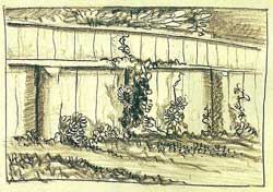
Kent’s artistic influence on his children was limited. In recounting his own development as an artist, Kent stated, “I believe that the majority of children…if given merely the opportunity and the means, take to making pictures; and this natural tendency is almost certain to assert itself if, in the child’s near human environment, there happens to be an artist” [Kent, unpublished ms.]. Only two of his five children, however, dabbled in the visual arts and neither of them pursued it as a career. Instead Kent’s influence would surface in the following generation.
Kent’s eldest son, Rockwell Kent III (“Rocky,” 1909-1986), expressed himself equally through play acting, writing, drawing and painting. Despite his enthusiasm for the visual arts during his adolescence, his later career search led him through astronomy, dairy farming and forestry before settling on physics. Rocky’s childhood creations range in subject from naive interpretations of animals—goats, fox, magpies—to “pictures of an imagined world,” prompted by “the fairy tales that children hear” [Kent, unpublished ms.]. Some of Rocky’s drawings appear in Kent’s book, Wilderness; many are illustrated letters to his mother; while others appear in his personal volume of natural history he titled Triypool. Rocky’s drawings were also displayed in his father’s Alaska Drawings exhibition in 1919 at Knoedler Galleries (New York). One of Rocky’s fanciful paintings that hung in the 1917 Independents exhibition sold to the artist Abraham Walkowitz for $25.
Rocky’s youngest sister, Barbara (1915-2002), studied at the Art Students’ League (New York) for two nonconsecutive years during the early 1930s. As she recalled, the League was loosely governed, allowing students to study from the model or the “book” whenever they desired. Barbara continued her studies at home by copying her father’s work. This may explain the stylistic similarities between her sketches, including Backyard Fence, Seminary Street, and some of Kent’s early drawings. Throughout the ensuing years Barbara continued to sketch for her own enjoyment.
INHERITED INSPIRATION
Few of Kent’s descendants ever really knew the family patriarch. Some of the eldest grandchildren, who enjoyed extended stays with Kent, occasionally reaped the benefit of a critique of their artwork by the master.
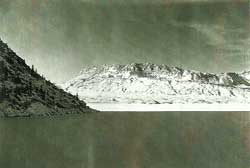
Tim Carter (Barbara’s son, b. 1935), who remembers a harsh review by his grandfather, overcame his childhood embarrassment to pursue the arts. He chose photography as a way to express himself and making a living. He prefers a black and white format because it best conveys his perception of stark landscapes. Tim believes his piece, Ice Light, with its contrasting tones and the suggestion of an immense landscape, reflects his grandfather’s influence. Tim’s compositional design—sloped mountainside protruding from the left and three stacked horizontal planes—resembles Kent’s Greenland painting Sledging (not in exhibition), in reverse. Tim alters this formula in Encampment, which, with its vertical furrows, distant structures, and heavy cloud cover, recalls several of Kent’s views of Whiteface Mountain (Adirondacks). Lone Tree, like photographs by Jerry Uelsman, is lyrically infused, enticing the viewer to search the composition for deeper meaning. Some of the haunting effects come from the artist’s manipulation of the imagery. Kent used this same subject in his paintings Ancient Elm and Ancient Oak (not in exhibition) to symbolize heritage and independence.
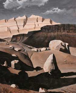
Observers have noted striking similarities between Tim and Thayer Carters’ (b. 1942) compositions. Considering that these brothers have seen little of each other or their respective works for several years, one could infer that Kent is their common source of inspiration. Visually and conceptually Tim’s Early Pond, like Thayer’s, Vermillion Cliffs, reincarnates Kent’s reductivist tendencies as a way of conveying the grandeur of nature.
Thayer’s marinescape, Sunspots, North Atlantic, depicts a view of the ocean from the starboard side of a ship, dissected by mast and rigging. This image recalls Kent’s book illustrations, The Lonsdale, from Voyaging and Cutting In from Moby Dick. Thayer, namesake of Abbott Thayer, says he pays homage to his grandfather by addressing “man’s relationship with nature, a feeling of loneliness…and a sense that things are bigger than we are.”
Chris Kent (Rocky’s son, b. 1956) continues the tradition of working in a realist style. Like his grandfather he trained in a branch of architecture—landscape architecture—which has some effect on how he perceives and develops his compositions. It may be the nature of his chosen medium (watercolor) or perhaps the effect he wishes to achieve, that brings about another similarity between Chris and his grandfather—their use of light.
Following in the footsteps of Kent and Cleveland Rockwell, Chris has traveled the northeast, Alaska, and the west coast to embrace nature and enhance his “library of real world images.” As a result, he contributes to an historical document of our changing environment.
Another family member with whom Chris shares some artistic affinity is his sister, Clara Dennison (b. 1958). The common ground in their works is a spiritual interpretation of the landscape that they shared in childhood (eastern Massachusetts), exemplified by her Supporting Columns and Silently by the River.
Clara finds that the monotype process, “with its inherent surprises, layered textures and colors,” enables her to explore “what can be seen and what needs to be imagined.” For her “the art of seeing is based on an intuitive recognition of the essential spirit of a place or phenomenon.” Although Clara, like many of her relatives, had no intimate contact with her grandfather, she experienced his world vicariously through his artworks and books. Unexpectedly, perhaps, there exists a kinship between Clara and Kent in her more abstract works—A Treasure and Around the Oak. She, like her grandfather, has the ability to make line speak and her free flowing brushwork resembles the underpainting found in many of his early landscapes.
Molly Carter (b. 1970), Thayer Carter’s daughter, works with feathers, juxtaposed with crinoline framing and other materials, to create large installations. In her sculpture, A Pair of Feather Skirts, represented here by three relief etching studies, the two diametrically opposed elements form an impractical garment, or a “beauty modifier,” as Molly prefers to call it. In this work, as well as in her series, How to Measure a Wig, she explores “the relationship we have with our bodies and how one goes about enhancing or changing their appearance to fit culturally defined ideals of beauty.”
Abbott Thayer defined idealized beauty simply and honestly. When he applied wings to his models he heightened that idealization, infusing a transmundane quality. By reconsidering beauty and incorporating feathers in her compositions Molly unwittingly transcends generational and conceptual barriers.
Many of Ellen Pearce’s (b. 1946) landscapes express the tensions between human activity and the natural world. The origin of this inharmony may have its roots in the “family legacy of emotional austerity,” she confides, that became apparent when her mother (Clara Kent Pearce, the Kents’ third child) and grandfather severed relations. In her painting, Monday Morning, she implies tension by depicting a street, channeled between walls, flowing into an artery of traffic. In contrast, Ellen contends that her paintings Slot—an O’Keeffe-like passage through crimson rock walls—and Confluence express a “universal sense of planet,” an idea often addressed by her grandfather.
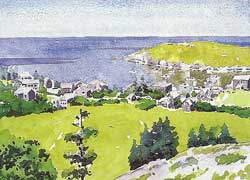
In much the same way as Kent, Ellen, as well as Molly and another cousin, Patrick Finney, draw from current issues for their concepts. By titling her painting, All Men Are Islands, Ellen pointedly disagrees with poet John Donne’s notion that “No man is an island.” Our present state of uncertainty and fear, born of the terrorist attacks in the United States on September 11th, 2001, has made islands of us all. Though intended as a generic statement, Ellen’s All Clear reiterates the bunker mentality initiated by this tragedy.
Patrick Finney (son of Kathleen, the Kents’ oldest daughter, b. 1940) frequently expresses himself in black, cynical terms. His compositions are provocative, reflecting the dismal headlines we ingest on a daily basis. In segments from two of his sequential works (shown here), Patrick’s intent is to “challenge the dominant political, social and religious paradigms” that exist in America. In The Industrial Zone, he asserts that Senate minority leader Trent Lott is not as righteous as he hopes to be perceived. Patrick suggests that Lott, like Clinton prosecutor Ken Starr, hides his own misdeeds by exposing the failings of others.
The “comix” genre, within which Patrick works, found popularity during the 1960s through artists Robert Crumb, S. Clay Wilson, and others. Related forms of sharp-edged satire, however, long precede the days of Crumb: Kent took the pseudonym Hogarth, Jr.—a reference to the biting humorist, William Hogarth—when he illustrated the satire of George Chappell and Franklin P. Adams.
Patrick’s more recent work, bearing the titles such as, Boy Scouts Appreciation Day, The Priests and a Boy in the Garden of Eden, and Autumn in New York, are screen print compositions that encapsulate their stories in one frame. Their topics, ranging from the Supreme Court’s ban on homosexual Boy Scout leaders, pedophiles in the church, and our country’s disclaimer of responsibility in the tragic events of “9/11,” are vivid reminders of an imperfect society.
CODA
Generations locates, on the art historical map, a family of important American artists. During the course of researching this exhibition, I identified additional Thayer and Kent progeny who have sought expression in the arts. Thayer’s granddaughter, Jean Reasoner Plunket, is a portraitist. Kent’s children were musically inclined: Kathleen Finney played violin and Gordon Kent played classical guitar. His grandchildren—Natasha Kent, Sally Pearce Cox, Kathi Finney Coane—and their cousin, Marcia Kent Holden Blanco, have enjoyed or continue to enjoy painting or drawing. Kent Carter is a musician, David Kent an actor, Rosie Carter, a writer, and with each new generation the artistic heritage continues.
© Scott R. Ferris
The Stormy Petrel of American Art
The Stormy Petrel of American Art was published in the August, 2000 issue of Smithsonian magazine. It appeared in conjunction with the 1999-2000 Adirondack Museum (Blue Mountain Lake, NY) exhibition, The View from Asgaard: Rockwell Kent’s Adirondack Legacy (guest curated by Scott R. Ferris), and the New York Times article, Adirondack Vistas in the Artist’s Eye and in the Visitor’s by Judith H. Dobrzynski (July 23, 1999).
The Stormy Petrel of American Art
Invoking the memory of Leif Ericsson’s explorations nearly a thousand years before, American artist Rockwell Kent set sail in July 1929 from North America to Greenland across Davis Strait. By mid-July, after tacking their cutter Direction for ten days through unpredictable and often foul weather, Kent and his two shipmates anchored for the night in Karajak Fjord, on the southwestern coast of Greenland. By morning, as Kent later recorded in his autobiography, It’s Me O Lord, the temporary calm was broken by gale-force winds: “Against the hurricane that woke us, that, sweeping downwards from the lofty plateau of the inland ice and ricocheting from the canyon’s walls, beat us with rights and lefts, we could do nothing but, like a groggy fighter, hang onto the ropes, our anchor ropes. And once the anchors failed to hold, the game was up. Within a half hour of the time we struck, Direction sank.”
The three hapless sailors salvaged as much of their personal gear as they could and made for the safety of shore. Kent, more than twice the age of his companions, loaded a pack full of provisions, maps, a boat compass, tent, Primus stove and cooking utensils, and trekked nearly 36 hours over rugged terrain in search of help. He finally made contact with an Inuit fisherman, and the two managed to communicate using mimed gestures. Within hours they arrived in Narsaq to orchestrate recovery efforts. Kent’s shipmates quickly made arrangements to return home, but the disaster had exhilarated Kent. Rescuing what paints, brushes, and remnants of canvas he could from the wreck, and augmenting this with burlap, duck and lumber purchased in the larger settlement of Godhaabt, Kent was, he later wrote, “soon well equipped to go to work as if no mishap had occurred…” For the next two months he painted constantly in a natural outpouring of his enthusiasm for all that he beheld in that “vast wonderland of sea and mountain.”
Rockwell Kent was born June 21, 1882, into an affluent Victorian family. His father, Rockwell Kent, Sr., was a partner in a prominent New York City law firm and an entrepreneur in Central American mining investments. His mother, Sara Ann Holgate, was the niece and surrogate daughter of James and Josephine Banker––one of New York’s first millionaire families.
The Kents earliest days as a family were divided between the fashionable lower Hudson River valley, Long Island and New York City, each home brimming with cultural amenities. That comfortable life, however, came to an abrupt end in 1887 when Kent Sr. died of typhoid fever, contracted on a business trip to Honduras. This left Sara with the sole responsibility of raising Rockwell Jr., who was only five, a second son, Douglas, and a daughter, Dorothy, born not long after Kent Sr.’s death. With the support of Sara’s mother and sister, Jo, and the erratic financial assistance of “Aunt Josie” Banker, the young Kent family tottered between the upper-middle-class comforts they had enjoyed and the genteel poverty to which they had become re-stationed.
It was during these tumultuous years that Kent was exposed to and struggled with the discrepancies between social classes. “When I was a young fellow,” he later recalled, “I was very much disturbed by there being some people with lots of money and lots of people with no money.” Predictably, when he participated in his first election in 1904, he voted for the Socialist party candidate, Eugene V. Debs. In Kent’s own words, he measured “being an artist and a writer by being heart and soul a revolutionist.” His determination and outspokenness on issues he held close to his heart earned him the epithet “the stormy petrel of American art.”
Few other artists in the history of 20th-century American art have received such praise and nearly equal condemnation. For some his name may conjure up bold, sweeping landscape paintings of Maine’s Monhegan Island, austere renderings of Greenland or spiritually invested depictions of New York State’s Adirondack Mountains. Others may recall his dramatic visual interpretations of Moby-Dick, Candide, Beowulf and the works of Chaucer and Shakespeare. Westinghouse, General Electric, Steinway & Sons, Sherwin-Williams and Rolls Royce all capitalized on his renown and creativity. And his support of and participation in innumerable unions and causes, such as the International Workers Order and the American Artists’ Congress, gave rise to the 1937 New Yorker ditty, “That day will mark a precedent, which brings no news of Rockwell Kent.”
Twenty-nine years after his death Kent has returned with a vengeance. Not since the height of his pre-McCarthyism popularity has so much of his work been available to the public. His own writings––Wilderness: A Journal of Quiet Adventure in Alaska, Voyaging Southward from the Strait of Magellan and N by E, among them––have been reprinted, and several new volumes on his work have been recently released.
Now, for the first time in 40 years, two paintings from the “Great Kent Collection”––a group of works that the artist gave to the Soviet Union in 1960––have returned to their homeland to be showcased in the exhibition “The View from Asgaard: Rockwell Kent’s Adirondack Legacy.” On display at the Adirondack Museum in Blue Mountain Lake, New York, through October 15, the show––which features luminous landscapes, sociopolitically infused graphics, advertising art, and memorabilia of the artist’s life on the Adirondack dairy farm he called “Asgaard”––offers an unprecedented overview of Kent’s later years.
Two other exhibitions are also currently on view: “Commercialism and Idealism: Bringing Art to Advertising” can be seen through December at the Rockwell Kent Gallery on the Plattsburgh campus of the State University of New York, and “Distant Shores: The Odyssey of Rockwell Kent”––which features seven additional paintings from the former U. S. S. R.––is at the Norman Rockwell Museum in Stockbridge, Massachusetts, through October 29 and will travel to museums in Florida, Illinois and Alaska before closing in September 2001.
Kent’s first love was painting. His work in book illustration, advertising and architectural rendering, and in designing fabrics, metalware, jewelry, murals and ceramic patterns was primarily a means to make a living, as were his forays into dairy farming, carpentry, home construction and lobster harvesting. Though he studied architecture at Columbia University, he had a lengthier tutelage in the fine arts under some of the most prominent artists of the day. Kent credited William Merritt Chase with having taught him to use his eyes, Robert Henri for encouraging him to enlist his heart and Kenneth Hayes Miller with urging him to use his head.
In one of Kent’s early paintings, Fishermen, one sees the Impressionist handling of paint that Chase and Henri employed in their own work, but one also glimpses Kent’s concern for the human condition, a trait that had been inspired by Henri.
Of all of Kent’s mentors, however, it was perhaps Abbott Thayer (SMITHSONIAN, April 1999) who made the most lasting impression on the young artist. As an early apprentice, Kent aided Thayer with his work on concealing coloration. In return Thayer provided Kent with what the artist considered to be “one of the richest cultural experiences” of his life. In the primitive but hearty surroundings of Thayer’s Dublin, New Hampshire, home, Kent participated in debates on the writings of Tolstoy, Emerson, Darwin and Thoreau, listened to German lieder and was introduced to the Nordic sagas. For Kent, these tales “opened the gate upon that highway to the North which led at last to Greenland and Alaska.” It was also at Thayer’s home that Kent met the elder artist’s niece Kathleen Whiting whom he would eventually marry.
Kathleen was tall, soft-spoken and beautiful. Kent believed that she “revealed the depths of her emotional nature only when overcoming her shyness and her natural modesty,” she sang and played the piano. A devoted mother, Kathleen remained loyal to the marriage despite Kent’s open infidelities.
Eventually, though, Kent’s promiscuous behavior, lust for life and tendency to uproot his family in search of his own goals wore on Kathleen, and the couple divorced when their fifth and youngest child, Gordon, was little more than a toddler. Kathleen was the only wife with whom Kent would have children. Yet she, like subsequent wives Frances Lee and Shirley “Sally” Johnstone––a woman the age of Kent’s youngest daughter––was expected to serve at Kent’s beck and call. Frances and Sally were also in charge of secretarial duties and of hosting the household’s baronial parties. All in addition to keeping house and garden on a constant pre-sunrise to post-sunset schedule.
Not unlike Thoreau, Kent found his “Walden” in the wilderness––in sojourns in Newfoundland, Alaska, Tierra del Fuego and Greenland. His trip to Alaska, he wrote, was “in no sense an artist’s junket in search of picturesque material for brush or pencil, but the flight to freedom…the pilgrimage of a philosopher in quest of Happiness!” Over a period of seven months during 1918-19, Kent, with his eight-year-old son Rockwell III, lived on Fox Island off the coast of Seward, Alaska. There they were secluded from all but the island’s sole permanent resident, Lars Olson, and his goats. Their only contact to civilization––Seward, roughly 12 miles away––was reached by means of a sometimes motor-driven, often muscle powered dory. On their island paradise, father and son kept busy by exploring the mountainous terrain, and cutting and splitting wood to fuel their stove. They bathed by warming themselves by the stove and then rolling outside in the snow. Young Rockwell drew, and wrote letters to his family back home. His father kept him schooled with required readings and entertained him at bedtime with excerpts from such tales as Robinson Crusoe. In addition to writing, painting and drawing, Kent, too, read widely from their library, including volumes by William Blake and Nietzsche––works that critics believe influenced his art. Some of the paintings he produced during this period, such as North Wind and Superman, portray soaring figures that represent the primordial vitality he experienced in the wild and are meant, according to Kent, to symbolize such concepts as “Energy” and “Will.” Other canvases, especially his pure landscapes, proclaim his reverence for nature.
During Kent’s absence Kathleen had been forced to borrow money to support the family. But a financially successful exhibition of Kent’s Alaska drawings at the Knoedler Gallery in New York provided a substantial influx of cash. The purchase of a home in Vermont, however, again drained the family’s resources.
For years Kent lived the precarious life of the starving artist and was dependent upon aid from various outside sources. One such supporter was collector Duncan Phillips, who wished to create a “Kent unit,” featuring works from each of the artist’s adventures, in his new gallery––now the Phillips Collection––in Washington, D. C. Toward this goal Phillips at one point offered to provide Kent with a stipend of $300 a month in exchange for first choice of two paintings per year. Over the course of their nine-year relationship, Phillips acquired a number of works, including the masterpieces North Wind and The Road Roller.
The Knoedler show of Kent’s Alaska drawings proved the marketability of his artwork and convinced a few well-to-do friends to take stock, literally, in the artist’s abilities. Thus was born a unique venture––put together by Kent and his friend Carl Zigrosser, a renowned authority on prints––to incorporate the artist. Rockwell Kent, Inc., provided Kent with enough income to secure his household while he got to work. Within two years his income was such that he was able to pay back his investors with a dividend.
For Kent, success begot success. His friend George Putnam published Wilderness: A Journal of Quiet Adventure in Alaska, which, according to the British paper The New Statesman, was “easily the most remarkable book to come out of America since Leaves of Grass.” A second showing of Kent’s artwork at Knoedler, “The Alaska Paintings,” was both a critical and financial triumph. These accolades brought renewed attention to his work as a painter and opened the door to his careers as an illustrator and adventure writer. With change in his purse and the end of his marriage to Kathleen in sight, Kent sought a more permanent “flight to freedom” and the beginning of a new life.
Within a year of his divorce from Kathleen in the summer of 1925, Kent met a young divorcée, Frances Lee, at a luncheon party at the home of mutual friends. Kent was enamored with Frances and immediately began courting her. In his bid for her hand, Kent gave her stationary that he had had engraved with the initials “F. L. K.” It was a gift she could not refuse.
In 1927 the newlyweds purchased an abandoned 257-acre parcel of farmland south of the village of Au Sable Forks, New York. There, in full view of Whiteface Mountain, the couple conceived plans for their new home, for which Kent drew up the blueprints. They moved in the following year and eventually added a studio, dairy barn and numerous support buildings. Kent named this now-operational dairy farm Asgaard, Norse for “home of the gods.” It was here that Kent found his “Paradise,” the final home where he chose “to spend eternity.” Asgaard was close enough to the hub of Kent’s livelihood, New York City, to easily maintain business, yet far enough away to allow him his freedom.
Kent was a man of boundless energy. His friend, the poet and anthologist Louis Untermeyer, considered him to be “the most versatile man alive….Sometimes (in spite of the physical evidence) I suspect he is not a person at all, but an Organization….”
Kent traveled to Greenland three times after moving to Asgaard and wrote three books about those travels, two of which are as much an anthropological record of 1930s Inuit life as they are the story of their gallivanting hero. The artwork he created abroad kept him knee-deep in exhibitions for years to come. At Asgaard the Kents hosted elaborate dinner parties that usually extended into the wee hours of the morning, at which time Kent would begin his tireless daily regime of work. The guest list for the Kent’s parties included many of New York City’s socialites––the Cowdins, Pulitzers and Putnams––his fellow Arctic enthusiasts Peter Freuchen and Vilhjalmur Stefansson, and such notables as actor Paul Robeson, writer John Dos Passos and singer Pete Seeger.
Kent’s artwork, especially his Adirondack paintings, radiates with pride in his personal accomplishments and with his nationalistic fervor. Whereas Adirondacks, with its grand view toward Whiteface Mountain from the vantage point of an abandoned farm, can be interpreted as representing the seed from which Kent’s Asgaard grew, Asgaard’s Meadows seems to represent his farm in full blossom––meadows are pruned and an abundance of Jersey cattle graze. America, on the other hand, depicts civilization’s reach into the “New World.” In Kent’s America we see a small ridge of land––jutting up from a vast sea of broad valleys and endless templed hills––on which a pioneer family is bathed in hallowed sunset light. Robert Henri once aptly observed that Kent’s canvases were the “proclamation of the rights of man, of the dignity of man, of the dignity of creation.”
The artwork that is on display in “The View from Asgaard” demonstrates Kent’s long commitment to realism as well as his romantic and social-realist tendencies. He was at once a regionalist, depicting the American scene around him, and a modernist, creating compositions that featured simplified, stylized forms and a reduced palette not unlike those of his contemporaries Edward Hopper, Arthur Dove and Georgia O’Keefe.
Kent’s dedication to brotherhood and world peace is perhaps best conveyed in his 1944 mural On Earth, Peace, originally commissioned by the Air Transport Association as an easel painting for the House Committee on Interstate and Foreign Commerce. Once Kent saw the 16-by-11-foot arched niche in the committee room, however, he offered to decorate it instead for the same $2,500 fee. The mural depicts cars, buses, boats, trains and airplanes in a landscape that reaches out to the horizon. Kent even included his beloved Asgaard Farm. But the overwhelming element in the artist’s painting is four angels hovering above spreading bounty and peace to all corners of the world––Kent’s vision of peace for a world caught up in a protracted and devastating World War.
As On Earth, Peace espoused Kent’s concerns for world harmony, his 1937 murals, Mail Service in the Tropic and Arctic Territories of the United States dramatized his devotion to human rights. The two panels, mounted on both sides of a hallway entrance in what is now the Ariel Rios Federal Building in Washington, D. C., illustrate the far reaches of the United States mail service, from Alaska to Puerto Rico. On the left we see Inuit sledge drivers bringing mail to a pilot (who bears an uncanny resemblance to the artist) for delivery, presumably, to Puerto Rico. On the right, a postal carrier on horseback delivers that mail to eagerly awaiting Puerto Rican citizens. Kent purposefully draws attention to a group of four women by exaggerating their expressions of surprise following their reading of a letter. The letter, which is written in an Alaskan Inuit dialect, translates: “To the peoples of Puerto Rico, our friends: Go ahead, Let us change chiefs. That alone can make us equal and free”––a direct reference to the Puerto Rican Nationalist independence movement.
Kent had written the letter in Inuit as a ploy calculated to attracted attention to that cause. To that end, he had enlisted the help of his friend Vilhjalmur Stefansson and a newspaper reporter by the name of Ruby Black. Black wrote of endlessly searching for someone who could translate the letter when at last she came upon the renowned Arctic explorer Stefansson. Kent’s publicity stunt worked. Newspapers all over the country covered the story. Embarrassed conservative Puerto Rican politicians and employees of the U. S. Treasury Department––which had commissioned the work––scurried to denounce Kent’s actions. “My simple little trick,” Kent stated, “has given the Nationalist movement more front-page publicity than was accorded to the Ponce Massacre….” (18 Nationalist had died and more than 100 had been wounded when police fired into a crowd of demonstrators on March 21, 1937.)
By the 1950s Kent was totally immersed in the political upheavals of the day. His call for recognizing human rights throughout our society, his pro-Communist and premature anti-Fascist activities during the Spanish Civil War, his support of more than 80 unions and causes, his endorsements of Henry Wallace and the American Labor Party, and his steadfast belief in socialism as a means of curing our social ills resulted in the boycott of his dairy business in 1948 and ignited his prolonged legal battle with the U. S. Department of State for his right to a passport. Later that year he mounted an unsuccessful campaign as the American Labor Party candidate for a seat in Congress.
In the summer of 1953, when Kent was 71 years old, he began making plans to disseminate a large portion of his own artwork and manuscripts from what he “amusedly termed,” The Great Kent Collection. He personally met with Wendell Hadlock, the director of the William A. Farnsworth Library and Art Museum in Rockland, Maine, about an exhibition of his work for the following summer. This discussion led him to believe that he had also found a home for his collection. But following a summons for Kent to appear before Senator Joseph McCarthy’s Permanent Subcommittee on Investigations, the once convivial atmosphere initially shared between Hadlock and Kent disintegrated, and the artist’s hopes of giving his collection to an American museum evaporated.
Four years later, in honor of his 75th birthday, Kent was invited to the Soviet Union to celebrate the event and to become the first American artist to be given a solo exhibition in that country. Though he was still embroiled in litigation with the State Department over his passport and could not attend, he organized the shipment of 55 canvases and approximately 163 graphic works for the exhibition. While the show was on its five-city tour, the U. S. Supreme Court handed down the decision that Kent and every American was entitled to a passport; immediate travel plans allowed him and his third wife, Sally, to catch up with the exhibition during its stay in Kiev. The overwhelming support and friendliness extended to the couple during their visit encouraged the Kents to give their “Great Kent Collection”––80 paintings and more than 700 graphic and literary works––to the people of the Soviet Union. On November 16, 1960, in a ceremony in Moscow, Kent stated, “I can only hope that the American people, who have often shown their liking for my work as a painter, realizing that their access to it is hindered by institutional and governmental control, will understand the compelling motives of my gift.”
Following Kent’s bequest to the Soviet Union, he continued to paint from his home at Asgaard. It was that view, “westward and heavenward to the high ridge of Whiteface, northward to the northern limits of the mountains, southward to their highest peaks,” from which he drew his inspiration to create such radiant canvases as Cloud Shadows and Winter Sunrise, Whiteface Mountain. He also resurrected for publication the diary of his second trip to Greenland (Rockwell Kent’s Greenland Journal), released the tales of his 1968 return to Newfoundland (After Long Years), and continued to work on an update of his autobiography––which to this day has yet to be published.
The Kents made numerous trips to the U. S. S. R. and Eastern Europe and often brought with them additional gifts for their Soviet friends. In 1967 they returned to Moscow for Kent to accept the Lenin Peace Prize.
The following year, at the invitation of premier Joseph Smallwood, the Kents traveled to Newfoundland. In 1914 Kent had moved his family to Newfoundland in search of the “stark grandeur,” that inspired his creativity. He renovated an abandoned house, painted, and hiked the hillsides, singing German folksongs. Suspicious neighbors began rumors that he was a spy, concealing charts of coastal fortifications within his paintings and maintaining radio contact, regarding refueling, with German U-boats. When the villagers turned their backs on him and community officials sought his expulsion, Kent responded in a typically brash manner by feeding their suspicions. On one occasion he placed a sign above the doorway of his studio that was decorated with the German Imperial Eagle and the words “Bomb Shop, Wireless Station, Chart Room.” The Kents were ordered out of Newfoundland in 1915. Fifty-three years later, Kent returned to the province as an honored guest of the government to receive an official apology for the wrong that had been done to him.
Throughout his later years Kent’s health deteriorated. In 1962 he had suffered a stroke that had paralyzed his left side, and in 1965 a pacemaker was implanted after his heart began to fail. Four years later lightning caused a fire that destroyed his Adirondack home and most of its contents, including some artwork and a life’s worth of memorabilia. Fortunately, most of his art was either in his studio, which was a distance away from the main house, or in a gallery in New York City. At the time, 50 cartons of Kent’s papers had been readied for shipment to the Archives of American Art, now at the Smithsonian Institution in Washington, D. C. Some of these papers were destroyed, while others still bear the telling effects of the conflagration.
Always the fighter, Kent set about drawing up plans for a new house the morning after the fire. He later wrote a friend, “one can’t start life again at eighty-seven and hope to have much time for rest.” Sally Kent recalled a similar expression of her husband’s desire to live life to its fullest: on a radio interview, asked if he had accomplished all that he set out to do, Kent replied, “I look back over my life, and see my one little wandering track and realize all I haven’t done. Is what I’ve done enough? Lord no!”
Kent died on March 13, 1971. There remains, however, a persistent cloak of controversy––a dynamic love-hate relationship––that is rekindled with each mention of the man and his work. A friend once told me that great art arouses either profound appreciation or intense dislike. For whatever reason Rockwell Kent’s work does both.
© Scott R. Ferris
A Greater Luminosity: Rockwell Kent’s Paintings and Related Work
The following essay was published in the exhibition catalogue, The View from Asgaard: Rockwell Kent’s Adirondack Legacy (Adirondack Museum. Blue Mountain Lake, NY. 1999) by Scott R. Ferris and Caroline Welsh. The essay, entitled A Greater Luminosity: Rockwell Kent’s Paintings and Related Work, is by Scott R. Ferris. The appendix, “Selected Checklist of Rockwell Kent’s Adirondack Works,” is also by Mr. Ferris. Please visit your online or local book retailer for a copy of the book.
A Greater Luminosity: Rockwell Kent’s Paintings and Related Work
When the maxims come to read Art, science, religion, labour all for Life’s sake, only then can that perfection of life which we long for and which nature works for be achieved.
– Rockwell Kent, Daybook, Circa 1906.
It was almost evening, the fields that lay before us were richly lit, as if the sun that had poured itself into the earth all day, all season long, were now being released through bark and foliage
– Jane Urquhart, The Underpainter, 1997.
From Rockwell Kent’s earliest writings we experience his heartfelt longing for a sense of place in the physical world, as well as a desire to attain spiritual resolve. Although much has been said about the technical instruction Kent obtained while attending Columbia University’s School of Architecture, and that which he received from his mentors William M. Chase, Robert Henri, Abbott Thayer, and Kenneth Hayes Miller, little has been written about his conceptual foundations. Despite his thorough training, Kent was inspired most by life itself. “The greatest feelings of life are universal,” he wrote, and it was nature — his life-long mentor — that served as his “ever present conditioner,” as well as the primary motif through which he conveyed his thoughts (Kent 1906; 1955, 526).
The signposts in life that Kent followed included rigorous labor, literature, and music. As a young man on Monhegan Island, Maine, he dug wells and privies, harvested lobsters, and built homes, and in his later years he operated a dairy farm. Kent’s use of literature in his quest for self-awareness began in the library of his childhood home and expanded with the encouragement of Henri and Thayer. He was exposed to and found inspiration in the writings of Emerson, Thoreau, Whitman, the Bible, and Darwin’s On the Origin of Species; he experienced, with lesser effect, Ernst Haekel, Henri Amiel, and Schopenhauer. He loved the Romantic poets, Wordsworth, Coleridge, Byron, Keats, and Shelley; he enjoyed William Blake, Richard Wagner’s prose, Goethe’s Wilhelm Meister, and Shakespeare. Kent specifically attributes to Abbott Thayer his introduction to Kropotkin’s Mutual Aid a Factor of Evolution, and the Norse Sagas, the latter of which opened the gateways to his northern travels. In music it was the opera (Lohengrin, Tristan), American traditional and spiritual, and the German lieder of Robert Franz. Kent believed J. S. Bach to be “a glorious draughtsman [whose] lines of melody and his manses of tone are marvelous. A great tonal architect!” Whereas such contemporary composers as Stravinsky and Gershwin had talked about returning to Bach, Kent also believed that the visual artists were going back to “the primitives,” referring to “the old masters who came not so long before Bach. Back to men who painted life as they felt it through their eyes” (Dean of Painters… 1934).
One of the most influential, early guideposts that Kent came upon was Leo Tolstoy’s essay, “What is Art?” “And suddenly,” Kent recalled in his 1955 autobiography Its Me O Lord, “it was as though my whole being had achieved the power of utterance, as though a God within me spoke, resolving the chaos that was me — my mind, my heart, my conscience — into an integrated man, aware and purposeful.” Especially noteworthy is this passage that Kent highlighted in his copy of Tolstoy’s work (fig. 38)
The destiny of art in our times consists in this: To translate from the region of reason to the region of feeling the truth that the well-being of people consists in their union, and to substitute for the present kingdom of force, the kingdom of heaven, that is, love, which presents itself to us all as the highest aim of human life.
– Kent, 1955, 91
Kent’s response to Tolstoy’s “impassioned exhortation” was an ingenuous, “Amen” (Kent 1955, 92). For Kent, the integration of art and social conscience was the key to unlocking the door to his path in life
A DISCERNIBLE EMERSONIAN VOICE
“From within or from behind, a light shines through us upon things and makes us aware that we are nothing, but the light is all. A man is the facade of a temple wherein all wisdom and all good abide,” wrote the American transcendentalist Ralph Waldo Emerson.1 Kent parallels Emerson in much of his thought and writing. Of mutual concern to these men was the sentiment that “art has not come to its maturity if it does not put itself abreast with the most potent influences of the world.”2 As with Tolstoy, these influences included peace and brotherhood, the plight of the laboring masses, and “the literal acceptance of the moral teachings of Jesus”
– Kent 1955,92
Kent was coming into his own when the world-wide rift between the social classes was noticeably growing. Having been raised in the precarious situation of genteel poverty, he became sympathetic to the truly less fortunate. His understanding of Christian ethics was translated, politically, into socialism, and his adherence to fundamental socialist philosophy remained with him the rest his life. In 1904 he signed on to the Socialist party platform — child labor laws, an eight hour work day, labor’s right to organize — and in 1948, when he ran for a congressional seat under the American Labor Party banner, his own platform espoused: “Peace and abundance… labor’s right to full employment and good pay… security for small business … the preservation of our liberties,” and prosperity in a “contented nation in a world at peace.”3
Robert Henri once observed that “the very things [Kent] portrays on his canvas are the things he sees written in the great organization of life; and his painting is a proclamation of the rights of man, of the dignity of man, of the dignity of creation. It is his belief in God. It is what art should mean” (Kent 1955,198). Kent believed that “in that act of re-creation, which is art,” he was copying God (Kent 1955, 138).
However, Kent’s was not a literal translation but rather a portrayal of the essence of his subject: “The greatest, most powerful, thoughts that nature arouses in us are not of herself but of human life[,] and art should be a record of these thoughts not merely of the physical beauty of the scene” (Kent 1906). Again, the similarities between Kent’s thoughts and those of the transcendentalists are striking. Emerson dwelled a little deeper on this topic when he wrote, “the best of beauty is a finer charm than skill in surfaces, in outlines, or rules of art can ever teach, namely a radiation from the work of art, of human character.”4 Thomas Cole (fig 39) took this thought a step further by suggesting that “if the imagination is shackled and nothing is described but what we see, seldom will anything truly great be produced”(Clark 1975).
Several of Kent’s later Adirondack canvases exemplify this reductive approach, including Asgaards Meadows (fig. 18), Pine Tops and Mountain Peaks (fig. 34), Cloud Shadows (fig 36), Ancient Elm (fig. 45), Mountain Road (fig. 35), and Asgaard in January (fig. 9). By reducing trees, fields, mountains, and clouds to modeled forms, and layering these forms in distinct, overlapping planes that recede to the horizon, Kent transposed luminism into twentieth-century prose.5
Clover Fields (fig 40) and Winter Sunrise, Whiteface Mountain (fig. 27) take a humbler approach to conveying Kent’s spirituality by drawing our attention to a narrow band — or patch — of light in the distance. A sense of reverence is inferred as he entices the viewer through shadowy foreground detail toward this band that is compressed by the muted sky above. It is as if the luminosity derives from the candles of a secret ceremony. For Kent, finding truth in light was both a technical and spiritual quest.
“Light was the first of painters,”6 Emerson wrote; “a jet of pure light” was the reappearance of the original soul.”7 Kent, like the luminists, took this interpretation to heart and re-created the same philosophy on canvas.
THE FIGURE AS ALLEGORY
Walt Whitman in Leaves of Grass wrote, “(Ah little recks the laborer, / How near his work is holding him to God, / The loving Laborer through space and time.)” Like Whitman, Kent’s imagery flows with a playful rhythm that is laden with romantic nationalism. He believed that “a truly native American art [included] all the characteristics of subject (the American scene) and of method (realism) that are not only proper but absolutely essential to the art of a Democracy” (Kent 1955, 519-520).
For Kent, the graphic arts — book illustration, and especially wood engravings and lithographs (which he considered multiple originals) — were the most democratic of the arts. In each of these three categories he excelled and therefore successfully broadened the audience for his message. To the uninformed, Kent’s use of the brush, pen and ink was frequently mistaken for his wood engravings. As an architectural student Kent was taught how the brush could supplant the pen as a means to convey both fine line and the broad, seamless wash. With ink and crayon he created illustrations for Moby Dick (1930), The Complete Works of William Shakespeare, and Leaves of Grass (both 1936), his own books This Is My Own (1940) and It’s Me O Lord (1955), and the posters Forest Fires Aid the Enemy (1943) and Student Christian Association Movement (1947), among others. Through a variety of printing techniques — line cut and electrotype included — the artist was able to mass produce his realistic imagery in an even greater diversity of formats (fig. 41).
Several of Kent’s later paintings use figures or symbols of mankind’s presence as devices to identify our place in the physical world. In his earliest of Ausable valley landscapes — Adirondacks and Deer on Palmer Hill (figs. 42, 43) — dilapidated structures and stumps of harvested trees are symbolic of mankind’s temporal existence. Adirondacks, in particular, portrays “the tragedy inherent to a region once populous and prosperous” (Kent 1955, 437). This statement by Kent is somewhat misleading. Cultivable land around the High Peaks region of the Adirondack Park (depicted here) was and is scarce, due to the nature of the terrain. Kent did belong, however, to a greater association of North Country farmers (fig. 44) — covering much of the northern tier to the Canadian border — who farmed lands that were more accessible than those in his immediate area. It is also quite true that portions of the Adirondacks were heavily harvested for various minerals and still are today for timber. During these periods of heightened activity, workers often came in droves, establishing temporary communities that simulated prosperity (the ghost town at Tahawus is witness to this). Some people settled in the region; others fled in search of new employment. Therefore, Adirondacks may be interpreted as a symbol of the times in which it was created (the beginning of the Great Depression), the often harsh conditions of life in the Adirondacks, or in a more literal sense, a record of the landscape near Asgaard Farm before Kent made it his home (he removed dilapidated farm structures to make way for his own buildings).8
The painting Ancient Elm (fig. 45) — lush in high-summer greenery — is rendered with fluid brush strokes in modeled forms that resemble the oils of Charles Burchfield and Fairfield Porter. Kent’s bold, centralized portrait of this majestic elm invites a somewhat unconventional comparison between this painting and his child-portraits, My Daughter Clara, and Heavy, Heavy Hangs Over Thy Head (fig. 46). In all of these portraits the main subject is virtually thrown into the arms of the viewer, making no mistake as to what or whom is portrayed. These child-portraits, in particular, are similar to folk portraiture (fig. 47) in another way: they both provide information about the “sitter” in the composition around them. In the painting Heavy, Heavy Hangs, the backdrop scenery is Kent’s idealized Adirondacks, and in My Daughter Clara, his romanticized Newfoundland. Kent employs a similar autobiographical method in his murals On Earth Peace and Mail Service in the Tropic and Arctic Territories. In the lower left corner of On Earth Peace, he incorporates an aerial view of his farm Asgaard (fig. 48), and in Mail Service, he places himself in the cockpit of the plane about to depart from Alaska.
The paintings This Is My Own (fig. 49), Asgaard’s Meadows (fig. 18), and Clover Fields (fig. 40), portray the romantic or sentimental side of Kent. They are in essence the backdrop in Heavy, Heavy Hangs Over Thy Head, the story of Rockwell Kent in the Adirondacks. Compositionally they share Kent’s hallmark horizontality in which stacked, compartmentalized planes move the viewer’s eyes up through the canvas. Kent “secures his pictorial balance… by his massive treatment of nature… and then by the power with which he defines a long flowing contour,” wrote Royal Cortissoz in his review of Kent’s landmark traveling exhibition “Know and Defend America” (1942-43).9 The horizontality that the artist creates is more obvious in the study for This Is My Own (fig. 7), which does not possess any of the figural elements. Contrasting shadows and sunlight, confined architectural structures, and overlapping individual mountains are (quite literally) modeled forms stretching the dimensions of the board.
Kent is often criticized for adding figures to completed paintings; this is especially true with his later work. This practice was usually misinterpreted as being the act of an aged, disoriented artist, when in fact his intentions were deliberate. In the process of creating Skaters (fig. 50), Kent produced a small oil study (fig. 51) of the basic landscape elements and pencil sketches of the figures (fig. 52). The artist likewise produced pencil sketches for the numerous figures depicted in Asgaard in January, originally titled Home from School, Asgaard (fig. 9) . In both of these paintings Kent worked up his studies on the larger canvases in his studio. It is believed that he executed his painting Au Sable River Rapids (fig. 6) in the same manner. To support this hypothesis, one can examine the development of the related composition Au Sable Rapids: Adirondacks. Numerous pencil sketches have been found for this work, and a smaller, similar view of the Ausable, entitled Spring Freshet precedes it.
In Kent’s early work his figures are very painterly and blend in with the overall composition. Perhaps as a result of the artist’s regular attendance of dance performances — including those by Isadora Duncan and the Follies — these figures often take on the appearance of “wispful” dancers. In his later work, however, Kent’s figures are considerably more rigid and angular, almost decorative; they often contrast with the more eloquent landscape. Consequently, they tend to visually rise to the surface of the canvas in much the same way as folk portraiture. Their mannequin-like positioning resembles the figures the artist created for Westinghouse (1931) or the 1939 Christmas Seal (fig. 53), and like them, they successfully convey a story line.
Aside from the obvious message (Skaters and Asgaard in January are aptly titled for the activities depicted), Kent’s figures also provide insight into how an artist perceives society, and, perhaps, how this artist perceived children (his own were raised in the Victorian manner of prescribed distance). In this respect Kent’s figures anticipate the sculptural work of George Segal and Duane Hanson in that they become a reflection of how we envisioned ourselves at the moment of compositional creation. For Kent, we as humans divorced ourselves from our natural origins, became materialistically dependent, and in the process, lost our spirituality. His mannequin-like beings, not unlike those produced by contemporary fine and performance artists, addressed this spiritual void just as we currently address the new conundrum, virtual reality.10 Perhaps Kent again had Emerson in mind when he created these “artificial life forms.” Although Emerson might have argued that “artificial life” is also “natural ,”11 he did state that “the beauty of nature must always seem unreal and mocking, until the landscape has human figures, that are as good as itself.”12
In the compositions Oncoming Storm, Adirondacks (fig. 54), December Eight, 1941 (fig. 61), At Peace (fig. 65), and Wake Up, America! (fig. 67), the figure or figures are more allegorical. Like the children in Skaters and Asgaard in January, the bare-breasted, bucket-toting male in Oncoming Storm: Adirondacks is a defining element in the story-telling title, but in contrast to the former paintings, he was somewhat meaningless in the context of its original title, The Au Sable Valley.
The meaning behind Oncoming Storm: Adirondacks (fig. 54; study is fig. 55) is apparent only after the date of the painting’s execution is taken into consideration. In 1946 the oncoming storm, symbolized by the ominous cloud, was the fledgling Cold War. Former allies, the United States and the Soviet Union in particular, were then in the throes of combating ideologies. This convinced Kent “that only tolerance of each other’s way of life by the two great powers would ensure lasting, world-wide peace” (S. Kent 1971). He wrote to Pavel P. Mikhailov, Acting Consul General of the U.S.S.R., “In these days, when the promotion of international distrust appears to be the main business of many people and interests, I feel it almost as a spiritual need to drop in at the Consulate and embrace you all” (Kent to Mikhailov, 11 Oct. 1945). The Kents had extended their hands in peace repeatedly. On one other occasion they invited fifteen Soviet students (fig. 56) from Columbia University to share in their Christmas (1942) celebration; twelve attended.13
In Oncoming Storm: Adirondacks, Kent reverses the natural order of things to depict the ominous cloud bank — a metaphor for the Cold War — as approaching from the east. This suggests that the Great War in the European theater was largely responsible for the Cold War. The position of the young man — apparently a farm laborer — facing away from the oncoming storm, suggests that he is either oblivious to the storm or that he is well aware of the oncoming peril and is moving west — to the home front — to douse the growing conflagration. Preliminary pencil sketches and related works lend credence to the latter interpretation. In one pencil sketch the artist considers the layout of the composition by placing a female figure, carrying a bucket in one hand and pulling a child in another, racing ahead of a male who is laden with buckets in both hands. A second sketch (fig. 55) takes the concept of three fleeing figures one step further by studying the individuals in greater detail. A third sketch, depicting the bucket-toting male standing alone and facing the opposite direction — so as to observe the storm — supports the suggestion that he is en route to douse the conflagration. Kent, as we know by the finished canvas, did not proceed with the use of three figures to convey his message. Instead he reverted to the solitary male figure — erect, arms taut, marching forward — thus maintaining an air of ambiguity. However, by Kent’s re-titling the painting and an examination of some related works, the artist’s intentions are made clear.
Kent exhibited this painting as The Au Sable Valley in both the Carnegie Institute’s “Painting in the United States” (1948), and in the “25th Annual National Art Exhibition” (1949) held at Springville (Utah) High School Art Gallery. Between these exhibitions and the 1957-1958 Soviet tour of Kent’s work, the artist changed the title to Oncoming Storm: Adirondacks. By making this change — without altering the composition — Kent suggests that we refocus our attention away from the panoramic valley view and toward the male figure shrouded by ominous clouds. Two related paintings — Green Valley and Untitled, View From Palmer Hill (fig. 57) — offer figureless landscapes from this same location without straying into a deeper meaning. In an earlier study for a pro-democracy poster (Columbia University), Kent utilized the now familiar erect male figure — a boy — marching forward, but he heightens the effect of his statement by including the “sentimental, old-time” elements of a Norman Rockwell composition (Kent 1936). An adoring girl races along beside the determined boy; the boy is adorned in the knickers of a by-gone school dress code and is carrying a long, rifle-like branch. They are both parading before a distant little red, one-room school house with an oversized flag unfurled by the breeze; the backdrop to this scene is an Adirondack-like mountain range. Clearly the physical stance of the male figure in this study represents something more than just a boy on an afternoon walk, and, in fact, it is an important element of the pro-democracy statement. The same can be said of the posturing bare-breasted male in Oncoming Storm: Adirondacks, whom we now understand to represent an active player in promoting peace in a world being torn apart by the oncoming Cold War. This posturing element appears in numerous propaganda compositions, including Aleksandr Samolhvalov’s 1924 poster Long live the Komsomo1 [Communist Youth League].14 If there was any doubt as to the purpose of Kent’s poster study, he reinforces it by including the caption, “That, for their sake, government of the people, by the people, for the people, shall not perish from the earth” (fig. 58).
Kent was the ultimate recycler. He would often use stationery and scraps of studio paper rather than sketch pads to render his concepts, and as a designer he would often reuse one compositional element to develop another idea. The above mentioned preliminary sketches of a woman and child racing — for Oncoming Storm: Adirondacks — appear again in a study for another wartime poster, but this time the woman is clutching children in both arms. This study shows the figures running from a forest fire that has consumed their home, while men battle the blaze. In two similar and conceptually progressive studies, the female figures are eliminated in favor of a solitary male, and the caption “Forest Fires Are Axis Fires, Volunteer to Fight Them!” evolved to become, Forest Fires Aid The Enemy, Volunteer to Fight Them (fig .59).15 Several of Kent’s poster proposals never came to fruition despite his petitions to President Roosevelt, William Phillips of the Division of Information at the Office for Emergency Management, and others, but Forest Fires Aid The Enemy did. It was produced in November of 1943 by the Office of Civilian Defense (Kent 1955, 543-546; Stanley 1989).
The solitary male figure, standing before a backdrop of flames and bracing a double bladed ax, lifts his left hand to his mouth to command the reader to “Join the forest fire fighters service.” A more refined variant on this same theme was printed as a lithograph, without text, five years later. Fire!, as this composition is titled, shows the fire fighter facing the opposite direction (fig. 60). This suggests that Kent traced over either the poster figure or the original finished drawing and transferred this outline to the lithographic stone; in the printing process this image would naturally be reversed. In the process of completing this lithograph the artist chose to use subtler gradations in the smoke and shading, and finer lines for the flora, details that would have been lost in the poster medium. The context for this lithograph, like that of Oncoming Storm: Adirondacks, was defined by the times in which it was created. The instability of world peace by the fledgling Cold War was the concern of every citizen in this country and abroad. From air raid preparation in the classroom to the battles between President Truman and General MacArthur, to the turmoil at the 1968 Democratic National Convention, we were constantly reminded of the world powers’ polar ideologies and how to address them.
Throughout Kent’s artistic career he illustrated the emotion “troubled” repeatedly: Foreboding (Kent 1920, 125), Lone Woman (watercolor, Brooklyn Museum of Art), Foreboding and And Women Must Weep (lithographs), Sorrows of the World (“A Portfolio of Drawings” published by Schering Corporation ), and the chapter head illustration “Brotherhood” (It’s Me O Lord, 489), among them. He also brings this concept to his painting, December Eight, 1941 (fig. 61).
Seen in the doorway of this painting are three female figures that represent pubescence, foreboding, and unyielding hope, and the girl at the fence, innocence; far down the road, almost out of sight, we see a wayfaring young man carrying a few bare necessities. Of this composition, which Kent originally titled, The Open Road, he remarked: “The road that led out in to a wider world has been open for many generations, and youth has taken it; and more youth now in these days will take it. And many, because of what will happen to them, will never return” (Kent 1942). Regardless of which title one applies to this painting, The Open Road or December Eight, 1941 — the latter being a direct reference to the result of the bombing of Pearl Harbor — the story of love and loss remains evident. Obviously Kent’s titles and his statement on the painting help us better to understand his intentions, but, unlike some of his more ambiguous work, the message is quite clear without them. The devices that the artist employs are timeless. His use of figural positioning and color is standard and easily understood. The woman leaning into the portal — her left arm covering her face, her right arm, raised in a gesture of emotional surrender, supports her weakened state — is undoubtedly the young man’s mother. Her positioning against a clapboard house, and the implied reference to a male member of the family going off to war, were presaged by the image Kent created in his lithograph And Women Must Weep (fig 62).
To her right, seated on the door steps, is her mother. A woman of age and experience, she has lived through this turmoil herself (her husband apparently is no longer with her), yet she clasps her hands out of un yielding hope. To their left stands a young woman adorned in the red of post-pubescence; she is one of two sisters. She leans against the house, clutching her own left arm in despair; she has lived long enough to have acquired some knowledge of the world and can understand the anxiety that her elders are experiencing. Her sister, seen at the fence and dressed in the white of innocence, is too young and cannot. It is a vast world — here represented by the Adirondacks — that the young man enters into, with much peril that he must negotiate. Where the closed doorway may represent an ending, like that of the autumn which is upon them, the open second story window represents the anticipated return of spring, and hopefully the return of the young man.
The lithograph Adirondack Cabin (fig 63) is another image that suggests love and loss, and may, despite the acknowledged date of 1946, refer to loss due to the “Great War.” Although the title aptly describes the locale, the lone female figure implies deeper meaning. Kent has rendered this figure from above her ankles, bringing her out of the domain of her Adirondack home and into the world of the viewer. The crossbars from the fence post are gone, further opening her world to us. The young woman appears to be in shock; her facial expression and posture are frozen. The disturbing letter that she has just read, she holds to her heart; the envelope she instinctively drops. By depicting a solitary figure surrounded by the Adirondack “wilderness,” the artist is telling us that no one escaped the devastation of the war.
Kent’s artwork during the period of the late 1930s and on through the next decade in particular provides us with a glimpse into the emotional difficulties war created for the artist. An abhorrence of violence was a fundamental belief of Kent’s.16 Whereas the execution of Sacco and Vanzetti by the State of Massachusetts in 1927 inspired Kent to produce his most graphic civil rights statements to date (oil portraits of severed heads), war manifested equally dramatic statements. A small oil referred to as War (1959) (fig. 64) depicts “Adam blasted to pieces and, in a sky lurid with flames, a bomber.”17 The scorched human torso retains enough muscle and bone to convey an expression of the pains and horrors of war.
With this in mind it becomes easier to comprehend the enormity of Kent’s commitment to human rights, to social-democracy as a means of establishing social equality and progress, and his disgust for war and violence. Therefore, when Fascism raised its viperous head in the Spanish Civil War, Kent struck back by providing the Loyalist cause with financial assistance and propaganda art. When the United States and other world powers refused to support the Loyalists, Fascism triumphed and gained a stronger foothold in Europe. In the aftermath, Kent, the Lincoln Brigade soldiers, and others like them, were discouraged and refused to have anything to do with the new battle (World War II).
Immediately following the Spanish Civil War Kent turned his enormous clout to the anti-war effort. It is believed that the composition At Peace (fig. 65) was painted during this deceiving lull between wars. This full-figured, semi-reclined woman appears to be on top of the world and supposedly far from the pervasive troubles of the day. There is, however, an uneasiness that exudes from the painting. The clouds, like those depicted in Oncoming Storm; Adirondacks, are an omen of approaching trouble; they appear to be retreating from the area right of the composition. The woman is dressed in black, a color most often associated with grief or death; her expression is restless, not relaxed. What’s more, a certain intensity is created by her proximity to the rocky ledge — a metaphor for the edge which Kent was about to cross over. We have seen this woman before, as the motherly character in December Eight, 1941, and Hope Springs Eternal (fig. 66).18 These figures are heavy, muscular, sculpted, like the figures in Diego Rivera’s Figure Representing The Black Race (1932, The Detroit Institute of Arts) and Picasso’s Large Bather (1921-22, Musées Nationaux, Paris), and represent Kent’s own struggles with relinquishing his hopes of peace, internally, and in the world theater. As Kent later recalled, “But in 1940, not even with Sally at my side, was the world — for me, for us, for anyone — that good” (Kent 1955, 535). For Kent, the final blow to peace was Hitler’s invasion of the Soviet Union in June, 1941, which “opened a struggle between opposing ideologies.” It was that war “that the believers in socialism, in loyalty to their beliefs and to democracy, now backed. From that time on it was, to me, our war” (Kent 1955, 542). Metaphorically, Kent leaps over the edge depicted in At Peace and back into the fight against Fascism; the painting Wake Up, America! (fig. 67) is representative of this monumental change in Kent’s attitude toward war and symbolizes his decision to join the struggle.
The androgynous, Amazon-like figure in Wake Up, America! represents the spirit of war. This war against Fascism was not gender or racial or ethnically specific, it was, as Kent said, “our war.” Kent had incorporated androgynous figures in his earlier work (including Cromleagh, [Druid Sacrifice]) but this “spirit of war” is a later model and appears to have its formalist origins in the 1938 Hugo LaFayette Black medal, Life, Liberty and The Pursuit of Happiness (fig. 68). Like Skaters (fig. 50), Asgaard in January (fig. 9), and Russian Mass (fig. 70), Wake Up, America! developed from numerous pencil sketches and, in this case, a small gouache and transparent water-color study (fig. 69).
In content and in some respects, form, this figure is closely related to Kent’s “Winged Victory” and Our Seamen, Give ‘Em A Hand poster studies, and his Fire! (fig. 60) and Eternal Vigilance is the Price of Liberty lithographs. These works are propaganda art — promoting the anti-fascism/pro-democracy cause — whose end goal is not unlike Norman Rockwell’s Four Freedoms: freedom of speech, freedom to worship, freedom from want, freedom from fear. It should be noted that this propaganda art differs from the artist’s three illustrations for The New York Evening Call — Life and “Art” (fig 38), Charity, and See No Evil, Hear No Evil, Speak No Evil — which are blatantly pro-proletariat.19
Another symbolic figure that Kent includes in many of his compositions — paintings, drawings, prints, greeting cards, and so forth — is the soaring figure, which he considered a “literal acceptance of a term of speech” (Kent 1955, 424). The figure depicted in Russian Mass (fig. 70), with its radiant diagonal light emanating from a sun-like source, illustrates the divine spirit portrayed in Sergei Rachmaninoff’s score. “Music was in truth the voice of Life, with Life’s supremely conscious being, Man, its instrument,” Kent said (Kent 1955, 188). Russian Mass was the last of three commissions that Kent received from Steinway and Sons. The other two interpret Stravinsky’s The Fire Bird and Wagner’s The Entrance of the Gods into Valhalla.
Several preliminary pencil sketches for Russian Mass show an evolving horizontal figure that closely resembles the fully reclined model in Kent’s wood engraving, The Lovers, also of 1928. The assembled worshippers and horse anticipate the artist’s illustrations for Goethe’s Faust (1941), Shakespeare’s Venus and Adonis (1931), and the ceiling mural at the Cape Cinema (1930, Dennis, Massachusetts). The church is considered to be studio-created, as a similar structure does not exist in the immediate area of Asgaard Farm. The landscape in the background does, however, resemble the rolling Adirondack foothills.
This interpretation of the divine spirit through the compositional element light returns in Kent’s canvas, America (fig. 71). Painted from virtually the same vantage point as his “ode to love” Pastoral (1941) (fig. 72), Kent portrays a frontier family bathed in bold, diagonal sun rays emanating from behind broken clouds. By illustrating two settlers at work outside their log cabin and the vast horizon beyond, Kent is making reference to the settling of America, and as one could also interpret, to his deep American heritage as well as his own founding of Asgaard Farm. Kent purposefully contrasts the tiny cliffs edge settlement against the vaster landscape to suggest the smallness of the physical in the all-encompassing spiritual; the sun’s rays serve to heighten that affect. America, with its view of the setting sun — and essentially the view from Asgaard — has its antecedents in Thoreau’s verse, “Every sunset which I witness inspires me with the desire to go to a West as distant and as fair as that into which the sun goes down. He appears to migrate westward daily, and tempt us to follow him. He is the Great Western Pioneer whom the nations follow.”20 In essence, America possesses the foundations of a luminist landscape — a subliminal spirituality created by the use of light and supportive structural elements — yet with a twentieth-century treatment, Kent’s.
So we have come full circle. Through Kent’s exploration of himself he has found the inspiration and the means — his art — by which to express his being. And through his canvases — Untitled, Asgaard Farm (fig. 5), Cloud Shadows (fig. 36), their strong diagonal orientation toward his home — he has invited us to experience the same. Of art he has said, “Art is not art until it has effaced itself. Only when the blue paint of a sky ceases to be just color — becoming as it were the depths of space — is that blue right, and truly beautiful. Only when green becomes the growing grass, or the earth-colors land and rocks, when indigo becomes the ocean, and the colors of a figure become flesh and blood; only when words become ideas; when the sounds of music become images; only when every medium of the arts becomes transmuted into a portion of our living universe, only then is art consistent with the dignity of man” (Kent 1955,137-138).
© Scott R. Ferris
FOOTNOTES
1 Irwin Edman, ed. (1951). Essays by Ralph Waldo Emerson. New York: Harper Colophon Books, 191.
2 Edman 1951, 255.
3 Rockwell Kent (1948). Stationery logo text.
4 Edman 1951, 251.
5 Luminism is a twentieth-century categorization of a predominantly nineteenth-century realist manner of treatment, in which atmospheric effect and spiritual emotion is conveyed by the use of stacked, overlapping modeled forms that recede to the horizon, and which contrast foreground detail against the often seamless tonal modulations of the sky.
6 Alfred Kazin and Daniel Aaron, eds. (1958). Emerson: A Modern Anthology. Boston: Houghton Mifflin, 97. Cited in Barbara Novak (1979). American Painting of the Nineteenth Century, Realism, Idealism, and the American Experience. New York: Harper & Row, Publishers, 123.
7 Edman 1951, 251.
8 The painting Adirondacks is but one composition that Kent painted on this theme. Another painting, also entitled Adirondacks (private collection), and two others, Old Man, Old Horse, Old Barn, Old Mountains: Adirondacks (Kiev Museum), and And this, my child, is where your mother was born (The Rockwell Kent Gallery), continue his theme on the human condition.
9 Royal Cortissoz (1942). “Rockwell Kent and Divers Others.” New York Herald Tribune, 8 February, section VI, 8. Kent’s painting This Is My Own was one of the paintings that Cortissoz was referring to in this description. Cortissoz also thought that the “modest ascent in scale” of this painting and December Eight, 1941 gave the painter “a greater luminosity.” It is also interesting to note that Kent reworked This Is My Own to reflect the lengthening of the barn and the addition of a silo to increase his dairy production during World War II.
10 Elizabeth Hayt (1998). “In an Era of Humanoid Art, A Forerunner Finds a Place.” New York Times, 13 December, 35 and 39.
11 Edman 1951, 390.
12 Ibid., 387.
13 Sally Kent (1943). “America Fêtes Soviet Students.” Fraternal Outlook 5, no. 2 (February-March): 6-7, 25.
14 Rita Reif (1996). “Posters that once Stirred a Nation.” New York Times, 25 February, 39. Kent had received numerous Soviet posters and anti-Nazi cartoons from the Soviet Consulate during the 1940s; the purpose of which was to distribute them to agencies in the United States and Canada that would exhibit them and therefore promote anti-Nazism and Russian War Relief.
15 The illustration — without text — for this poster, is pictured on page 543 of It’s Me O Lord and is referred to on page 146 of Dan Burne Jones (1975). The Prints of Rockwell Kent.
16 Kent discusses his abhorrence of violence and war in several formats including in It’s Me O Lord (318, 487, and 541, for example), in a 12 September 1957 interview with John Wingate of WABD in New York City, and in Carl Harris’s 13 September 1940 Daily Worker artide, “Artists Oppose Conscription and War, Says Rockwell Kent.”
17 In a 7 July 1959 letter to Jacquie and Dan Burne Jones, Kent writes that he had been “making drawings for a book calling for an end to atomic test and war — a book on peace… I had sold them on the idea of using Michaelangelo’s ‘Creation of Man’ [Stanley Collection] on the cover, with a line or two of text from the Book of Genesis, and on the back cover a painting of the same scene with Adam blasted to pieces.”
18 Hope Springs Eternal depicts an Adirondack landscape surrounding a foreboding woman and carefree child. A similar painting, Lone Woman (private collection), depicts Monhegan and Manana Islands in Maine, and the carefree child has been painted over. With the use of ultraviolet light and X rays, the child in Lone Woman is seen clearly, but other former elements of this painting are not. Some of the faint lines of underpaint imply mountains and a structure which suggest that Kent may have over-painted Hope Springs Eternal with the new composition Lone Woman. During the 1950s Kent’s relationship with the Farnsworth Museum of Art in Rockland, Maine, soured when they suddenly retracted on their offer to host an exhibition of Kent’s work, and ultimately, rejected Kent’s gift of his “Great Kent Collection” (see Rockwell Kent’s Forgotten Landscapes).
19 Life and “Art” appears on page 1 of the 16 February 1909 issue of The New York Evening Call; Charity on page 6 of the 11 March 1909 issue; and See No Evil, Hear No Evil, Speak No Evil on page 8 of the 3 April 1909 issue.
20 Jeffrey L. Duncan, ed. (1972). Thoreau: The Major Essays, 205 , cited in John Wilmerding (1991) American Views: Essays on American Art. Princeton: Princeton University Press, 69.
Excerpt from Rockwell Kent’s Forgotten Landscapes: The Bestowal
The following is an excerpt from the book Rockwell Kent’s Forgotten Landscapes, by Scott R. Ferris & Ellen Pearce. The essay, entitled Bestowal, is by Scott R. Ferris. For the full essay please visit your online or local book retailer for a copy of the book.
Forgotten Landscapes: The Bestowal
All my life I have been provoked by the habit of our press bestowing upon rich art collectors … the title of ‘art patron’… their accomplishment in the patronage of art consisting … of isolating them from all public gaze by hanging them on the walls of their own exclusive residences, to be looked at. .. by probably no more than a selected few… And art belongs to people, and those who love it most have the first title to its custody.
– Rockwell Kent to Dan Burne Jones, 27 April 1960
Throughout the 1940s and 1950s Rockwell Kent had shared frequent correspondence with artists, the general public, and government officials of the Union of Soviet Socialist Republics. This correspondence was casual and more friendly than political, but it did establish a relationship that served to guide Kent in the disposal of his personal collection of his own artwork. He finally chose the Soviet Union as a recipient for these holdings, a decision that, as Ellen Pearce has brought to light in her essay, reflected Kent’s personality much as it did his belief in humanistic philosophy and his desire to have his artwork appreciated.
Kent admired the Soviet Union’s policy of state-supported arts and advocated the federally funded arts programs of the 1930s and 1940s in the United States. But by the 1950s his aspirations for this type of support had been all but completely frustrated. He said, “…the concept of people’s art has not only not been entertained but discouraged, even scoffed at, by the arbiters of culture and the whole branch—the dealers, critics, galleries and showmen—into whose hands the destiny of American art has fallen.”1 Kent had been a frequent exhibitor in museum and gallery shows throughout his career, often at his own expense, and he came to feel that “[his] role, like that of American artists in general, [had] been that of an unpaid public entertainer. ” As a consequence of decreased sales of his artwork and what he believed to be “political prejudice” and “vagaries of fashion,” his pictures were “overflowing” his storage capacity.2
Kent also believed that the world owed the Soviets a debt of gratitude for stopping Fascism’s eastern expansion at Stalingrad during World War II, which further encouraged him to look favorably towards the Soviet Union. If Kent needed more persuasion he found it in the response he received from the Soviet people who saw his traveling exhibition, Exhibition of the Work of Rockwell Kent, Paintings and Graphics (1957-1958). “The simple fact is this: that in the course of one short year in the Soviet Union, many times more people have seen and loved my work than in the whole of my long life in America. That is of itself enough. My pictures are for them.”3
An exhibition of the new acquisitions and a celebration in Kent’s honor took place at the USSR Academy of Fine Arts in Moscow on 16 November 1960.4 Grandiose speeches were made and innumerable toasts raised. Kent is quoted in the New York Times as saying, “I can only hope that the American people, who have often shown their liking for my work as a painter, realizing that their access to it is hindered by institutional and governmental control, will understand the compelling motives of my gift.”5 In a telegram read at the ceremonies, Soviet Chairman Nikita Khrushchev said, “The motives which guided you have our earnest and deepest respect. They are understandable and close to the hearts of the Soviet people… I am firmly convinced that these motives will be correctly understood by the American people, too, for your gift is a step on the way to greater understanding and friendship between the people of the USSR and the USA.”6
The importance of the earlier 1957-1958 traveling exhibition in persuading Kent to give his collection to the Soviets cannot be overstated. Fifty-five paintings — including fifteen canvases borrowed from private and public collections — and approximately 163 “black and whites” (graphics) were displayed at the Pushkin State Museum of Fine Arts, the State Hermitage Museum, Kiev Museum of Western and Eastern Art, Odessa Museum of Western and Eastern Art, and the State Museum of Fine Arts, Riga, all within twelve months.7 By the end of the tour well over a half million people had seen Kent’s artwork. Meanwhile, Kent had been denied a passport by the U.S. State Department to attend a 75th birthday celebration in his honor in Moscow, but on 16 June 1958 the United States Supreme Court decided in Kent’s favor, freeing him to catch up with the exhibition later in Kiev. Though Sally and Rockwell Kent had missed the inaugural exhibition in Moscow, they were able during their visit to relive it vicariously through a film of the events being shown throughout the Soviet Union.8 The overwhelming display of respect for Kent’s artwork, and for him personally, was cardinal in clinching his decision to place the Kent Collection there.
Thirty-one of the fifty-five paintings in the 1957-1958 exhibition were now returned to the USSR as gifts. Two additional paintings and a number of graphic works had already been purchased by the Soviet Union before the exhibition tour ended. The great majority of the Kent Collection went to the Pushkin State Museum — 27 paintings plus November, North Greenland from the original purchase, approximately 415 drawings, and numerous prints, reproductions, and literary works (some of which were also included in the original purchase).
The second largest bequest went to the State Hermitage Museum — 26 paintings (one of them, Adirondack Autumn, was later given to Odessa) plus Brewing Storm, Monhegan from the original purchase, and approximately 8 drawings in addition to numerous prints. The remaining collection was divided between the National Gallery of Armenia, Kiev Museum of Western and Eastern Art, and eventually, L’vov Art Gallery, Dilijan Regional Museum, and Odessa Museum of Western and Eastern Art.
Other paintings, such as Post Arrival (Pushkin), “The Farm on which I Live” (Tolchan Collection),9 Gorki House (Adirondacks) (Gorki Museum), and Sunset, Monhegan (Chegodaev Collection) were given away as gifts during the course of several visits by the Kents to the USSR. At least one small painting was given to the Kents’ interpreter and friend Larisa Alushkina. A watercolor, Coast of Donegal, Ireland, was given to fellow artist and friend, Orest Vereisky. In addition, several graphics were given separately to friends throughout the Soviet Union.10
The vast majority of paintings in the Kent Collection depict scenes of Greenland, distantly followed by compositions of the Adirondack Mountains of New York, and Maine, with a few examples of other geographic areas. We know that Kent did paint in the USSR, but how many works he produced and where they are today no one can say. One of them, descriptively titled “Russian Landscape, Barvikha” (fig. 37), came on the auction block at Christie’s in 1992.
“THE GREAT KENT COLLECTION”
For many years I have refrained from exhibiting and from offering pictures for sale, and as a result we are possessed of what we amusedly term ‘The Great Kent Collection.’
– Rockwell Kent to Edgar P. Richardson, Archives of American Art, 18 June 1959
“The Great Kent Collection” was a representative body of the artist’s work that evolved from two subcollections: the so-called “Lost Paintings” — which became the subject of a chapter in It’s Me O Lord11 — and a body of work for which Kent had a special affinity and therefore kept throughout his life. Some other works were added to round out his oeuvre. In this volume I focus on those paintings that were given to the Soviet citizenry, not individuals. I touch upon the graphic works and literary materials included in the Kent Collection by way of brief mention and in an appendix. Another appendix includes a list of variant titles for the paintings and the locations of the paintings, as known.
My aims are to clearly identify the paintings in the Kent Collection, to provide the reader with a sense of the depth of the collection as a whole, and to reintroduce the reader to the depth and breadth of this important 20th-century American artist. My comments regarding the majority of these works are based, in part, on my personal examination of Kent holdings at the Pushkin, the Hermitage, the National Gallery of Armenia, and the Dilijan Regional Museum.
WORKS UNWITTINGLY PRESERVED
As with many a young artist, the praise comes faster than the dollar. Hence much of Rockwell Kent’s early work produced during the first decade up to 1911 remained in the artist’s hands or was passed on to family or friends as gifts, or in some cases, given as payment of debts. During these early years Kent was not only a budding artist but also a young father often in need of immediate cash for unexpected emergencies. On 19 April 1911, for example, Kent’s second child, Kathleen, was born prematurely. With the frail babe and weakened mother both in need of special attention, Kent asked New York art dealer William Macbeth for assistance. Macbeth, who had already exhibited Kent and whose gallery served as a repository for some of Kent’s canvases, gave him five hundred dollars; the artist in turn allowed Macbeth to select works that he felt were the financial equivalent. To Kent’s surprise Macbeth selected thirteen paintings, including many of his finest canvases: Afternoon on the Sea (Fine Arts Museums of San Francisco), Toiling on the Sea (a.k.a. Toilers of the Sea, et al., New Britain Museum of American Art), Road Breaking (a.k.a. The Road Roller) and Burial of a Young Man (both the Phillips Collection);12 a small price, Kent later recalled, for saving the lives of his wife and newborn.
EVOLUTION OF A PAINTING: COMMON IDENTIFYING MARKS
Many of the works acquired by Macbeth share a common identifying mark, that of a tacking margin title. This title—in some cases the first of several—was painted by Kent in upper case lettering to record his paintings. Croquet (private collection) and Monadnock, Trees Against Sky (The Art Museum, Princeton University) with top tacking margin titles, and Hypaticas (a.k.a. Winter Landscape, Indianapolis Museum of Art; fig 38),13 with a bottom tacking margin title, were all purchased by Macbeth.
This method of titling paintings continued until about 1914,14 after which Kent does not seem to maintain any consistent means of record-keeping. Toward the close of 1913 and into early 1914 the artist was making arrangements to move — with wife and now three children—to Newfoundland. In the process he assembled and packaged for storage his “lifetime’s work in painting.”15 Fortunately for the artist, his good friend George Chappell had a country home in Bantam, Connecticut, and allowed Kent to store these works in his spacious cellar. Chappell was a partner in the New York architectural firm Ewing and Chappell, at which Kent was employed as a part-time renderer. Chappell was also a writer of humorous verse illustrated by “Hogarth Jr.” — Kent’s pseudonym — for such literary publications as Life, Judge, and Puck.
Like the paintings sold to Macbeth, the majority of works stored at Chappell’s were titled on the tacking margins. Berkshire Winter (Metropolitan Museum of Art) is one example. Some of the other paintings traced to Chappell, however, do not have tacking margin titles; the descriptively titled Monhegan painting, “Seascape with Rocky Shore” (Conservation Center of the Institute of Fine Arts, New York University)16 is one. That “Seascape” is not titled may suggest that Kent either gave this painting to Chappell as a gift or, according to Chappell family legend, to settle an outstanding debt,17 not an uncommon arrangement between the two. The presence of a tacking margin title does little to clarify how Chappell came to possess a given painting, but could imply that it was in his possession before 1914 and remained in the family until given to the present owners.18
In the chapter, “Lost Paintings,” Kent recalls that in 1939 the stewardship of these paintings came into question when artist Alec James (1891-1946) informed him that George Chappell was offering his paintings for sale. That autumn Chappell did return most of the remaining paintings, though some works had already been disseminated among his family members. By Kent’s account these paintings were returned in “appallingly bad condition.” “However,” he says in a letter to Dan Burne Jones regarding his painting “Cranberry Pickers” (Cranberrying, Monhegan, Terra Museum of American Art), “I managed to get it back in perfect shape.”19 Kent often made repairs to his paintings, but the canvases stored in the cellar at Chappell’s home required more attention than a simple touch-up or cleaning.
IDENTIFYING “THE GREAT KENT COLLECTION”
I am not trying to sell any of those [paintings] that are now in the Soviet Union. They will all be kept as parts of the ‘Great Kent Collection.’
– Rockwell Kent to Dan Burne Jones, 7 January 1959
It is important to research the evolution of the paintings once in the possession of Macbeth and Chappell because such a study sets a framework from which one can identify and date works that eventually become part of the Kent Collection. Heretofore written and illustrative references to the collection have either been incomplete lists or limited in the depth of information they provide. Furthermore this material has not been brought into context with Kent’s greater oeuvre. Such references have included: a list of painting titles and sizes compiled by the artist at the time of the gift; catalog checklists published by the late Soviet scholar Andrei D. Chegodaev; and partial catalog or magazine entries published in this country or the Soviet Union. The lack of thorough research into Kent’s artwork has resulted in a considerable amount of confusion, since Kent is known for having altered the identity of his paintings in a variety of ways. He would retitle a painting, sometimes unintentionally; he could virtually duplicate a painting; during the lengthy process of completing a composition he would occasionally rework a painting; and in restoring several of the paintings returned by George Chappell, he often altered their compositions as well.
That Kent would retitle paintings seems innocent enough; the problem arises when identical or similar titles are attributed to comparable compositions. The painting Late Afternoon (collection of Jamie Wyeth; fig. 39) has the same compositional theme as Late Afternoon (a.k.a. Maine Fishing Village: Evening, Pushkin; p. 21) but they are separate works that vary slightly in composition and in size. Another topically comparable painting, Maine Fishing Village: Sunset (Kiev; fig. 4), is the same size as Wyeth’s Late Afternoon and appears deceptively later than these two.20
Kent also produced virtually identical compositions, further complicating the problem of commonly used titles. Whereas Maine Fishing Village: Evening mentioned above has only compositional similarities to other works, Sun Glare (Fairbanks North Star Borough Library) is literally a duplicate of Sunglare: Alaska (Hermitage).
Unlike the Macbeth paintings that were sold and never returned to Kent’s easel, paintings that remained in or were returned to his studio often evolved; one example, Greenlanders (Near Godhavn) (Hermitage), went on a five-city tour in 193421 in one state of completion, only to be reworked by Kent before being given to the Soviet Union.
The painting Spring Fever: Berkshire Hills, Massachusetts (Pushkin) shares the same geographic view from Greylock Mountain as do three of the Macbeth paintings: Snow Squalls (private collection), Winter, Berkshire Hills (a.k.a. Winter in the Berkshires. Wexner Center for the Arts, Ohio State University), and Berkshire Winter (a.k.a. Winter in the Berkshire Hills and “Berkshire Hills.” Museums at Hartwick College) but in the process of restoration by the artist, Kent included two horses stylistically more consonant with his animals of the period of restoration (c.1940s-1950s) than of the original date of the painting (1908).
…continued in Rockwell Kent’s Forgotten Landscapes by Scott R. Ferris & Ellen Pearce
© Scott R. Ferris
FOOTNOTES
1 Rockwell Kent to Dan Burne Jones, 27 April 1960, The Dan Burne Jones Papers.
2 Ibid. Kent also admits in this sentence that he is partially responsible for the build-up of his collection due to his “own unwillingness to stoop to the demands of the marketplace.”
3 Ibid.
4 It seems the date and location of this exhibition was not decided until the very last moment. Kent himself refers to opening dates of 15 and 19 November, at the Pushkin State Museum of Fine Arts. He later dates his press conference statement as 16 November. The New York Times also gives the opening date as 16 November. A few Soviet publications—USSR: 1, 52 (January 1961): 21, and Culture and Life: 1 (1961): 34-35 and No.2 (1961): 38-41—refer to the exhibition being on display at the USSR Academy of Arts in Moscow.
5 Topping, Seymour, “Moscow Gets Art of Rockwell Kent,” The New York Times (16 November 1960); quoted from Kent’s press conference statement.
6 Khrushchev, Nikita, quote cited in “Rockwell Kent Presents His Work To The Soviet People,” USSR, No.1 (January 1961); 21.
7 Kent’s 27 April 1960 letter to Dan Burne Jones mentions that this exhibition took place “in the course of one short year.” The exhibition actually began at the Pushkin on or about 11 December 1957 and (I believe) ended at the State Museum of Fine Arts (a.k.a. Foreign Art Museum) in Riga, Latvia, on 30 November 1958. Kent had been told that the museum in Tbilisi was also interested in hosting the exhibition, but his letters do not confirm that this venue was actually scheduled. Kent’s artwork arrived back in the United States in April 1959.
8 This film of the Kent exhibition on display at the Pushkin was put together by Vera and Yakov Tolchan, and a man named Popov.
9 “The Farm on which I Live”—”This Is My Own (Asgaard Farm)” might also be applicable—is a translation of a Russian title from the 1983 Pushkin exhibition, Rockwell Kent 1882-1971, for which I currently have no other reference. Titles with quotation marks signify either a descriptive title or a transitional title—with the exception of “Calm and Free” (Maine Coast), where the quotation marks are Kent’s.
10 It is believed that Chegodaev’s daughter, Tolchan’s son, and Vereisky family members have now inherited works by Kent from their parents. The artist refers to “the little painting” that he had sent to Alushkina in a 9 November 1960 letter to the interpreter; further information on this painting is unknown at this time.
11 Kent, Rockwell, It’s Me O Lord (New York: Dodd, Mead, 1955), pp. 535-538.
12 In a 2 June 1930 letter to Kathleen Dunning (an assistant to Kent who was compiling what was to become Rockwellkentiana, Harcourt, Brace & Co., 1933), Robert W. Macbeth listed the thirteen paintings as follows;
- Afternoon on the Sea (Fine Arts Museums of San Francisco)
- Berkshire Winter (Museums at Hartwick College)
- Burial of a Young Man (The Phillips Collection)
- Croquet (private collection)
- Hypaticas (Indianapolis Museum of Art)
- Monadnock, Trees Against Sky (The Art Museum, Princeton University)
- Northwest Morning (possible title change; collection unknown)
- Pollock Seining (Columbus Museum of Art)
- Road Breaking (The Phillips Collection)
- Snow Squalls (private collection)
- Spring, Moving Day (possible title change; collection unknown)
- Toiling on the Sea (New Britain Museum of American Art)
- Winter; Berkshire Hills (Wexner Center for the Arts, Ohio State University)
- Rockwell Kent papers, Archives of American Art.
13 David A. Miller, Senior Conservator of Paintings at the Indianapolis Museum of Art (IMA), first brought the tacking margin inscription, Hypaticas, to my attention in 1985. Though uncredited, Mr. Miller’s work is mentioned in Richard V. West’s, “An Enkindled Eye”: The Paintings of Rockwell Kent (exhibition catalog, Santa Barbara Museum of Art, 1985). I later informed Mr. Miller that this was the first title used by Kent for IMA’s painting Winter Landscape, in the 1914, 27th Annual Exhibition of American Oil Paintings and Sculpture at the Art Institute of Chicago (spelled “Hepaticas” in the catalog). I have since discovered several paintings with tacking margin titles, many of which were thought to be untitled.
14 The latest painting to bear a tacking margin title that I have as yet discovered is the 1914 Newfoundland composition, Pastoral (Columbus Museum of Art). The title, “Winter Nor’west,” seems to bear little significance to this summer scene, which suggests that this canvas may have been inadvertantly titled; the underpaint that is exposed under ultraviolet light only supports the summer theme.
15 Kent, It’s Me O Lord, p. 278.
16 James H. Frantz, a grandson of George S. Chappell, a conservator at The Metropolitan Museum of Art, and an instructor at the Conservation Center, informed me that he had inherited this painting and Berkshire Winter, and that he was responsible for giving the former to the Center and the latter to the Metropolitan Museum of Art.
17 Three other Chappell grandchildren—George Chappell, Peter McCalmont, and Lucretia Marmon—repeat the “Chappell family legend” that many of the Kent artworks in their grandfather’s possession were obtained as payment in lieu of debts accumulated by the artist. The Kent-Chappell letters at the Archives of American Art confirm this was so, and also that Chappell bought some artwork, and that he returned paintings that were admittedly in storage at his Connecticut home.
18 Of the pre-1914 paintings that I have inspected—including the seven early Monhegan and the lone Berkshire canvases in the Kent Collection—the tacking margins, where still extant, show signs of gross deterioration. This supports Kent’s opinion that the extended period of storage of these paintings in Chappell’s damp basement is responsible for the deterioration. In cases where there is no tacking margin and there are signs that Kent reworked or restored a canvas, it often appears that the artist restretched the canvas using part of the composition as a new tacking margin.
19 Kent to Jones, 8 October 1959, the Dan Burne Jones Papers.
20 Late Afternoon, Monhegan (34 x 44 inches) is the caption title Kent uses in Rockwellkentiana for the painting that is now owned by Jamie Wyeth. Late Afternoon (Monhegan) (28 x 44 inches) is the caption title Kent uses in It’s Me O Lord for the painting Maine Fishing Village, Evening, now owned by the Pushkin. Maine Fishing Village, Sunset, now owned by Kiev, measures 34 x 44 inches. Wyeth’s Late Afternoon is also referred to as Late Afternoon, Monhegan and Sunset on Monhegan Island.
21 In 1934 Kent’s Greenland work toured the Milwaukee Art Institute (now the Milwaukee Art Museum), the Art Gallery of Toronto (now the Art Gallery of Ontario), the National Gallery of Canada, Ottawa, the Old White Art Gallery in White Sulphur Springs, West Virginia, and the William Macbeth Gallery in New York.
Rockwell Kent: A Painter of Monhegan
A Painter of Monhegan appeared in the exhibition catalogue, Rockwell Kent on Monhegan (Monhegan Museum, Monhegan Island, ME. 1998).
Rockwell Kent: A Painter of Monhegan
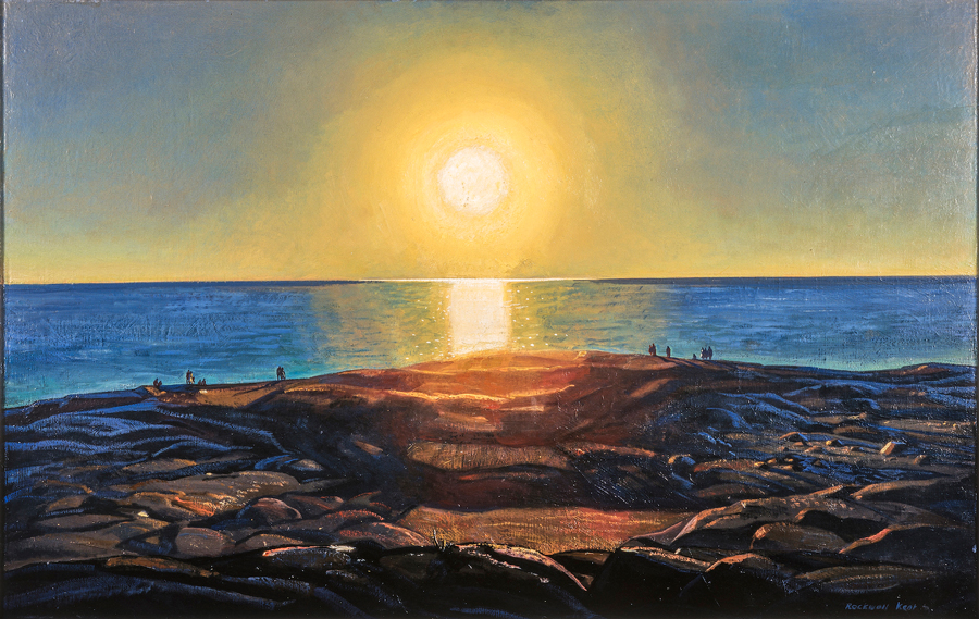
Probably the most difficult and daring attempt of an artist has been to paint the sun itself blazing down upon the sea and islands, in an hour some of the time midway between noon and the time for setting. Men have painted sunlight before, and men have painted the dawn and the sunset, but no one has painted the actual blazing disc of the late afternoon sun before it becomes redder and more seeable. Mr. Kent has succeeded, to a large degree, in his attempt to paint such a sun…
– John Cournos “Rockwell Kent’s Democratic Ideas on Life and Art.” Philadelphia Record. Sunday, 23 October 1910.
John Cournos was writing about the act of painting this natural phenomenon but he could just as well have been describing a spiritual encounter or communing with nature, as Rockwell Kent might have defined it. In the composition Late Afternoon (4)1 we see that Kent has focused on the glowing yellow-white ball of the sun. The image, frozen in his mind as if captured in the lens of a camera, reflects the sun’s curvilinear form as a partial arch before it. All other forms around the sun’s epicenter are silhouettes of liquid color, bleeding together like molten emotion. In losing perceived focus Kent gains a spiritual focus through the clarity of light. He states, “The greatest, most powerful, thoughts that nature arouses in us are not of herself but of human life and art should be a record of these thoughts not merely of the physical beauty of the scene.”2
In Fishermen’s Beach (8)3 Kent depicts two oil-skin garbed fishermen appearing languid as they lug their days catch and drag their dory onto the shore of a mist-blanketed Monhegan. In the study for Toilers of the Sea (6) we witness two dories carrying teams of fishermen to their harvest. The oarsmen heave to battle the waves or lock the tholepins to steady the boat as their co-laborers haul in the traps. We see in these works that Kent envied the Island laborers and their relationship to the natural world. He saw his “own thin wrists, [his] artist’s hands” and “as though for the first time” he saw his “work in true perspective and felt its triviality.”4
Monhegan was, quite literally, the landscape in which Kent “came of age.” It was on the Island during his early stays that Kent wrestled with the question of “God,” the purpose of human exsistence, and the meaning of his own work. From the perspective of a devout vegetarian Kent also struggled with the relationship between humans and other creatures in the Kingdom Animalia. He recorded his analysis of these matters throughout 1906 (in essay form) under such titles as “The True Life: Charity,” “The False Life,” and “Men and Animals: Physical Labor & Physical Need.” Kent’s contemplations on God and Nature approached those of Ralph Waldo Emerson and Henry David Thoreau. To understand his purpose in his life he found humility and direction in the writings of Leo Tolstoi and Walt Whitman. Though Kent came to Monhegan in search of subject matter for painting, he felt a “moral necessity” to be “Where he could live the life he wished.” Not because the Island was picturesque but, for him as man and artist, it held “a vaster sky, a greater sea.” “Character,” Kent said, “is formed out of life, and art is an expression of a live personality; that sort of art has a truer ring that any other art.”5
By all prior accounts — including those of the artist himself — Kent first appeared on Monhegan in June 1905. Recent evidence, however — an Island painting dated 1904 — suggests that he arrived the previous autumn, perhaps on a prefatory visit.6 Regardless of his actual date of arrival, Kent set foot on the island eager to explore every headland and cove as well as himself. “Before a man tries to express anything to the world, “Robert Henri wrote, “he must recognize in himself an individual, a new one, very distinct from others.”7 While Kent was still finding his way on Monhegan he reflected, “My road to life was this. It began with the study of painting… I honored fine brush work and good drawing and good composition and a mysterious something called ‘quality’… I loved the old masters, Hals and Velasquez because they truly had all these… I believed nature was the material out of which the artist created things of beauty and I believed in art for arts sake… Then there came doubts. They came because being a healthy normal person I knew as I stood in the face of nature that never could I hope to tell the joy that was in me because I was too young to know better… “8 Art became, for Kent, an “outgrowth of some grand, heartfelt, human idea about life.”9
Late Afternoon is a paradigm for the soul searching Kent was experiencing. It exemplifies his appreciation for the beauty of nature, yet respects his belief that nature arouses in each of us the questions surrounding our existence. Kent’s use of light — specifically the setting sun — in a more spiritual sense, signaled a parting from his mentors and, to some degree, aligned him with the luminists. Though numerous examples exist, Late Afternoon shares kinship with Ralph Blakelock’s The Sun, Serene, Sinks into the Slumberous Sea (Museum of Fine Arts, Springfield, MA), Frederic Church’s Cotopaxi (Reading Public Museum and Art Gallery), and Seneca Ray Stoddard’s silverprint photograph, Little Tupper Lake, Adirondacks (The Library of Congress).10 Kent was obviously captivated by this theme as evidenced by such period canvases as Maine Fishing Village, Evening and Sun on the Sea (both Pushkin State Museum of Fine Arts). Though his use of this form of expressive motif never waned, it was not matched per canvas until the artist paid homage to the setting sun over Mount Whiteface in paintings like Evening Red (View from Asgaard) (Pushkin)11 and Haybales, Evening (private collection).
Kent’s use of the sunset motif, especially when depicted reflecting on water, may also be interpreted to represent his sexuality. In the painting “Calm and Free” (Maine Coast) (State Hermitage Museum)12 the ray from the mid-afternoon sun reflects on the ocean as a phallus attempting to penetrate the rocky coastline. Even more obvious in its sexual imagery is the Alaska composition, Into the Sun (Bowdoin College Museum of Art).13 In this later composition the bolder, almost vibrant shaft of light is enwrapped by the curvaceous protrusions into Resurrection Bay, symbolic of the intimate contact between male and female. Kent’s use of this motif recalls Summer Night’s Dream (The Voice) (Museum of Fine Arts, Boston), The Voice ( Munch-Museet, Oslo), and The Dance of Life (Nasjonalgalleriet, Oslo) by Edvard Munch. In each of Munch’s paintings we see that a “shaft of moonlight is placed as a phallic symbol on the fjord” to represent “awakening eroticism.”14
Although this similarity exist in certain paintings by Kent and Munch, one should not infer that these artists influenced each other. Kent stated that “the one absolute quality that man and his work can possess is personal integrity; and that integrity is abhorent of influence as nature is of a vacuum.”15 His post-student paintings of 1905-1910 (which predominate in this exhibition) document an archetypal American-modernist idiom. Without forgoing his realist proclivities he has created land and seascapes constructed of modeled planes. In this sense Kent’s painting is a precursor to Arthur Dove and, a later admirer of his work, Fairfield Porter.
Reviews of Kent’s early exhibitions include such adjectives as, “rough,” “crude,” “harsh,” and “stark” to describe his paintings. These same critics drew comparisons between Kent and the painter to whom virtually all turn of the century American artists were measured, Winslow Homer. Kent’s “rocky formations are mineral to the core,”16 one reviewer stated, and his seas, driving. Like many of Homer’s seascapes Kent’s compositions are as elemental as nature itself.
The paintings Harbor, Monhegan (1) and Monhegan Headlands (2) are clear examples of this raw, simplistic manner. Harbor, Monhegan (1905) reflects the “primeval quality of the Island.”17 It possesses a certain primitivism in its elimination of details for the sake of basic form and energy. The abstractions found in Kent’s early Monhegan canvases provide a link between Homer and the modern American art period. Harbor, Monhegan is in itself a link between two other canvases depicting the harbor: The painterly hand of the study, “Seascape with Rocky Shore,” (Conservation Center of the Institute of Fine Arts, New York University)18 and the sharper definition of Kent’s maturing style as seen in the 1907 painting, Pollack Seining (Columbus Museum of Art). Monhegan Headlands (also of 1905) takes simplicity one step further through the vehicle of evening light and the subtle blending effects of shadow. In this composition the elements land, sea, and sky are compartmentalized into three predominant color masses. A reviewer for the New York Art Bulletin, commenting on Kent’s 1907 exhibition at Clausen Galleries, offered a description of the painting Evening Stillness which may very well refer to Monhegan Headlands. The author wrote, ” ‘Evening Stillness’ has a delightful glow of light and a graceful flow of lines where the rocks and water meet.”
Monhegan Headlands in particular provides evidence of one approach Kent used to develop his paintings. In this work we see underpainting that is not always consistent with the message created by the surface paint. The brush strokes were applied to fill the canvas with color and in this case, random texture. This method contradicted the teachings of Henri who felt that strokes that do not tell a tale are distracting, and should be eliminated.19 Kent’s underpainting also suggests a build-up of momentum as the artist rapidly laid out the elements of his composition.
Clarity through rapidity of stroke is evident in Rocks, Monhegan (3), Headlands and Sea (9) and especially the small oil study Manana (5). The resulting impression is that Kent mastered these compositions in one sitting. The preparation to the canvas was minimal and all other brushstrokes were applied to “tell the tale.” Manana, with all certainty, was created in the moment of inspiration. It was this type of painting that stirred James Huneker of the New York Sun to write that Kent’s “paint is laid on by an athlete of the brush.”20 Manana, as identified by Kent’s first wife Kathleen on the verso of this particleboard, was brought to fruition in the larger canvas Manana Island and served as the inspiration for another period canvas, Afternoon on the Sea (The Fine Arts Museums of San Francisco).
An early photograph of Rocks, Monhegan (Kent Papers, Archives)21 attest to the decisive yet fluid strokes of the original, unaltered painting. The detailing that was later applied to the foreground does not detract from our sense of solid rock and turbulent sea. Though this painting bears compositional similarities to like scenes by Henri, John Sloan, Edward Hopper, George Bellows and others, the palette and execution is distinctly Kent’s.
Headlands and Sea is one in a series of paintings in which Kent captures the “dignity of form”22 that he saw in Blackhead. Rendered from virtually the same perspective, these compositions are explorations into the effect of changing atmospheric conditions. This idea, perhaps inspired by Kent’s mentors Chase and Henri, has it roots in the works of the Impressionists (especially Monet) whom the masters brought to life in their classrooms. Whereas Monet’s series of haystacks, poplars, and the facade of Rouen Cathedral were studies of “uninterrupted changes of light on various motifs,”23 Kent broadened his observations to include movement. Regardless of these differences, each artist strove to “get a true impression of a certain aspect of nature.”24
Kent’s later use of variant titles seems redundant when juxtaposing the opposing atmospheric conditions depicted in Headlands and Sea and Blackhead (formerly of the George P. Putnam collection)25 The late afternoon sunlight presented in Headlands and Sea (a.k.a. Monhegan Headland, Evening) divides the canvas into upper and lower planes of light and shadow. Furthermore the light blends once separate forms into solid mass, obliterating detail. The action of the waves is suggested by the bouyancy of pure white pigment, especially as it is used in drawing both abrupt and sinous lines that represent crests. In contrast, the painting Blackhead (a.k.a. Monhegan Headland, Morning) is aptly defined in more linear terms by its exposure to direct sunlight. A much calmer sea exposes teeth-like rocks, and sharp shadows delineate a multiplicity of crevices in the rocky headland.
As I discuss in depth in my book Rockwell Kent’s Forgotten Landscapes, the artist once kept a system of recording his paintings in the form of tacking margin titles: Headlands and Sea possesses such a title on it’s top tacking margin . I also discuss Kent’s frequent use of multiple titles. This painting, for example, has also been referred to as Monhegan Headlands (Maine) and Marine, which can be confusing because these are titles shared by several other Monhegan paintings.
The canvas Monhegan Coast, Winter (7)26 was descriptively titled “Lone Tree & Ocean, Winter” by Kent’s mother when she owned it. Shortly after Jamie Wyeth acquired this painting (and the house Kent had built for his mother) the two artists shared correspondence. In Kent’s letter he states that “The picture was painted from the steep hillside overlooking Gull Rock…”27 The top of Gull Rock, discernible lower right, is pocketed with snow characteristic of the painterly drifts rendered in Winter, Monhegan Island (The Metropolitan Museum of Art). A later view of this formation — Young Spruces: Maine Coast (The State Hermitage Museum) — also scans the top of the rock, though from a variant perspective.
The tree in this composition appears to have been rendered by a method Kent utilized during his student days and which he described in this manner: “the trees are the result not of having tried to paint trees but of merely leaving out sky in patches that more or less resembled trees and then filling in these left-out spaces with an approximation of tree color.”28 Adding to this effect is the new paint Kent applied to the canvas — especially to the sea around the tree — when he restored the canvas after it was returned to him following his mother’s death. As a general rule Kent would re-sign a painting after he reworked it, which may account for the double signature. Another reason given Wyeth for the second signature was that the frame covered the original, instigating the request that the artist re-sign in a higher location.
This theme of solitary object or figure is one that Kent returned to throughout his career. The painting Doctor Grenfell in Labrador (private collection) may represent the solitude that accompanies living in an isolated area, whereas To God! (private collection), like Late Afternoon, suggests a more spiritual encounter. Monhegan Coast, Winter is more closely associated with the paintings Ancient Oak (private collection) and Lone Rock and Sea (William A Farnsworth Library and Art Museum) which exude a timelessness and universality that is reminiscent of Caspar David Friedrich, and the American luminists.
The continuity seen in Kent’s paintings of Monhegan — from his very first visit to his last — was his genuine awe of nature. In a Thoreauian manner of living — whether it was on Monhegan or even Fox Island, or in Igdlorssuit — Kent found a means of experiencing nature, and in nature Kent found ‘God’. How the artist expressed these sentiments (his artistic style) did change, or mature, but the message did not. Kent’s key to conveying these sentiments was light.
The artist ‘s presentation of light certainly evolved from one period on Monhegan to the next. The latter work, as that produced in the Adirondacks or the Canadian Rockies, is little understood and readily debunked because it is considered contrived. On the contrary, properly illuminated, this latter work actually shows Kent’s mastery of light. Kent removed the surface light of his earlier compositions and relocated it below the surface on his later work.
The study for Whitehead (11), like the study for Toilers of the Sea, was undoubtedly rendered all’aperto; aside from this similarity little else appears common. The former exhibits Kent’s mature style and palette, the latter, his earlier work. Whitehead represents a method of painting where an idea was transferred onto a larger canvas. This final canvas was most likely composed in Kent’s studio and as likely, with very little, if any, reworking. The base of these later final canvases was thinly primed with a fair pigment, and the compositions themselves also thinly painted, thus allowing light to literally eminate from the image. One of the most successful examples of this method is the painting Blackhead, Evening (private collection)29 In the completed composition, Whitehead shows slight variations in the rock formations and the inclusion of fishermen in a dory which separate this from the study.
Monhegan Headland (10)30 shares on affinity with Monhegan Coast, Winter in that it possesses two signatures. The location and date of this painting have proved to be ambiguous. With some reservation I will suggest that the white surface and pointed knobs of rock resemble features seen on Little Whitehead. Upon closer inspection this painting appears to be an earlier composition reworked or completed at a later time. An obvious thematic comparison — rocks and sea — can be made with Rocks, Monhegan, but the lighter hues are more analogous to the study, Whitehead.
Monhegan, Village at Night (12)31 also derives from Kent’s later stays on the Island. As a focused study on night — as opposed to a subject veiled in night-light — this composition is an anomaly among Kent’s paintings. A broader interpretation of night became the subject of the Whitney Museum of American Art’s exhibition, Rockwell Kent by Night, in the summer of 1997; curiously absent from this were this composition and another exemplar of the topic, Bonson, Alpes Maritimes, Moonlight (The Phillips Collection). Another striking aspect of this painting, twilight reflecting on the clouds, is shared with the canvases Dan Ward’s Stack: Ireland (Hermitage) and Kayaker: Greenland (Pushkin). The bold, contrasting palette depicted in Monhegan, Village at Night, is not commonly found in Kent’s earlier Monhegan paintings.
The portrait of island laborers, as depicted in Fishermen’s Beach, is retold in the work of several of Kent’s friends and colleagues including George Bellows, Jim Fitzgerald, and Andrew Winter. The backdrop of this scene recalls Winslow Homer’s The Artist Studio in an Afternoon Fog (Memorial Art Gallery of the University of Rochester) and anticipates Kent’s own, Maine Fog, Monhegan (Pushkin). Despite these common characteristics this painting, like all the paintings in this exhibition, are undeniably Kent.
The small oil studies that Kent rendered during the first decade of his career — Toilers of the Sea; Manana; Winter, Monhegan Island, et al. — are dramatic expressions of the vibrant mind and tireless physicality of an emerging messenger. These studies are executed with brushstrokes that are “rich, full, generous, alive,” and “tell [a] tale in harmony with… the motive of the picture.”32 They are fine works in themselves yet only precursors to paintings that are, by all accounts, some of the finest examples of Kent’s work as a painter. Such is the legacy of Kent’s artistic gleanings from Monhegan.
It was on Monhegan that Kent triumphed in his quest for self expression, came to terms with “God” and nature, and where he refined his personal credo to which he remained steadfast throughout his life. “It really was such a transitional, important period for Kent right there; it’s so curious that it was an island off the coast of Maine.”33
© Scott R. Ferris
FOOTNOTES
1 As I discuss in my book, Rockwell Kent’s Forgotten Landscapes (Camden, ME: Down East Books, 1998), Kent, and various owners, have been responsible for changing the titles of the artist’s paintings so much so that it is often difficult to ascertain the history of a given work; unfortunately this is the fate of most of the paintings in this exhibition. It is my endeavor to correct this matter here by incorporating titles known to be used by Kent in this essay and footnote later titles. Late Afternoon — a.k.a. Late Afternoon, Monhegan; Afternoon Sun; Afternoon Sunset on Monhegan Island, et al. — suffers the added dilemma of sharing its title with a similar work, Late Afternoon (Monhegan) (Pushkin State Museum of Fine Arts) — a.k.a. Maine Fishing Village: Evening; Fishing Village Evening; et al. The shared titles are especially confusing when only the title appears, as in the catalogs to the 1907 exhibitions at the Clausen Galleries and the Gallery of the New York School of Art. A break in clarification comes when the Late Afternoon of this exhibition is listed as Afternoon Sun in the 1921 Junior Art Patrons of America First Retrospective Exhibition of American Art, as Late Afternoon in the 1924 Kent retrospective at Wildenstein Galleries, and as “‘Late Afternoon,’ Monhegan” in Rockwellkentiana (New York: Harcourt, Brace and Company, 1933) — all three of these later listings are accompanied by an attribution of ownership to Theodore B. Wagner. One other clarification needs to be made in that Kent’s Rockewellkentiana caption for this painting includes both the title — enclosed in quotation marks — and location — divided from the title by a comma — of this composition. Kent uses this title and place manner of captioning a painting again in It’s Me O Lord (New York: Dodd, Mead & Company, 1955, facing p.26) for the Pushkin Museum’s Late Afternoon. Yet when he refers to this painting in his text (p.538) he simply refers to it by title.
2 Kent, Rockwell. Manuscript, March 1906.
3 Also known as Fisherman’s Beach, Monhegan.
4 ____. It’s Me O Lord. (New York: Dodd, Mead & Company, 1955), p. 122.
5 Cournos, John. “Rockwell Kent’s Democratic Ideas on Life and Art.” (Philadelphia Record. Sunday, 23 October 1910).
6 A painting, simply entitled Monhegan Island, is said to have been given by the artist to his sole brother, Douglas and his wife, on the occasion of their marriage. Though the vantage point of this composition is virtually the same as two of Kent’s later paintings Maine Headland, Winter (The Hermitage Museum) and Maine Coast (Cleveland Museum of Art), the artist’s selection and application of pigment resembles his work under the tutelage of Abbott Thayer.
7 Henri, Robert. “Individuality and Freedom in Art.” (The Craftsman, 1909) cited in The Art Spirit (Philadelphia: J.B. Lippincott Co.), p. 134..
8 Kent. Manuscript “Introduction,” 8 September 1906.
9 ____, Manuscript, 9 January 1906.
10 Wilmerding, John, et al. American Light: the Luminist Movement, 1850-1875 (Washington, DC: National Gallery of Art, 1980).
11 Kent includes the description in parentheses as part of this title.
12 In a letter to Dan Burne Jones (25 July 1906) Kent titles this work, “Calm and Free” (Maine Coast): leaving in the quotation marks because this painting is “titled from a line in a Wordsworth sonnet ‘Calm and Free’ .”
13 Also titled Pioneers, this painting, like To God! (a.k.a. To the Universe!), likewise speaks to the artist’s spirituality as it depicts him standing in reverence to a spiritual light.
14 Eggum, Arne. “Major Paintings,” Edvard Munch: Symbols & Images (Washington, D.C: National Gallery of Art, 1987), p. 40.
15 Kent. It’s Me O Lord. p. 95.
16 Lemon, Courtney. “Independents in New York…” (Tearsheet unclear — title fragmented, date and publication unknown: a review of the 1910 Independents exhibition).
17 Conversation with Jamie Wyeth, 27 January 1998. The original titles for this painting, as well as Monhegan Headlands, is not yet confirmed. It is known that Harbor, Monhegan was also titled Seascape.
18 Untitled when given to the Conservation Center they have since applied this descriptive title, hence the quotation marks.
19 Henri. The Art Spirit, pp. 62-65.
20 Huneker. 2 April 1907, as cited in It’s Me O Lord, 147-148.
21 Rocks, Monhegan may be a later title. The original, which is yet to be confirmed, may have been Sea and Rocks. Sea and Rocks was owned by C.B. Eddy and exhibited in the 1924 Wildenstein exhibition.
22 Kent. It’s Me O Lord, p.118.
23 Rewald, John. The History of Impressionism. (New York: The Museum of Modern Art), p.563.
24 Monet, as cited in Rewald, p. 562.
25 This painting is illustrated in Kent’s Rockwellkentiana. The painting was destroyed in a fire that consumed the home of George and Amelia Earhart Putnam.
26 This is also referred to as Monhegan Coast in Winter (Gull Rock). The original title of this work has not been confirmed.
27 Kent to Wyeth. 3 March 1970, cited in Johnson, Rockwell Kent: An Anthology of His Work (New York: Alfred A. Knopf, 1982), p. 239.
28 Kent to E.H. Chapman. 6 January 1952, Kent Papers, Archives of American Art, Smithsonian Institution.
29 Blackhead is illustrated facing page 517 and Whitehead, facing page 516, in It’s Me O Lord.
30 This painting is also referred to as Whitehead in Wyeth’s notes. Monhegan Headland apparently is the title Kent gave Richard West when they collaborated on the 1969 Bowdoin College Museum of Art exhibition, Rockwell Kent: The Early Years.
31 Also known as Village at Night; Sunset, Monhegan; and Monhegan, this painting was purchased from Kent by his friend and fellow American-Soviet Friendship Society member, Mendel Terman.
32 Henri. The Art Spirit, p.63.
33 Conversation with Wyeth, 27 January 1998.
Selected Bibliography
Selected Bibliography
- The Evolving Legacy of Rockwell Kent, FineArtConnoisseur, Jan./Feb., 2008, Vol. 5, Issue 1.
- In Review: “Rockwell Kent: The Mythic and the Modern,” Privately printed. Oct. 2005.
- In Review: “The Prints of Rockwell Kent: A Catalogue Raisonné,” Privately printed. Jan. 2005.
- “In the Presence of Light,” Foreword to Salamina, by Rockwell Kent. Wesleyan University Press, Middletown, CT. Reprint edition. 2003.
- The Artistic Heritage of Rockwell Kent, American Art Review, Sept.-Oct., 2002, Vol. XIV, No. 5. And, Generations; Essays for two exhibition brochures. The variation in text reflects the change in artwork within the exhibitions themselves. Generations: The Artistic Heritage of Rockwell Kent, Frye Art Museum, Seattle, WA, 2002: Generations: The Artistic Influence of an American Master, Plattsburgh State Art Museum, Plattsburgh, NY, 2002.
- The Stormy Petrel of American Art, Smithsonian magazine, Washington, D.C., August, 2000, Vol. 31, No. 5.
- Rockwell Kent’s Adirondack Legacy, with Caroline M. Welsh, American Art Review, July-Aug., 2000, Vol. XII, No. 4.
- A Greater Luminosity: Rockwell Kent’s Paintings and Related Work and “Selected Checklist of Adirondack Works” (essay and catalogue), in The View from Asgaard: Rockwell Kent’s Adirondack Legacy, with Caroline M. Welsh, Adirondack Museum, Blue Mountain Lake, N.Y., 2000.
- Rockwell Kent’s Forgotten Landscapes (essay and appendices), with Ellen Pearce, Down East Books, Camden, ME. 1998.
- A Painter of Monhegan in Rockwell Kent on Monhegan, Monhegan Museum, Monhegan Island, ME.
- Rockwell Kent Undeniably, Art and Antiques Northeast, Hudson, N.Y. Jan. 1997, vol. 3, no. 4; reprinted in The Kent Collector, SUNY-Plattsburgh, Fall 1997, vol. XXIII, no. 4, and an alternate version of this article appeared in CADS Magazine (magazine of the Chicago Art Deco Society), Chicago, IL. Winter 1997.
- “News from The Legacies,” (column) in The Kent Collector, 1981-1982, with occasional contributions to The Kent Collector, through present.
Related Editorial Project
- CRSA Forum: The Journal of the Catalogue Raisonné Scholars Association, Editor and contributing writer, No. 9, Summer, 2002 through No. 19, Winter, 2006.
Related Bibliography
- Adirondack Vistas in the Artist’s Eye and in the Visitor’s, Judith H. Dobrzynski. New York Times, July 23, 1999.
- Hot Rocks, Wayne Curtis. Casco Bay Weekly. June 22, 1995.
- Rockwell Kent: An Anthology Of His Work, Fridolf Johnson, New York: Alfred A. Knopf, Inc., 1982 (research assistant and copy editor).